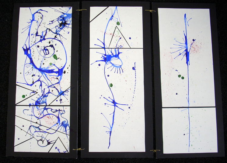
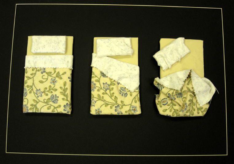
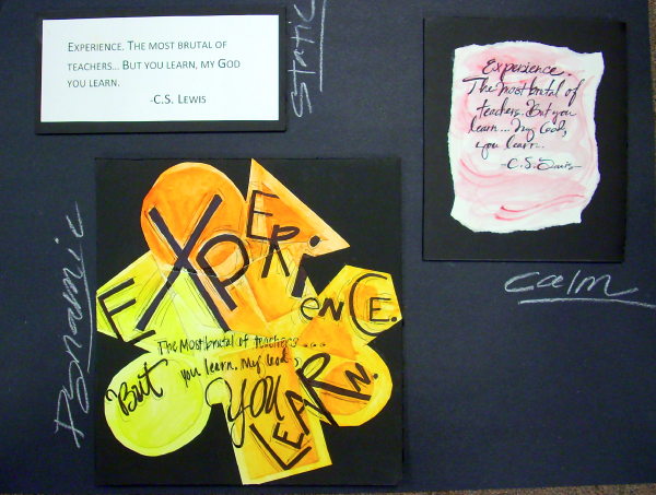
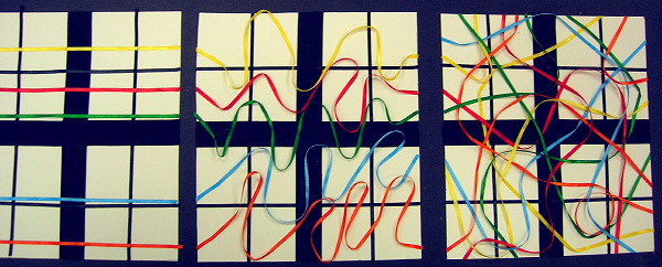
Here the dynamic is really dynamic via energetic lines of varying types.
The Static design is not absolutely static, but is clearly the calm one of the three — it is very still compared to the others.
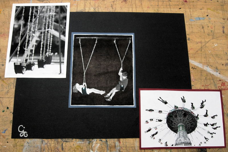
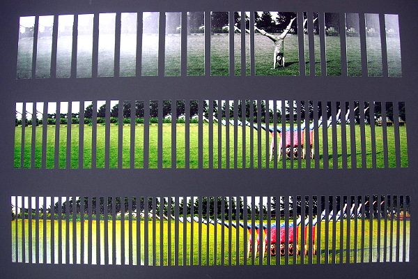
This photo set is tied together by the swing subject matter.
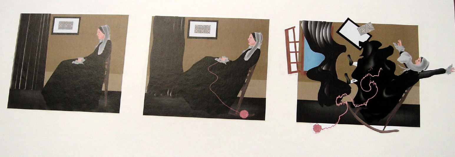
How might forms have been selected or enhanced to empower the content — particularly in the 3rd image?Ok...during the last class, too few folks had a clue about this one.
The subject — the painting "quoted" in the design above — is an iconic American painting by James McNeil Whistler. Though it is often referred to as Whistler's Mother, its proper title is Arrangement in Gray and Black No.1: Portrait of the Artist's Mother. Check out the artist and this work.
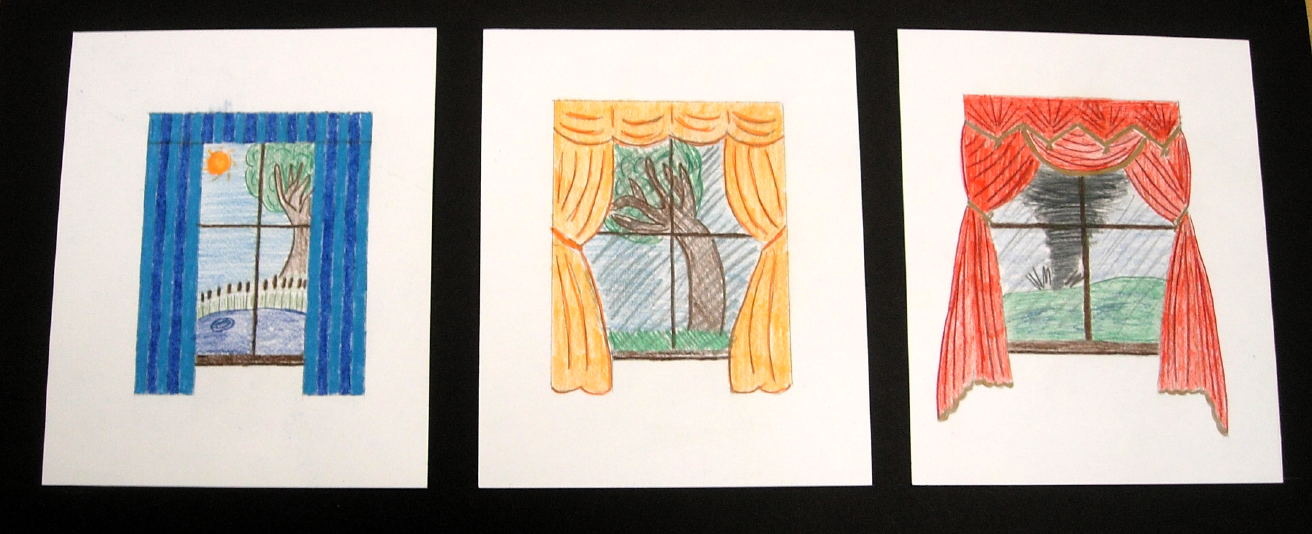
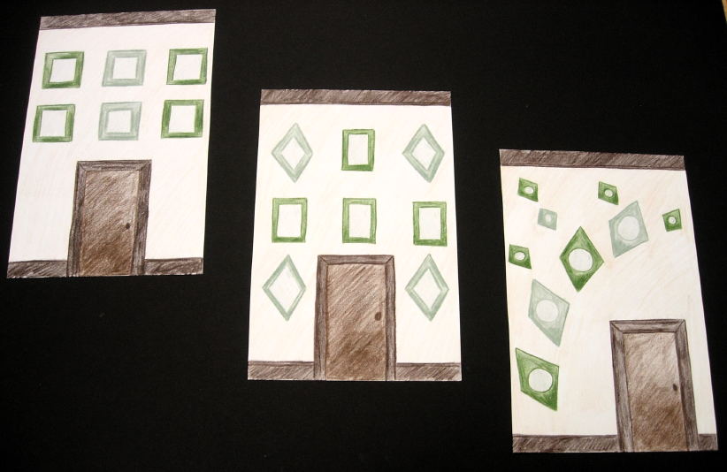
Here the problem is solved via wall-decoration arrangements.
The concept is fine, but how much more dynamic can the 3rd design be?
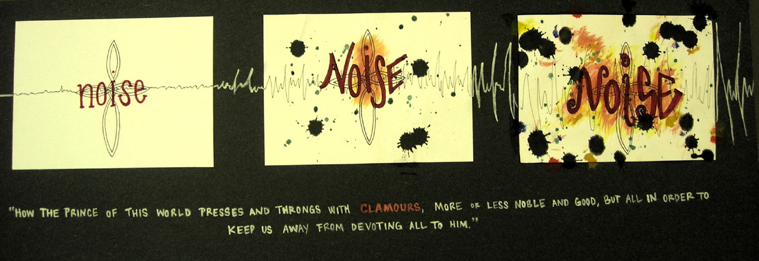
How would you develop the concept more fully? Wall arrangments are a very common problem that usually don't get the thought deserved.I keep wondering...what if the three words were "silence", "sound" and "noise"?
(or quiet/music/cacophony)
The content of the copy is related to the themes as well.
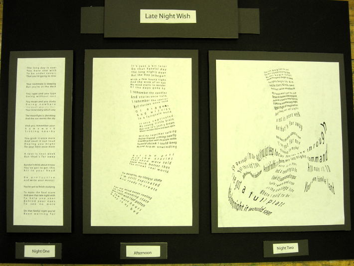
Here readability itself becomes an expressive tactic. One design is easily readable, the next a bit of effort is needed, and the last involves real work to read.
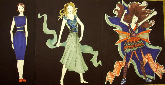
This designer uses fashion/costume design as the format, and offers a distinctly diverse set of options...day wear, evening wear and late-night party?
Are you familiar with Alfred Hitchcock's The Birds?
How might size have been used still more aggressively in this series?
Here the unifying graphic theme is "faces" or "facial expressions". Notice how many formal traits contribute to expressing the three different content themes.
( The expressions on the faces, the pose or positioning within the picture frame, the lighting (value contrast, dominating vaue), and the orderliness of the arrangement of the images. )
