Static-Dynamic Set

Art 160 / Greg Clayton

Static-Dynamic Set based on bold, simple motifs


Series 2: Static and Dynamic Form — expressing varying states of energy

 A 3-design progression expressing varied states of energy using a single dominating graphic element, based on a common theme or subject.

Create three related, unified designs of similar size and shape. 
Develop a dominating graphic element in your composition -- emphasize line or shape or texture or value, etc.

Your designs should use similar elements and related colors. 

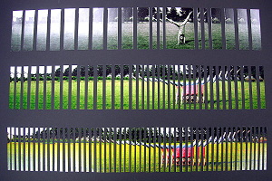
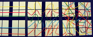
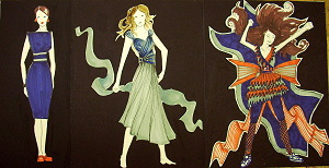
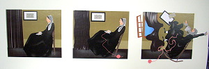
All designs are to be ordered. Your designs are to express changing states of energy or dynamism.

Each design expresses a different state of energy or actiivity:

Each design is to express a different degree of energy through forms and the arrangement of forms.

The first design is to be very static, still, stable, solid, passive…
Express calm.

The next is relaxed and expresses a gentle or restrained motion, energy or movement.
It should have a comfortable motion, dynamism and/or imbalance.
Express a gentle energy.

The third design is to by highly active and very dynamic.
It might be fast, or explosive or powerful.
Express bold but ordered energy.

NOTE: many of the examples, below, did NOT emphasize order in the final, energetic design. Some examples do.
Look carefully for examples of both structure and energy in the final stage.
Be sure that this series is not just another order-to-disorder sequence.
Energy and movement are to build -- but each design is to express organization and structure.

Aim to make each design equally distinct or "different from" the others in terms of the energy expressed.

Devise a simple, unifying graphic theme:  

This set involves three designs with a single dominating graphic element.

Explore how you might build a composition around line. How would you use variations in line to express stillness, gentle motion and bold motion?
What about shape? Could changes in shape characteristics do the job?
Texture? Color? Value?

In practice, one element should dominate, but several elements will amplify the expression. That is, you may use shape as your main element, but color and value could add to the distinctive expressive qualities of your three designs. Just be sure that one element is your most active element.

Your three designs should achieve a unity -- it is to be one composition that includes three regions or statements, rather than three separate designs.
How might you tie them together?

Select a Content Theme (a content concept)

Select some topic, client, product or cause that involves different states of energy.

Consider any subject or theme that has different states of energy.
(a car or a plane are sometimes still, and sometimes in motion. A baby is sometimes resting and sometimes active or aggitated.)

Also consider subjects that are not really associated with energy per se.
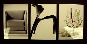
(suggestion:  Interior:   chairs, picture frame(s)  Graphic: Letterform(s)) 

Consider: the Biblical character David. He is a calm, peaceful poet as well as a shepherd dealing with lions and a warrior confronting Goliath.

Consider: promote or present a car that aims to brand itself as safe and secure for family driving, but rugged enough to go off-road.


Create a concept that uses practical applications in your field. 

Interior Design: For your motifs, consider using icons or pictures of furnishings or accessories.  Arrange them in a practical way.  
For instance:
Floorplans:
You might create floorplans as your design.  Arrange a collection of chairs, tables, desks or workstations in such a way that traffic-flow, ergonomics and access are considered.  Indicate two doorways on your plan/design. Be sure too allow adequate access to all features.You might plan a hotel lobby or seating for a banquet hall.
Decorative Wall Arrangement: You might concieve your designs as wall elevations.  Arrange a collection of framed pictures or other decorative elements so as to use the wall space well.  Consider natural viewing heights. Challenge yourself and include either a doorway, a window or a fireplace. You might find a large, tall wall in a hotel foyer or in a large living room. How would you fill that space? Be sure to include many images and elements -- pictures, wall sconces, or other elements in the arrangement.

Graphic Design:

You might consider using letterforms as your motifs. Select large letterforms and use them as graphic elements. You might begin with a simple word-theme for each design: "Static", "Relaxed" and "Dynamic". Build designs around those words.
You might develop your design around blocks of text/copy — manipulating the shape of the text field, the color, weight and spacing of type, the direction or flow of baselines, etc.
Within each design, write words that express the graphic qualities you are expressing (e.g. “static” “dynamic”, “fluid”, etc.)
You might create designs for three restaurant menus — one for a serious, upscale, black-tie restaurant; one menu for a beach-side cafe; one for a lively night club.

Web/Computer/Interactive Design:
 
Consider using buttons and icons as your motifs.  Arrange a web/program interface/layout that organizes the buttons in alternate ways. You might design an interface for a financial services web site, for a restaurant and for an interactive game.
Might you design three versions of a single site -- a calm corporate layout, and two increasingly bold and dynamic versions?

Materials:

You may use most any safe medium that allows you control of form and arrangement.

You may use very simple materials on this design and yet create a very complex design — the key to success is in your arranging, not in the materials you choose.

The most basic option: White/light board, Black/dark board (poster board or better).

see notes on Series 1 materials.

Computer Graphics — CG

You may develop this design using computer software.
(recommended: Illustrator, Photoshop, Autocad/Revit, Flash )

see notes on Series 1 materials.

Size/Dimensions

Backing sheet size: minimum 11x17", maximum 18" x 24”

Prepare three similar visual fields to work on.
Note that you may make your fields any shape you want. The size and shape of each needs to be either a) identical or b) similar.
Your choice.

The size of your motifs varies according to what you can fit within your fields. You may need to scale your motifs up or down in order to arrive at the best balance between positive and negative space. 

Design Pointers — expressive form

Focus on exactly what you’re trying to accomplish – what’s the point of this arrangement?

Study each design specification and visualize what it means graphically—sketch it out.  These are simple designs, but problem-statements are specific.

Try several arrangements side-by-side so you can see what difference small differences make – always give yourself visual options before deciding — let your eyes and your intuitions influence your choice.

Explore the Concepts of Stillness and Calm, in contrast to Dynamism, Energy and Motion

Brainstorm words and phrases that you associate with stillness, calm, stability, etc. Try a Thesaurus.

Brainstorm on words and phrases associated with energy, action and dynamism.

What visual, formal traits are present within designs that seem "still"? Look at images, web pages and interiors — find 3 that seem, intuitively, "static." Analyze them — make notes and sketches in your sketchbook.

Look over designs that seem to be dynamic and active. Make sketches and notes on traits that seem to contribute to that feeling.

Read and look over Chapter 11 on Motion. It presents various strategies of graphic motion.

What arrangements of elements, alterations of features or added elements can evoke a sense of motion, action, change or progression?

— Use many curved lines.
— Use many diagonal lines.
— Create lines (or alignments) that continue to flow through the composition.
— Asymmetry — “dynamic balance”
— Directional Shapes — wedge or arrow-like shapes that point or move, having directional force.
— Rhythms — repeated elements. Introduce rhythms of shapes/elements along lines and, especially, along curves.
— Progressions — series of forms that gradually change somehow.

Emphasize those objects within your design that evoke movement, and subdue those objects that tend to be static or blocking elements.

Which lines/edges might be enhanced…
…and which subdued?

Emphasize
(exaggerate…darken…thicken) curvilinear, flowing lines.
Also, diagonals can be used…rectilinear lines (straight vertical and horizontal) tend to be static.

Subdue
(make thinner, softer or lighter) rectilinear lines or edges.
Look especially for lines and shape that “block” flow through the design.
If an individual shape is static or still, subdue it — soften its contrast or soften/blur its edges.

How can contrasting values be used to "fire up" a design?
Bold contrast seems more dynamic; subdued contrast seems more calm.

How can spacing, grouping or distribution influence the dynamism of a design?
Very regular spacing will feel predictable and, generally, static. Varied spacing will seem more active. Progressive spacing (elements getting gradually closer or gradually farther) will seem to be accelerating or decelerating — thus, in motion.

On Imagery and Form: express primarily through form rather than subject

Your concept may include representational (recognizeable) imagery.

However, that can be a bit of a trap.
There is a tendency to become captivated with issues of imagery and representation. While those are important, they are usually, and in this assignment are, less important than form — the basic structures and relationships of pure visual forms. If your image does not work in the abstract, then it won't really work as representation — its graphic weaknesses might be veiled by fascination with imagery or sentimentality of subject, but if the formal foundation is weak, the image will not satisfy for long.

So your job is to be sure that the core features are strong, before representational forms are added. Basically, you must conceive and design a good foundation before you build the house on top.

Graphic Objectives: Work to establish the mood or attitude of each design using pure form. One of the traps in this assignment involves:
a) presenting a representational subject and
b) emphasizing representational issues but overlooking the formal foundation of the design.

Self-Crit Question: Does my design work, even when I cannot recognize the subject matter?

To be successful in this design problem, the shapes, contrasts and arrangements must do the real work of expressing your content (i.e. static, relaxed or dynamic).

Self-Critique Questions

Self-Crit Question: Does my design work, even when I cannot recognize the subject matter?

-- Is the concept expressed in the imagery, or in the form, formal choices and formal emphases?
If only through the imagery, then you're not yet communicating well -- you're not harnessing the expressive potential of your medium. The eye responds to form before it responds to imagery -- and form influences how we interpret imagery. So, lay a graphic foundation of expressive form first -- then integrate imagery with pure form.

(static design)
— What forms and formal traits create a sense of stillness, stability and rigidity?
— What might be changed to make this design still more static?

(relaxed/gentle design)
— What forms and formal traits create a sense of calm, relaxation or gentle movement?
— What might be changed to make this design still more relaxed?

(dynamic design)
— What forms and formal traits create a sense of dynamism, movement and energy?
— What might be changed to make this design still more dynamic?
— Is this organized and well unified? (or is it just chaotic energy?)

(overall content theme and unity)
— Describe anything that detracts or distracts from the content or the presentation:
— What formal traits unify this set of designs? (describe similar or repeated forms)
__ What is the dominating graphic element that both unifies the composition, and drives the expression of energy?


Presentation:

Mount designs on contrasting backing board.   Position them neatly and consistently. 

Placement on the Backing Board:
Give more space around the outer border and on bottom margin. 
This is a matter of visual balance. Extra space around a collection of elements helps "contain" or "frame" the design. Often this is helpful. On the other hand, when elements crowd the edges of a field, they can feel as though they are escaping -- pressuring the outer edges. This tension can be useful, but often it distracts from the design's content. When figures in a design overlap the edge of the field, there is a sense that the design goes on — those figures are either coming or going, extending the space of the design. This trait is either useful or distracting, depending on the content you're aiming to express.

Use guidelines to help place your designs on the field. (use ruler and very light pencil marks to show you where to position elements.)

Glue securely.
Don't let elements buckle or peel away. Why? Because it distracts the viewer from whatever the design is doing.
Avoid glue stains. Experiment with your adhesives and your papers before gluing your final project down. Know how the glue interacts with the paper. Know how much glue to use — very often you can use very little and thus avoid glue stains or buckled paper.

Label each design
with neat, consistent and legible title. Design a label that informs but does not distract from the design.
[not required]

Personal Labe
l .  Design a small self-identifying label that is neat and legible.  Include – “2D Design”, “Intro Order-Disorder 1 Design”, your name, and the date.    [ H-number for IntDes students ]
Mount this on the BACK of the presentation board.
All labels should be consistent, sharp, and legible –not distracting. 

Your Mark: include your mark somewhere on the front design. Max size 3/4" x 3/4"

Give attention to general craftsmanship: 
Details matter. 
Avoid rough or ragged edges, cuts or tears. 
Align and orient all features carefully.
Avoid glue stains or smears.
Erase pencil marks and other unneeded marks.

Due Dates/Project Development

1st Day

— Assign and Discuss

2nd Day

— Have sketches for presentation/crit/discussion for all three designs.
— Begin any one of your designs.

Have materials on hand to work on designs. (if instructor confirms this)

3rd Day

— 1/4 Size+ Rough concept presentation.
Goal: have your design set complete enough, and developed enough that we understand it without explanation.
Imagery, type and arrangement should convery your unique graphic concept to us.
You design should be mounted for presentation — though it may be mounted on poster board or other cheap backing, be sure to provide adequate margins so as to visually isolate your design.
The size of your presentation should be at least 1/4 of the size of your final design — and it may be full size, if you like.

4th Day

— Have all three design ready for critique.
Note that this is a critique day, not "final turn-in day." Your work is expected to be finished — to be as completed as you know how to make it. We'll critique and look for any changes or ideas that might enhance your design. Then you'll have until next class to revise it before turning it in for a final grade/crit.

5th Day

— Turn in, photograph and self-crit.

Variations on Your Theme

Generate many variations on your basic concept.
Be sure to explore how form drives connotation and energy.  Your subject may help viewer's know what's going on, but form expresses your content -- the mood, energy or degree of dynamism.  Explore many different ways of evoking both calm and action.

Balance and Placement

— How might position in the field alter the mood or energy?
Try moving your subject to the center of the page.
Move it to one side...
Move it partially off the edge of the page.

Try your subject along the bottom edge      Does it tend to rest or just lay there?
... along the top edge.     Is there any sense of floating, flying or falling?

Scale

What happens if your subject is very small... swallowed up by surrounding space. 
What happens if your imagery fills the page?
What happens if your imagery overflows the page?

Line

Can your image be more dynamic if directional lines are introduced or emphasized?
What if you emphasized and emboldened the vertical lines in your design?
What if you strengthen the horizontal lines?
What if most or all lines were curved?
What if all of your lines interconnected? ...can your lines be continued by other nearby lines or edges?
What if all of your lines and edges were diagona?

Shape

Calm it down:
What happens if most of your shapes are blocky... fairly squarish or circular?
What if each shape has a comfortable space around it... lots of breathing room?

Add dynamism:
What happens if most of your shapes are enlongated... stretched or streamlined?
What happens if your shapes are jagged?
What happens if your shapes are flowing and fluid, graceful and curving?
Try shapes that bump and overlap and interconnect. Let your shapes creat pathways through your composition.

Space

Calm it down:
Can you make your design very flat or shallow?

Add dynamism:
How could you add suggestions of depth or distance? (overlap, position in field, linear perspective, aerial perspective)
Can you create a distinctve near, middle and distant plane?
Can you zoom us in very close -- give us an enlarged, macro view?

Texture

Calm it down:
Use mostly very flat, smooth surfaces.

Add dynamism:
Use very distinctive and contrasting textures.
Place very different textures next to each other.
Use actual textured materials.
Make sure your textures involves bolder, contrasting values.

Value and Contrast

Calm it down:
Soften your value contrasts. 
Soften the edges or transitions between values -- led values and shapes glide into each other.
Use only a narrow range of value.   You might make everything fairly light ... or make your imagery and background generally dark.
Be sure to keep enough contrast for the image to "read."

Add dynamism:
Embolden contrasts. Place light areas next to dark.  Be sure that no shapes "run into" or fade into each other.
Expand your value range.  Be sure you use both very light values and very dark values, and mid-tones as well.

Color

Calm it down:
Use only one hue (monochromatic scheme) or a very narrow set of neighboring hues (analogous scheme)
Use modest or low chroma colors... keep your colors muted or grayish.
Break up color into very small fragments.
Set similar colors next to each other... keep very different or contrasting colors apart.
Use mostly cool hues.

Add dynamism:
Use complementary hues... or try a triadic scheme with three hues as far apart as possible on the color wheel.
Use vivid chromas. Highly saturated colors evoke energy.
Set contrasting colors next to each other.
Use mostly warm hues.
Mass your colors into big areas. Color takes on more power in large areas or shapes.


Examples

Quite a few examples of earlier versions of this project, along with some commentary, are here.
Note that the problem varies from semester to semester -- so the examples you see, many not involve all of the same challenges or limitations that you have been assigned.
 

Glossary | Order-Disorder Series | Series 1 | Series 3 |


Greg Clayton
Design Foundations I
Design Foundations II

Senior Seminar

 
Photography Course
 
Course Schedule
Course Schedule
 
Independent Study
 
               © 2017 Greg Clayton/ gclayton@harding.edu