Order-Disorder Series

Art 1600 / Greg Clayton

Order-Disorder Series based on bold, simple motifs


Series 1: Order-Disorder via simple motif

Brief Description:

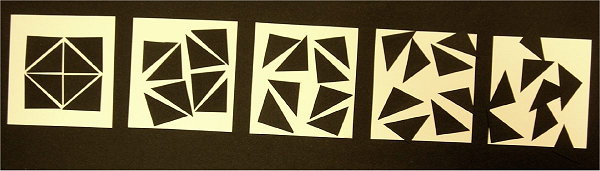
Stage 1: Create 3 distinctive, ordered designs each using the same motif and field.

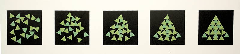
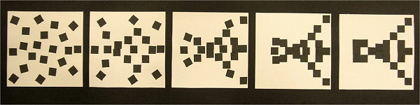
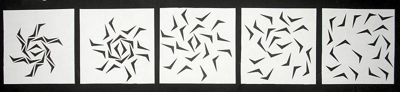
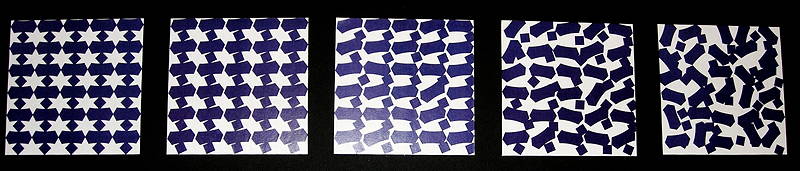
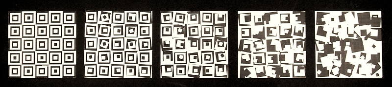
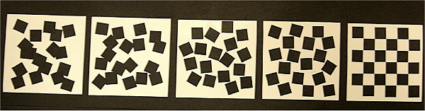
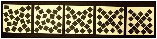
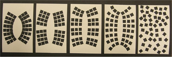
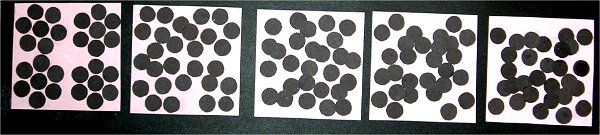
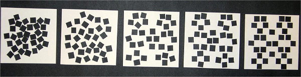
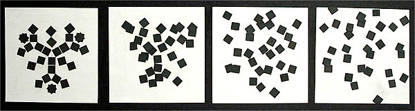
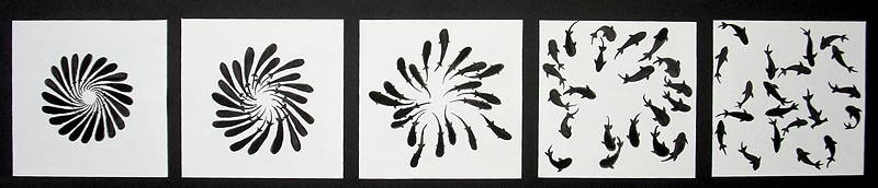
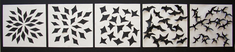
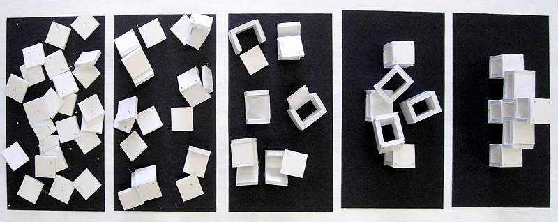
Stage 2: Create a 5-design series based on simple, bold motifs.

The series should progress gradually from an interesting, highly ordered design, to a highly random design.


Goals:

Become conscious of the characteristics of order itself.
Refine skills and perceptions involved in creating and controlling degrees of order within designs.


Graphic Objectives:

Stage 1:
Create 3 Different "Ordered" Designs.
Explore distinctly different strategies for building order and unity within your design.
Use the same motif in each design.
Use the same field or boundary in each design.

Goal:
Each of your 3 designs will have a distinctly different character, despite using the same motifs and field.

What might you explore?

Try different types of symmetry.

Try different types of alignments.

Try different massings or imagery...

Try hierarchal designs with large organization, and smaller "sub-orders" within the whole.

Try empowering the negative space to create a distinct pattern or shape.

Explore varied patterns that can be constructed with your motifs.


Stage 2:
Create a progressive series of 5 designs/arrangements of similar, consistently-colored motifs.
 
These designs gradually morph or transition from the first design to the last. 

— The first design should be highly ordered, carefully structured, positioned and aligned — and visually interesting.

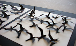
— The last design should be utterly random

— Designs between should gradually transition between these extremes.  

Include at least 20+ shapes in each design. 

— Don't let your design be too vacant or too empty — balance positive and negative space well.
     (i.e. your black and white elements should fill roughly equal areas... roughly.)
— Make your design complex enough to offer many possible positions for the individual motifs — that is, don't create a design that is too simple, with too few elements.

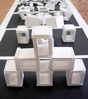
Motifs must be small, similarly shaped, similarly colored and similarly sized.

Many of our example designs use simple shapes — black squares — as their motives.
You don't have to limit yourself to squares.

Design a simple motif that allows you to build interesting patterns.
Consider shapes that flow into neighboring shapes in interesting ways.
Consider shapes that create interesting negative shapes between motifs.

Your motifs may be identical throughout your series of designs, or you may introduce very subtle changes in your motifs.
But keep the basic gestalt of the underlying motif consistent — that is, at first glance, all of your motifs should look the same.

NOTE: Use bold value contrast to help keep figure and ground separate.

LImit overlaps between shapes and frame/border. Restrain or subdue contacts between motifs.

That is, don't let your motifs "cluster" into dense masses or groups with no space between them. Don't let your motifs "stack" into solid rows or shapes. Keep the identity of the underlying motif apparent and separate.

Keep the negative space between your shapes active.
Negative space is as important to visual perception as are positive shapes — thus, a designer needs to be quite conscious of negative spaces while arranging positive shapes.

Notice that every time you move a positive shape (one of your motifs), you simultaneously alter the negative space — the shape of the background. You'll gradually learn to watch the background for patterns as well as the foreground.


Colors: 2 contrasting (near-)neutral color regions

Use neutral or near-neutral colors only, with strong value contrast.
That is, black, white and gray are fine...
... but also subtle colors — low chroma, near-neutral colors.
(Q: So what can't I use?
A: Really bright, bold, rich colors — higher chroma colors.)

You'll pick one general color for your motifs (a.k.a. foreground, figures)...
...and another general color for your background (a.k.a. ground, field).

Important:
Be sure that your two colors have strong value (light-dark) contrast.

Slight
variation from your two base colors, creating color "regions", is allowed.  That is, not every motif has to be precisely the same color, but the colors must be similar in hue, in value and in chroma.


Size/Dimensions

Backing sheet max size: 20"x40"
(suggested: 11x28” ( which is ½ sheet of posterboard when cut along the long axis.)

Prepare consistent visual fields to work on –  for example,
most of the samples posted here have 5”x5+” fields
 to design within
(5”x9” max if using the suggested 11x28 backing)

Prepare a whole lot of small shapes/motifs to arrange within your fields.
(usually your motifs will need to be between 1” square and 1/4” square — but there is no absolute required motif size.)
 

Materials:

You may use very simple materials on this design and yet create a very complex design — the key to success is in your arranging, not in the materials you choose.

As long as your final design meets the goals and limitations, above, your medium is up to you
(within reason — check with the professor if you have questions.)

The most basic option: White/light board, Black/dark board (poster board or better).


Scissors, knife or paper cutter  — or, how to make all those little shapes?

Cut with whatever works (safely) for you.
Some of us are scissors users.
Some of us are exacto knife users. (and we always have a scrap matboard underneath...or a cutting mat, so that we don't gouge the table tops....right?)
Some use the paper cutters. (...and we pay close attention to where our fingers are while the blade is coming down.)
Some have discovered dies and punches (I'm told the Educational Resource Center (3rd floor, Education blg) has a variety of punches.)
Some have even found packages of stickers that happen to suite their concept.
If the Laser cutter has a lab operator, consider that. (GlowForge)

Others have either bought, or cut their own rubber stamps. (it is tricky to place stamped images very precisely, though.)
You might even fold and tear paper — but keep at least some of your edges sharp & crisp for this design (it helps make the motifs vsually bold.)

Glue  — what to stick those shapes down with? 

Plan to use something to "stick" your motifs temporarily in place while you create and revise your design. Options: double-stick tape, stick-um (that not-quite-chewing-gum stuff that lets you stick pictures onto walls), repositionable adhesives (including rubber cement applied to 1-surface only; let dry; then position.)  

Avoid glues that release when you least expect it — many stick glues seem reluctant to hold on.                        

Computer Graphics — CG

You may develop this design using computer software.
(recommended: Illustrator, Autocad, Flash )

Note, however, that whenever you choose to use computer-based design tools, you are expected to take advantage of your medium. That is, each medium, material or process that an artist or designer uses, has its own distinctive potential and advantages as well as its own disadvantages. Excellent design always includes the component of craftsmanship — knowledge of, familiarity with and controlled use of tools and materials. A craftsperson explores, discovers and then designs to exploit the full expressive and aesthetic potential of his/her medium.

So, if you use CG tools, exploit the range of diversity and control that those tools offer.
What forms can you explore more freely with CG tools than with traditional tools and materials?
What kinds of structures or arrangements do your allignment, distribution and rotation tools make feasible?
What kind of transitions between stages can you readily control with blends or tweens?
Brainstorm on that.

Explore symbol-capabilties in Illustrator, Autocad and Flash. Symbols or Blocks allow you to create simple motifs, and then easily change all of the instances of the symbol, looking for the best overall result. It might also be possible to use 1 motif at the beginning of the series, and a slightly varied motif at the end. (But remember, the problem limitations insist that all motifs be " similar, consistently-colored".)

In Illustrator or other graphic apps, you might explore blend and tween tools to elaborate your transitions. You might preview or print 10 transition stages, and then select the 3 that offer the best interim stages visually.
Note however that automated Blend/Tween tools will introduce literal changes at a consistent pace, but not percieved or "felt" change -- which is what our design is about.

CG Output:
Make sure you do NOT turn in standard laserprinted bond paper.
When presenting designs, use output that has strong graphic qualities. Paper stock makes a huge difference in the visual quality of most digital prints — glossy paper stock dramatically improves both b/w laserprints and color inkjet prints.
Other problems to avoid include streaked images due to toner or ink running out, or set too light.

Design Pointers

Focus on exactly what you’re trying to accomplish – what’s the point of this arrangement?
Develop your core concept well.

Study each design specification and visualize what it means graphically—sketch it out
These are simple designs, but the problem-statements include specific limitations.
While reading the project specs, look over the examples further down. Each sample design, though imperfect, will "describe" the problem visually.

Sketch in terms of ordering strategies.
Think about ways that you can introduce order into an arrangement of simple motifs — consider alignments or patterns that might offer a sense of organization. Ask yourself: What traits might create a sense of "order", "organization", "control", "structure" or "intention"? What traits or features make a design 'interesting'?

Explore alternatives.
Try several arrangements side-by-side so you can see what difference it makes – always give yourself visual options before deciding — let your eyes and your intuitions influence your choice.


Consider the design elements and principles that you actually have direct control over.
This assignment is very constrained — you are left with only a few things that you, the designer, can actually choose. The challenge is to recognize just how many things you do have choice over, and how many ways those choices can be used to create visual or expressive relationships.

Motif:
What shape or shapes? What size or sizes? What color or colors? This assignment requires that your motives be very similar — but not identical. How can you use that flexibility?

Color:
What colors will you use? Your two colors are to offer strong value contrast, and are to be neutral or near-neutral colors (not too bright or high chroma).

Field:
The "field" of each of your five designs is usually identical — but, actually that's not required anywhere in the problem statement ('09). In any case you are creating five designs. Each design will fit into its own field. The examples, illustrated further below, use square fields (5"x5") or rectangular fields (5"x9").

Independent Traits of each motif:
Placement

W here do I place or position an element on the page?

Orientation/Rotation
A t what angle do I place my motif on the design?

Relationship Traits: (traits that involve two or more elements)
Intervals/Spacing
How close or far apart will my pieces be?

Clustering/Grouping
Similar to intervals. Gestalt psychology reminds us that we tend to organize objects into patterns or groups. What groups or subgroups might you use to organize your many pieces into a more coherent whole?

Alignment:
Alignment involves arranging, trimming or scaling objects so that key features lie along a single line. These implied lines act as a sort of an underlying skeleton to the overall design — alignments offer a kind of visual connection, or relationship, between separate features.
The line can be straight, in any direction, or it might be curved and wavy. Edges can be aligned...centers can be aligned...axes can be aligned. "Grid" layouts involve forced alignments throughout the design.

Design Strategy

Get your goal clear in your head.

Start with the two extremes – the first design in the series and the last.


The Ordered design involves the most brainstorming.
How can you create something that is organized, but interesting?
How ordered is enough ordered?

What makes something look, feel or seem "orderly"?

How is an "intentional" form different from random form?

Strategies include: alignment of parts; balance (symetrical, radial); imagery; hierarchy (levels of organization — large forms might branch off into smaller forms then into smaller still groupings. For instance, a tree has a trunk, then branches, then stems...the leaves. All of the stems are very much like all of the other stems. The entire tree has its own distinct form — a pine tree might be a create cone-form, or triangle-shape, while an apple tree might be a big sphere or egg-shape.

What makes something visually interesting anyway?
Strategies include: Complexity. Motion/movement. Repetition of secondary patterns or motifs. Imagery or message. Tension — breaking the "order" in just the right way.

Sketch out several ways of doing these in pencil or ink in small thumbnails.

Lay out at least three versions of each design before gluing one down.  
Practical Suggestion: Use repositionable glue, tape, or sticky-tack until you’re sure.


Self-Critique Questions

When viewing the 5 designs progressing from ordered to disordered:

— Where is the biggest jump in orderliness?
If your intuitions identify a pair of designs that change dramatically, then you know that one or both of them need to be adjusted.

— Which two designs offer the least difference in orderliness?
Notice that we're talking about "orderliness" -- not the shapes within the designs themselves. Look for, and sense, the quality of order. Watch for designs that are different, but equally orderly. (or equally random)
Adjust one or both of those designs.

— When I look at design 2, can see distinct changes from design 1?
Be sure you're introducing enough change to be felt...noticed.

— When I look at design 4, can I still see something of design 1 in it?
This is an important test. There needs to be continuity —  from your first orderly design to the 4th design, your graphic concept should evident — still there.


Presentation:

Mount designs on contrasting backing board.
max size: 30x40" (suggested 28”x11” (1/2 sheet of poster board)) 
Mount 5 designs on the backing board. 
Position, distribute and align them neatly and consistently. 


Placement on the Backing Board: Borders, Spacing and Margins
Give more space around the outer border and on bottom margin. 

This is a matter of visual balance.
Extra space around a collection of elements helps "contain" or "frame" the design. Often this is helpful. In contrast, when elements crowd the edges of a field, they can feel as though they are escaping -- pressuring the outer edges. This tension can be useful, but often it distracts from the design's content. When figures in a design overlap the edge of the field, there is a sense that the design goes on — those figures are either coming or going, extending the space of the design. This trait is either useful or distracting, depending on the content you're aiming to express.

Use guidelines to help place your designs on the field. (use ruler and very light pencil marks to plan where to position elements.)

Glue securely.
Don't let elements buckle or peel away.
Why?
Because it distracts the viewer from whatever the design is doing.

Avoid glue stains. Experiment with your adhesives and your papers before gluing your final project down. Know how the glue interacts with the paper. Some glues "bleed through" some papers. You don't want that.
Know how much glue to use — very often you can use very little and thus avoid glue stains or buckled paper.

Label each design
with neat, consistent and legible title. Design a label that informs but does not distract from the design.
[not required]

Personal Labe
l .  Design a small self-identifying label that is neat and legible. 
Include – “Art1600 Design Foundations 1”, “Order-Disorder Series”, your name, and the date.   

Mount this on the BACK of the presentation board.

All labels should be consistent, sharp, and legible –not distracting. 
(note: its a good idea to make up a nice label, then photocopy it so you can quickly mount it to later projects.)

Your Mark: include your mark somewhere on the front design. Max size 3/4" x 3/4"
[not required ]

Give attention to general craftsmanship: 
Details matter. 
Sloppy details distract — and detract.

Avoid rough or ragged edges, cuts or tears on your designs and on your presentation board.. 
Align and orient all features carefully.
Avoid glue stains or smears.
Erase pencil marks and other unneeded marks.


Due Dates/Project Development


1st Day

— Assign and Discuss


2nd Day

__ 3 Alternate Ordered Designs.

Present your designs in class -- be sure we can set them side-by-side to compare your organizing tactics.


3rd Day

— 1st, middle and last design completed -- highly ordered, and thoroughly disordered.
The designs do not have to be mounted, but should be ready to set side-by-side for discussion.
Feel free to glue/tape your motifs down lightly — rather than permanently. That way any adjustments that become obvious during critique can be easily made.

Have materials on hand to work on designs 2, 3, 4


4th Day

— Have full design ready for critique.
Note that this is a critique day, not "final turn-in day."
Your work is expected to be finished — to be as completed as you know how to make it.
We'll critique and look for any changes or ideas that might enhance your design. Then you'll have until next class to complete it, however, I will record a grade based on quality and completeness today. This grade is a component of the project grade.


5th Day

— Turn in and post to Semester Portfolio.
Show both your 3 ordered alternatives and your 5+ design progression.

Examples


This is a straightforward and successful solution to the problem. The "orderly" extreme is about as ordered, regular and predictable as you can get -- a checkerboard pattern. (but not very interesting)

Look for ways to introduce BOTH visual interest AND orderliness into your extreme-order design.

   
This series adds complexity to the orderly design, compared to the prior series — stage5 is ordered, but more interesting.
   

Here the ordered design has a major design, a symmetry of two large clusters, as well as smaller row/column groupings -- thus there are several layers of order even in this very simple arrangement. These layers —  or hierarchy — adds a sense of complexity and visual interest.

Progression problem: note that stage 4-5 is quite abrupt...not gradual.

Question: How successfully does order diminish in stages 2-4?

   
Here the "ordered" design is an icon -- a sort of recognizable image.
   

Notice how the extreme symmetry of the circle motif offers fewer ways to introduce and vary order — oriention is not really available as a design tactic.

Progression: it is hard to tell the difference between state 3, 4 & 5.


This series has too few elements (per the assignment), but it is nevertheless, an interesting solution.

The progression here is really quite good — consistent transitions occur between each step.

   
Progression: note that 3,4,5 are quite similar. 2-3 has a huge "jump" in orderliness. 1-2 are similar in orderliness, though clustered/grouped differently.
   

Here the ordered design is actually quite ornate. It's three-axis symmetry causes a basic design to be repeated (and rotated) about the center of the design. The simple overlapping-square-become-star is a nice touch too.

(note: this was assigned as a 4-stage series — not 5-stage.)

Note that the order breaks down much to abruptly from #1 to #2, so we really don't have a progressive breakdown of order here.


Here the motif is certainly simple, but it is obviously not a square (great!) and the overall design is far from being a simple, orderly grid. (great, again!)


This sequence uses a tactic that is not used in any of the other examples (I think)

How is this one really different?


This one actually manages to tell a bit of a story ...though you don't discover that until you've explored past the first stage.


Here the "simple motif" is elaborated a bit... but quite successfully.
There are several different sizes of squares used, instead of just one size.


Here the negative shapes and the postive shapes effectively reverse roles -- in the first stage the white shape has a stable gestalt, but by the 3rd stage, the dark shapes are the positive shapes.


This design progresses from 2D to 3D as order breaks down.

However, look carefully at order in #2 & #3...
... is order generally breaking down, or are forms only getting more dispersed?


This designer daringly chose to move his motifs into 3d space.

Are there any project limitations against this?


Series 2: Static-Dynamic Progression

Series 3: Thematic Progression

Glossary | Order-Disorder Series | Series 2 | Series 3 |


Greg Clayton
Design Foundations I
Design Foundations II

Senior Seminar

 
Photography Course
 
Course Schedule
Course Schedule
 
Independent Study
 
               © 2019 Greg Clayton/ gclayton@harding.edu