Thematic Progression

Art 1600 / Greg Clayton

Thematic Progression

In this design series, you select an expressive theme involving changing states, attitudes or conditions — your content concept.

The forms of your design will be informed by one of your MyFavs artist/designers.   

Then you develop forms, composition and, possibly, imagery that will express your theme visually.

You will create five stages that progress between two extreme conditions.


Series 3:  Thematic Progression

5-stage progression
5 designs that move from one condition to another expressing the changing conditions within your underlying theme.  Select and arrange forms to be visually unified as a compositional whole.
Develop one visual element as the dominating expressive element.

Content Concept/Theme:
Select a theme or topic* to express through the forms that you select and arrange. 
Avoid literal illustrations of your topic — aim to express the character of your theme, but do not depict it.

Graphic Concept/Form:
You will select a specific dominating graphic element (line, shape, texture, pattern, etc.) that will visually unify your design.

Medium/Materials: Unlike the prior two designs, you may select and arrange most any materials, objects or forms as long as the entire design is successfully unified and is mounted securely into the assigned fields. 
Explore strategies of selecting and arranging forms and materials to best establish both unity and variety for your design.


Suggested Themes:

There are many themes that might work for this and you are welcome to propose and develop better alternatives.
Note that the trait that is most essential is a progression from one distinct condition to another condition -- these changing states are what you are to express.

Ideation/Creation        
Re-explore our creative problem-solving process.
How might you express the creative experience?
First, what are the extreme conditions? Unknown to known? Obscurity to clarity? Frightened to euphoric?
What it is like to not know where you're going? What is the discovery of an idea like? What is it like to design forms that successfully express an idea?

Falling  in  Love 
Keep in mind, you are not depicting what it might look like to fall in love, but rather, you are to express the experience of falling in love — what is it like on the inside. 
But what might the extreme conditions be? alone and unified? independent to inter- or de- pendent?       

Fall from Grace   
How do you visually express grace...what are traits of grace that might be visually expressed?
What about the opposite of Grace...what are traits of such a condition?      

Epidemic        

Maturation

* other options for themes.

__________________________________________________________________________________

Develop a unifying graphic concept

A Goal: Devise a distinctive graphic concept that can both unify your design, and express your content.

Either limit or avoid representational imagery — the goal it to express conditions via form. Any imagery used should not interfere with basic, underlying form as an expressive vehicle. A good practice is to explore your concept in the abstract (rough thumbnail images) before trying to place anything recognizeable in the design.

Graphic Themes — dominating, unifying, repeated formal traits:
Devise clear, dominating graphic traits to unify your design.
Start by declaring one graphic element that will be "active" — the dominant visual element.

— You might select one type of shape or line to dominate.
Eliminate, adjust or subdue all other lines and shapes in order to empower your dominating line/shape trait.
— You might select swaying, wavy lines as a dominating graphic element.
— You might select very prominent textures — rough, rocky textures, or silky textures, or sandy textures. There are many options.
— You might select patterns of zig-zag lines or patterns of checkboard. Create richly patterned rhythms that fade in and out as needed.

Color:
You may use brilliant, though scarce, intense color in your design— color accents.
However, select only one dominant color — and make that color -- or hue -- pervasive. Explore variations in value (light and dark versions of your hue) as well as variations in chroma (vary the purity, saturation or "grayness" of your color) In short, there are many colors available based on any single hue. So you can unify your design by using a single, dominating hue, while at the same time offering variety by varying value and chroma.

— Select only a very few colors
Select one hue as your dominant hue.
Select one value as your dominant value.
(i.e.: monochromatic scheme — one hue with light and dark, rich and muted variations on that hue)
(alt: develop a neutral-dominated design (black, gray and white) with strong accents of one chromatic color.)


Materials:

You may use very simple materials on this design and yet create a very complex design — the key to success is in your selecting and arranging according to your concept, not in the materials you choose.

Unlike the prior two design series, you have very wide latitude on materials/media here.

Your main challenges are to
a) express your content and
b) visually unify your design.

These two issues should inform your choice of materials.
Think, brainstorm, sketch and experiment with materials that might successfully unify your composition. The more similar or consistent your materials, the easier is unity.

How might material/medium inform your forms? If you use a distinctiive material (fabric, torn paper, etc), you might, for instance, arrange materials so that prominent textures dominate and unify the design.

The most basic option: White/light board, Black/dark board (poster board or better).

see notes on Series 1 materials.

Computer Graphics — CG

You may develop this design using computer software.
(recommended: Illustrator, Autocad, Flash )

see notes on Series 1 materials.

Size/Dimensions

Suggested backing sheet minimum size: 11x28” ( which is ½ sheet of posterboard…cut along the long axis.)
Max size: 16"x40" ( 1/2 sheet of matboard. )

Design Pointers

Focus on exactly what you’re trying to accomplish – what’s the point of this arrangement? What is your content concept -- your theme? How might simple forms express that feeling?

Study each design specification and visualize what it means graphically—sketch it out.  These are simple designs, but problem-statements are specific.

Try several arrangements side-by-side so you can see what difference it makes – always give yourself visual options before deciding — let your eyes and your intuitions influence your choice.


Design Strategy

Start with the two extremes – the first design in the series and the last.

What is you theme really about?  What are the attitudes or feelings involved?

Where does your theme begin?

Where does it end?

Now what happens in between?


Explore your concent concept...
...your inflences and art/design you might borrow ideas from...
...your graphic concept, including dominating traits and areas of emphasis...
...then develop and refine your design.        


Self-Critique Questions

 Is my theme abstract and conceptual, or concrete and literal?      

Aim for an abstract concept that changes from one condition to another. 

Consider the theme:  A Tower Falling

This is, or can be, a sequence of very literal images.  You start wih an image of a tower standing upright.  You add some images of a damaged or crumbling tower.  In the final image you show rubble.
That's a literal process illustrated.
That's NOT what we need for this project.  It is too literal, too objective, too concrete. 

Now, if you want personify the tower and express what it feels like as it falls, that might work.  That would involve expressing the internal feelings of the tower-as-a-person.  That is not a literal problem and so that would fit this assignment.           


Consider the theme:  Falling in Love

What does that look like?   What must be illustrated?  What colors or shapes must be there?
There is really no one answer.
Falling in Love is an experience, a concept and an idea -- but it is not a thing or a particular event. 
What feelings are present at each stage?   Lonliness?  Anticipation?  Excitement?  Hope?  Relief?   
We can each select and refine our own characterization of what falling in love can be.  We can each express a unique perspective.   
That makes is a useful theme for this project.  Your job is to explore and express what it is like along the way -- from beginning to end.  But you do not have to illustrate what it looks like -- you do not necessarily need to show someone falling in love.    


Does my design primarily illustrate an event or a story?    ...or does it express the changing attitude, connotations and emotional content? 

We are aiming to "express" the connotation.
If you include imagery that illustrates details, that can be helpful, but the focus and the priority here is connotations, mood, attitude and emotional content --- not information or denotation.
Thus, avoid narrative illustration.

Now, there's nothing wrong with narrative. However, in this design you've been asked to emphasize the felt experience. Narrative illustrations tend to depict events, not feelings — often tapping into the viewer's prior sentiments, rather than evoking a direct response through form in the design. We, in this project, are aiming for forms that express on their own, rather than images that remind viewers of past experiences.


Do I have a clear set of unifyng visual traits?

Just what are my dominating visual traits in my design?
Is there a dominating hue?    ...a dominating value?
Is line active or prominent?    Are the lines straight, curved, wavy, spiraling... just what qualities are prominent?
Is pattern prominent?   Are textures active and varied?
Is shape the dominating element?   What kind of shapes?

Pick a very few elements and traits to "drive" your visual design. 
"Limit the vocabulary" -- use a few types of visual traits rather than everything.  Consciously narrow down your palette of color, of line, of shape, of texture...  
   
If I can't clearly and obviously see which traits are prominent, then I probably don't have a strong, well-established set of unifying elements.


Do I have a single, prominent, dominant graphic element?

There needs to be something — some kind of line, some shape, some pattern, some texture or some color — that just keeps reappearing in the design. 

If needed, go over-the-top and try overusing something. 
Develop your "norm" clearly -- your dominant trait(s).
Then elaborate, vary and introduce anomalies.

The order matters -- start with unifying traits.  Then introduce variations and contrasts.


 Does my solution reflect inspiration from one of MyFavs artist designers?

Which of your influencers -- your favorite artist/designers -- are you borrowing ideas from?
What formal traits are you borrowing?    Color?  Composition?  Pattern?


Are the beginning and the ending conditions distinctive — is it really very obvious that something has changed dramatically?  And just what it is that has changed?

In order for your content to effective and dramatic as well as visual, contrast is needed.

Your content concept is really important here. 
What is changing?  What is significantly different at the beginning than the end? 
It needs to be some attitude that changes, some feeling or felt condition.   That is, we're aiming for something that cannot be literally, specifically or accurately illustrated.

As you develop your concept, be very clear what is happening at each stage.  What is different? 


Are the various (5+) stages apparent?
Or do they all run together?
Are there several clear conditions or attitudes expressed?

 The series does NOT have to be five individual, separate frames. The series may well be done as a continuoum of gradually changing, or melding conditions. However, you DO need to be sure that there are at least five distinct regions or neighborhoods -- five or more attitudes expressed along the way.


Presentation:

Mount designs on contrasting backing board.
 

Placement on the Backing Board:
Give more space around the outer border and on bottom margin. 
This is a matter of visual balance. Extra space around a collection of elements helps "contain" or "frame" the design. Often this is helpful. On the other hand, when elements crowd the edges of a field, they can feel as though they are escaping -- pressuring the outer edges. This tension can be useful, but often it distracts from the design's content. When figures in a design overlap the edge of the field, there is a sense that the design goes on — those figures are either coming or going, extending the space of the design. This trait is either useful or distracting, depending on the content you're aiming to express.

Use guidelines to help place your designs on the field. (use ruler and very light pencil marks to show you where to position elements.)

Glue securely.
Don't let elements buckle or peel away. Why? Because it distracts the viewer from whatever the design is doing.
Avoid glue stains. Experiment with your adhesives and your papers before gluing your final project down. Know how the glue interacts with the paper. Know how much glue to use — very often you can use very little and thus avoid glue stains or buckled paper.
 

Personal Labe
l .  Design a small self-identifying label that is neat and legible.  Include – “2D Design”, “Intro Order-Disorder 1 Design”, your name, and the date.    [ H-number for IntDes students ]
Mount this on the BACK of the presentation board.
All labels should be consistent, sharp, and legible –not distracting. 

Give attention to general craftsmanship: 
Details matter. 
Avoid rough or ragged edges, cuts or tears. 
Align and orient all features carefully.
Avoid glue stains or smears.
Erase pencil marks and other unneeded marks.


Due Dates/Project Development

 *** Refer to Canvas Assignments for specific Deadlines/Due Dates ***


Note that each stage of the project development is a part of the final grade for the project.
Thus, prepare and post your work along the way.


1st Day

— Intro project priorities, assign, discuss & review prior projects.


2nd Day - Project Class 2

Due: Proposed Content Concept
What is my progressive theme?
What is the attitude or condition present at the beginning?
What is the attitude or condition present at the end?
What attitudes occur along the way?

Share with crit group:
My theme involves a progression from _____ (the first attitude or condition ____ to ______ (the final attitude or condition) ____
The main attitudes or emotions along the way include:
What causes the changes? What events, conditions or realizations lead to changing attitudes or conditions?

Create at least one project slide in your SP that explores your content concept in depth.
You may type notes into your slide, but you are also welcome to post photos from portions of your sketchbook pages. Aim to communicate your ideas clearly.


Project Class 3

Due: Graphic Concept
Describe and/or depict your dominating graphic traits and influence from at least one of MyFavs artist designers.

How will my forms change in order to express the changing conditions in my theme?

Include sketches along with notes on attitudes/emotions along the way.

I will express ______(attitudes/emotions)______ in this sketch:
I will use ____ (these types of line/color/texture… ) ____  to express that.

I am borrowing ___ (these forms/ideas) ____ from my influencing artist(s)/designer(s).
Show us images of any influencing artists or artworks. 

The goal is to explore how visual form might express a particular attitude.

Create at least one project slide in your SP that presents your graphic concept in connection with your content concept.


Project Class 4


Create a concept presentation of the entire design.

Emphasize the flow both form and emotional change from beginning to end.

Explore the focal areas.
What features or areas need to be “loud” and prominent?
What areas can play a background or “relief” role?
What kinds of heightened contrast, enhanced chroma/color, directional devices, isolation, etc. will you use to build emphasis (and relief)?

Create at least one project slide in your SP that presents your concept presentation. Include notes or labels that describe the focal areas you aim to emphasize.


Project Class 5 

Draft of Project in Final Materials.

Present a rough but representative version of your project in your final materials.
Your design does not need to be refined and complete, but needs to be complete enough that the form, craftsmanship, focal areas and expressive changes are evident -- done but not refined.

Create at least one project slide in your SP that presents this first draft. Include notes on any changes or revisions you are considering.


 Project Class  6

 2nd Draft -- Complete for Critique

Today’s version is to be completed as you intend your design to be.

We will present these in class and in our SP’s for feedback.

Create at least one project slide in your SP that presents this draft. Include notes on any changes or revisions you are considering.
Include notes on suggestions you got from your classmates or instructor -- whether in class, via SP comments or otherwise.


 Project Class 7

 Post final revision to your SP.

Include notes on any final changes you made, and why.


Other Process-Oriented Themes

Suggested processes or experiences that involve a transition from one state of being to another:  

Explosion,
Metamorphosis,
Expansion,
Collapse,
Growing,
Overcoming
Entropy

Dying
Invention
Epidemic
Disease
Rumor Mill or The Grapevine,
Crawling--to–soaring,
Awakening: Slumber-to-Carpe Diem
War—to—Peace,
Calm-to-Angry,
Totalitarianism—to—Democracy,
Superstar—to—Scoundrel,
*Fall from grace,
Lost—to—Found,
*Falling in Love.   _____?_____
*“Pride comes before the Fall”

These are somewhat more concrete processes.
Be careful not to (merely) depict or illustrate the process — work to express the character of the process.
Your design need not show "what an explosion looks like", but rather "what is explosion like?"
Explosion
Collapse
Development and impact of...
... technology, complexity, social media, consumerism, materialism, secularism...

Epidemic
Aging


More open and metaphorical. These may be less visual and concrete — yet still familiar. 
Falling in Love.
Maturation

Ideation
Discovery
Becoming
Liberation

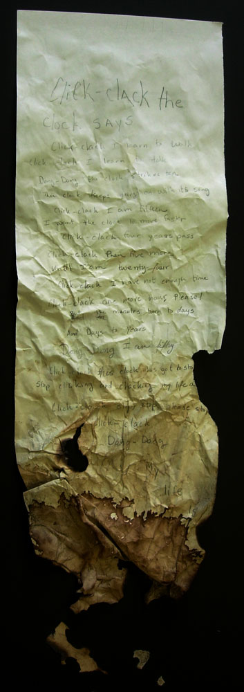
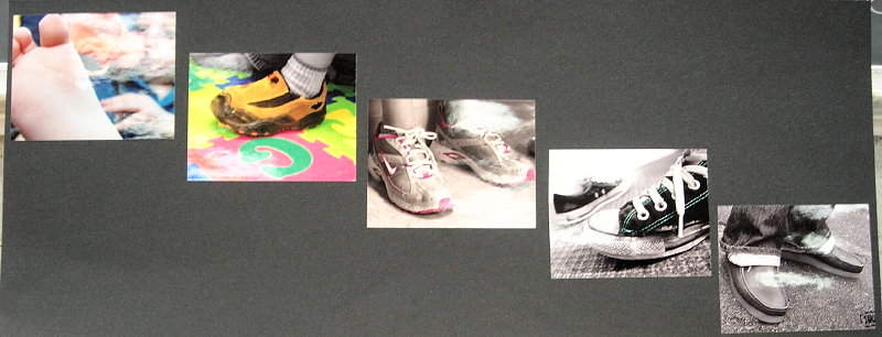
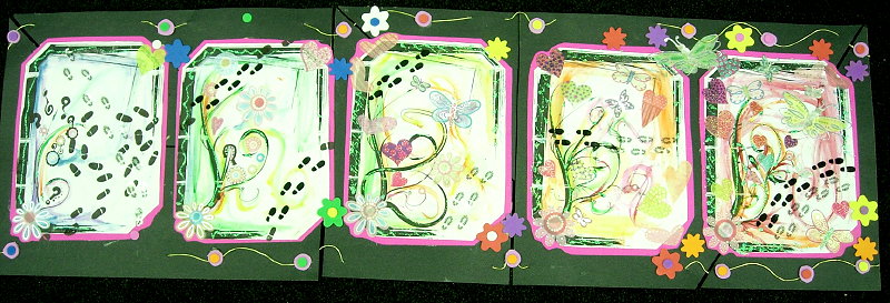
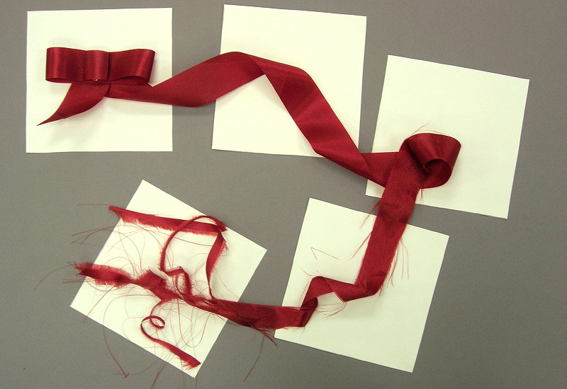
Examples

 Some more examples


Glossary | Order-Disorder Series | Series 1 | Series 2


Greg Clayton
Design Foundations I
Design Foundations II

Senior Seminar

 
Photography Course
 
Course Schedule
Course Schedule
 
Independent Study
 
               © 2019 Greg Clayton/ gclayton@harding.edu