Nature Color Studies Color Studies
(6) from nature
~5"x7" or larger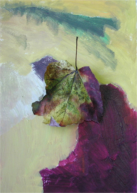

Proportion Studies
(2 sets of 6) based on any two of the Color Studies, above.
~3"x 3" or larger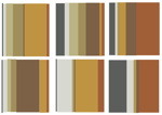
Organize and mount color studies and proportion studies on backing boards for presentation. Complete Crit Sheet and Charting of Color Studies and turn in with your color plates.
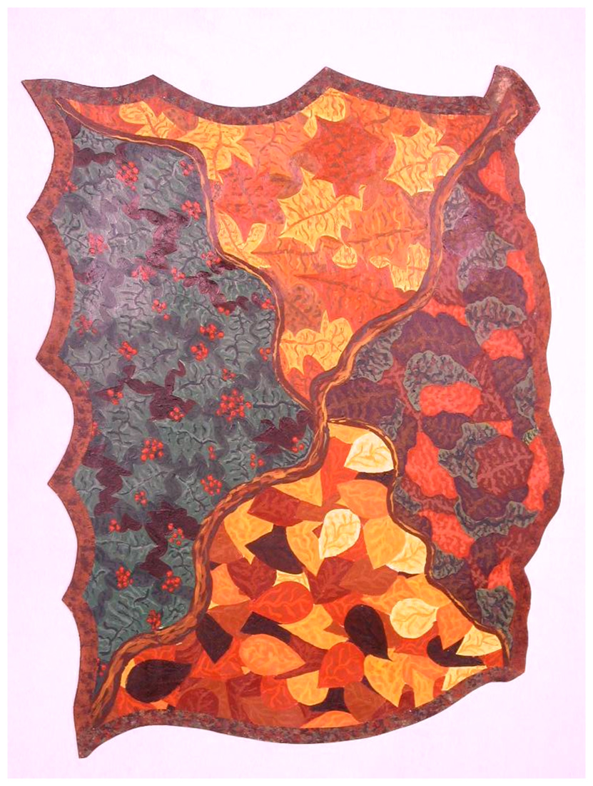
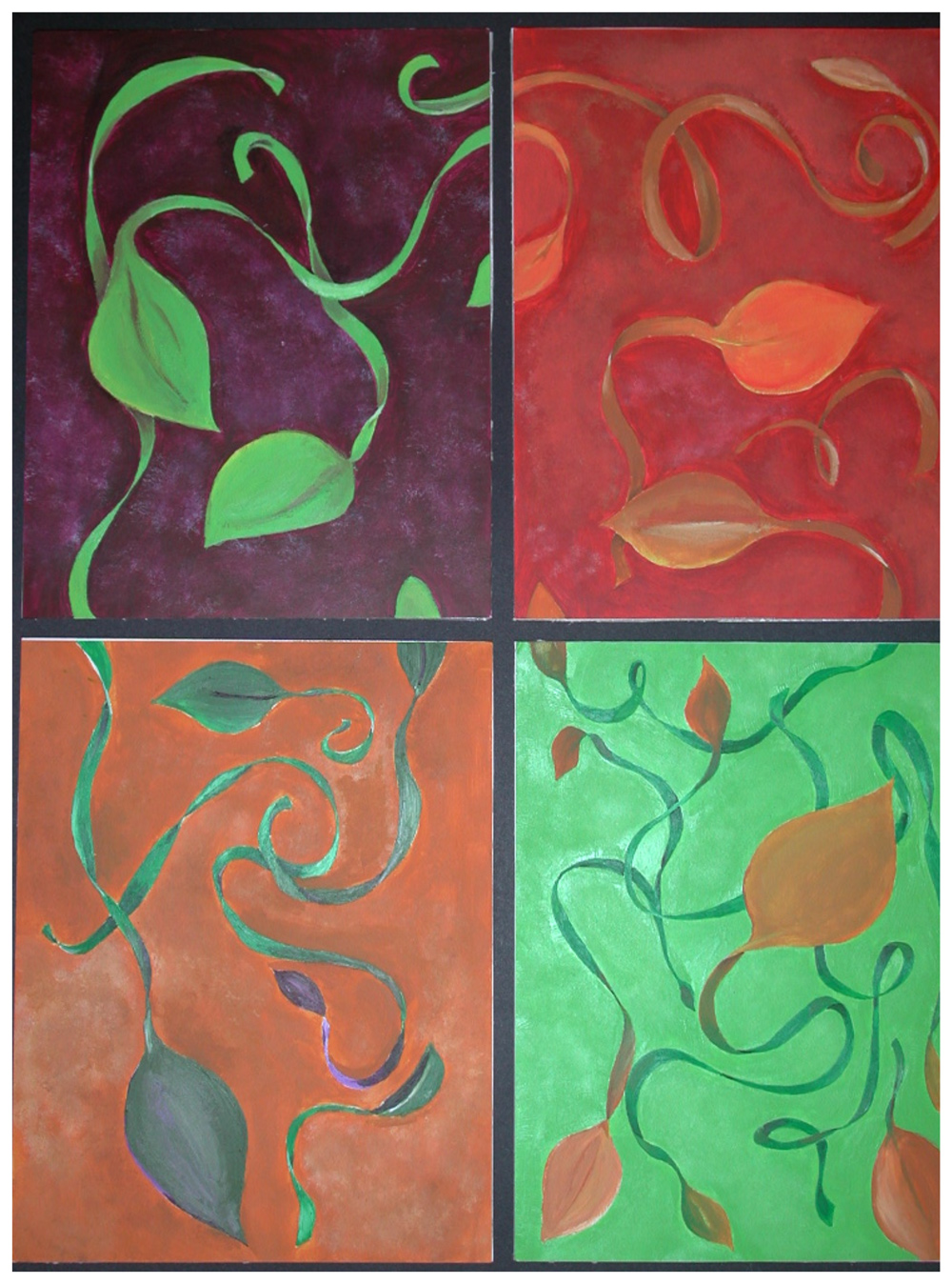
4-Scheme Design Create an "expanded palette" based on any one of your Nature Color Study palettes Create 4 related palettes derived from your expanded palette. Develop 4 related designs using those 4 related palettes (OR, create one large artwork that has 4 separate color regions — each with its own scheme.) (samples) Mount & present work. Complete Crit & Charting Sheet.

Color Studies (6)
Color Studies: complete six Color Studies & 2 sets of Proportion Studies of color harmonies from nature.
Begin by finding your own examples of color in nature.
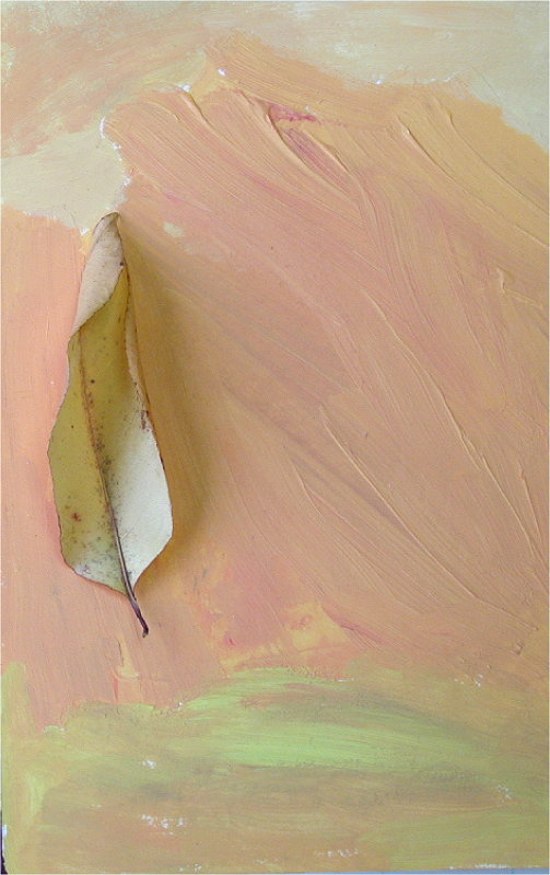
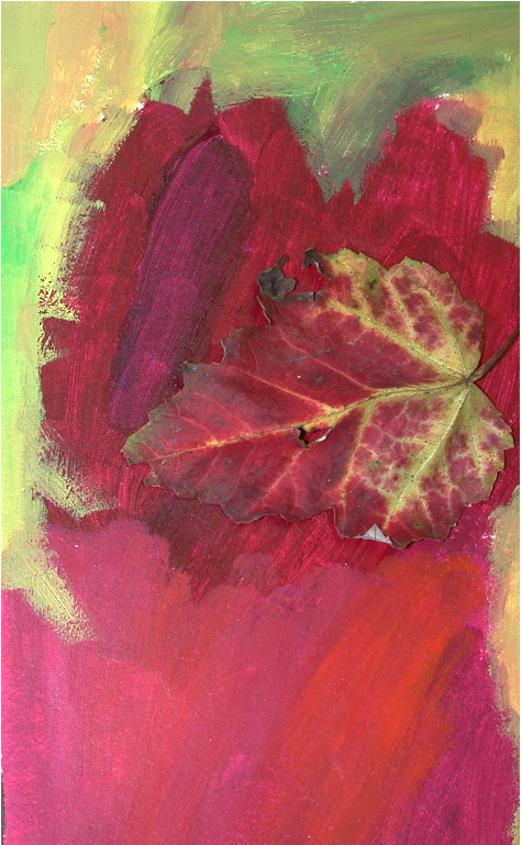
Find Color Subjects in Nature: Find a subject in nature whose color is impressive, evokative or interesting to you.
(Subjects can be most anything whose color attracts and holds your eye: leaves, blossoms, folliage, sunsets, etc.) Search for a wide variety of color and distinctive harmony, look especially for brilliant or unusual color. Look for leaves, blossoms, or settings that have a distinctive range of hues.
Do not plan the color schemes of your initial color studies—just observe and capture nature.Let's just let nature teach us what successful color combinations and arrangements can be.
Painting the color study:
Work to accurately capture the colors of nature.
You do not need to paint an illustration or even an approximate likeness of your subject, In fact, its best if you simply paint an abstract arrangement of the colors you see. In effect, study and capture the color, but ignore the identity of your subject.Look closely for subtle colors and transitions between colors -- look for the colors that bridge, or connect, one color area to a neighboring area of color.
Look especially for the broad range of colors present – (min. 7 colors; each color study should be 1/2 plate or larger )
Match color proportions and color juxtapositions in your studies.
Look carefully at how much of each color is present in your subject -- get the color proportions of your painted study to match the proportions of the colors in your natural subject.
Also, pay close attention to which colors lie next to each other in your subject. The arrangement of color with respect to color is important. So, the juxtapositions of color in your painted study, should be similiar to the juxtapositions of color in your natural subject.Create an abstract color composition/design while giving attention to composition — treat each study as a small, abstract design with a major focal area, and minor areas of interest.
Develop focal and relief areas.
Develop a pleasing balance and tension in the composition.
Paint a small (approx. 4"x7" or larger) study of the colors present in your subject(s).
Paint from life when possible -- collects samples and reference photoes:
When possible, collect samples from nature to take back to your dorm or studio, or paint plein aire. You may also begin painting on site, then take documentary photos. Thus, if possible, work directly from nature — paint while observing your subject. Find your subject and paint your studies quickly – nature changes color quickly. Get a good photo of your subject (while the color is still vibrant.). Take photos of your subject in natural light so that the color is true to the local color.
Goal for each color study:
— Match the individual colors that are present in nature. (accurately recreate the palette of colors you see in nature. Aim for 7+ colors. )
— Match the proportions of the colors present in nature. (accurately match the amounts of each color)
— Use similar juxtapositions of color to those present in nature. (juxtapose colors in your design as the colors were juxtaposed in nature.)
— Mass the color: develop broad areas of roughly constant color so that each of the colors in your study has a distinct presence. In effect, feel free to simplify the distribution of colors.
— Compose Your Design: Build focal and relief areas. Balance composition with interesting tensions. Build unity with some traits of shape or line or texture.
Scan or photograph each study.
see examples, below
Proportion Studies (2 sets of 6 variations)
— Select any two of your color studies (above).
Each of the studies needs to have 7 or more colors (7 colors, not necessarily 6 hues).— You will prepare proportion studies for both of those two color studies.
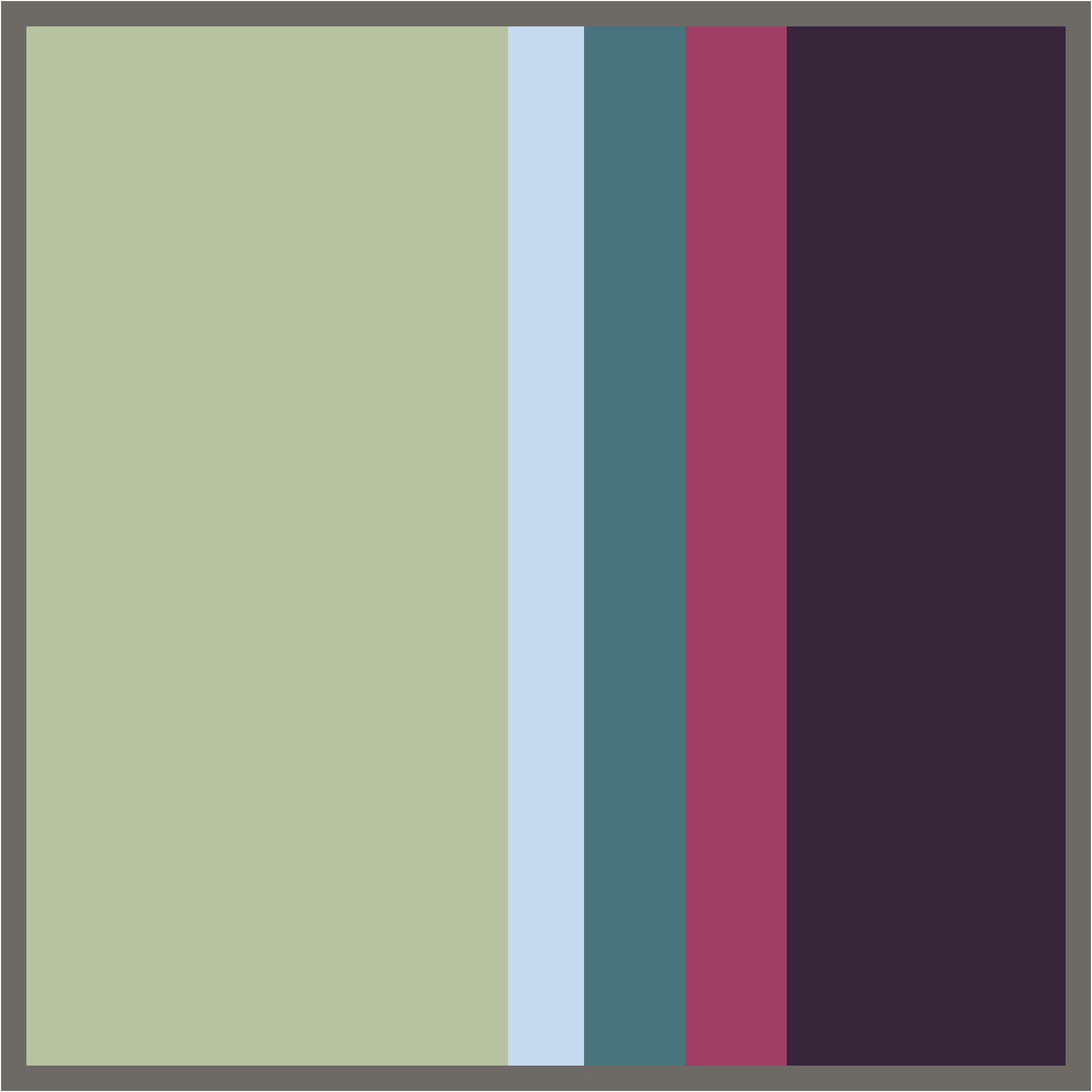
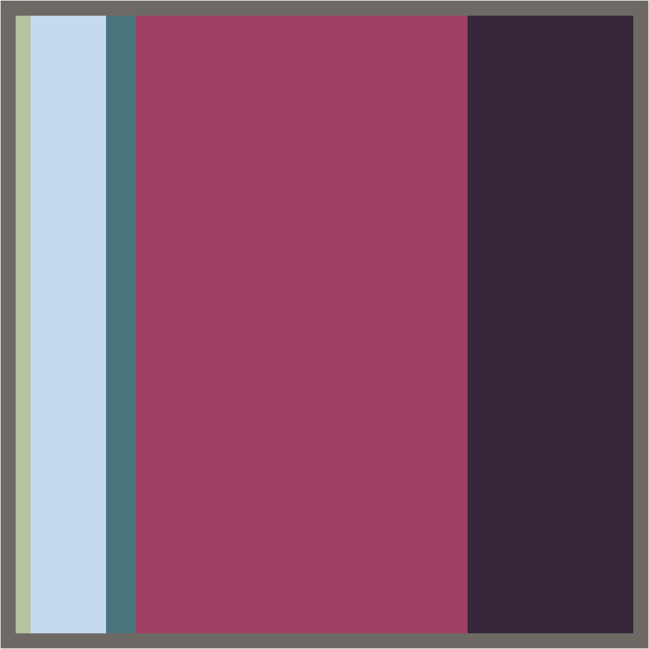
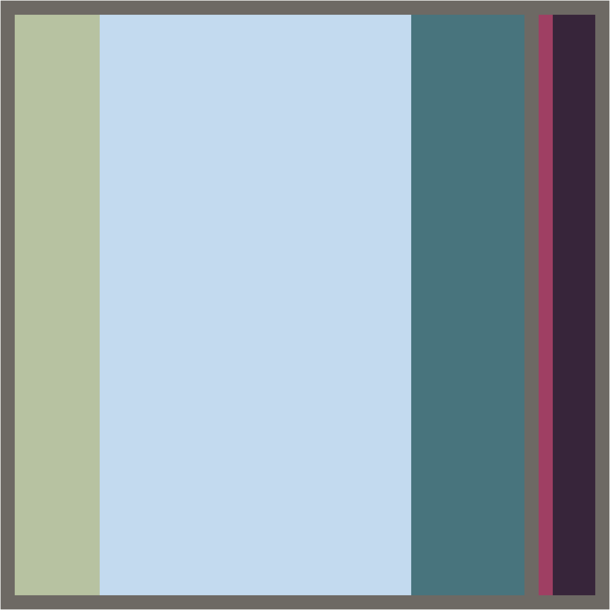
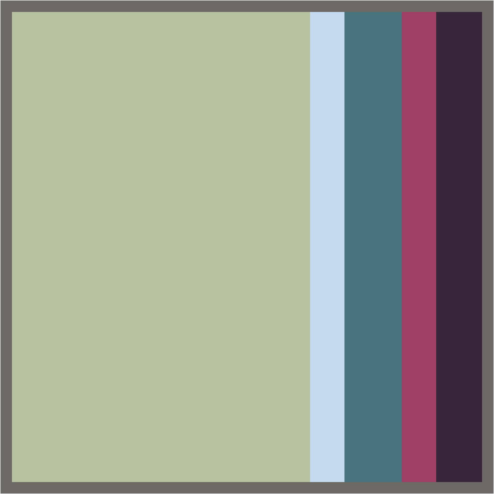
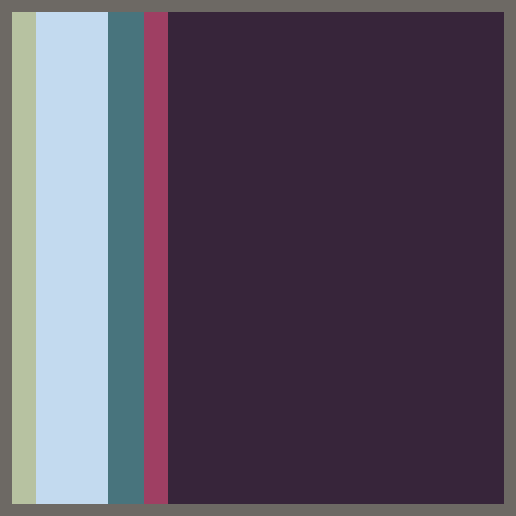
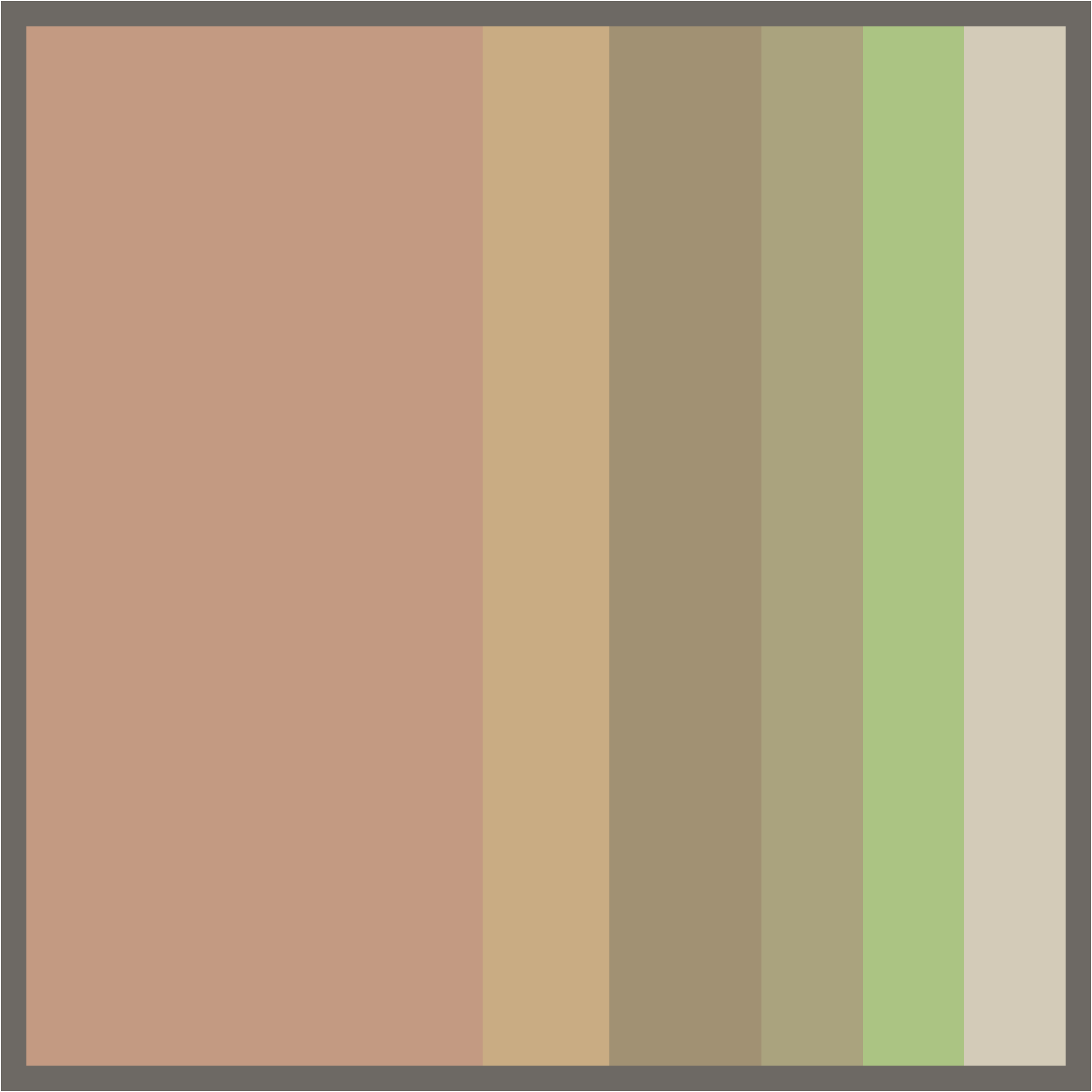
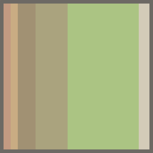
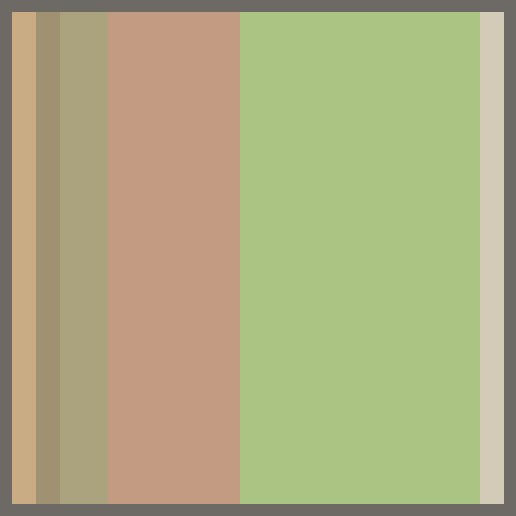
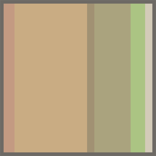
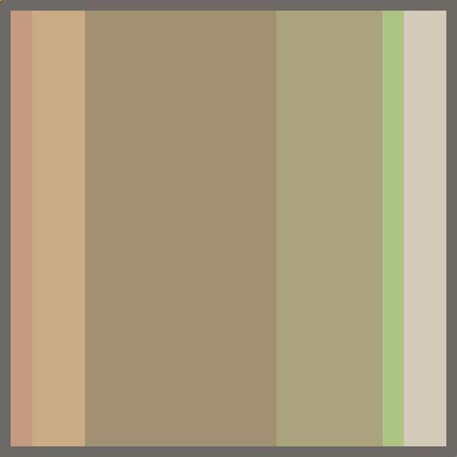
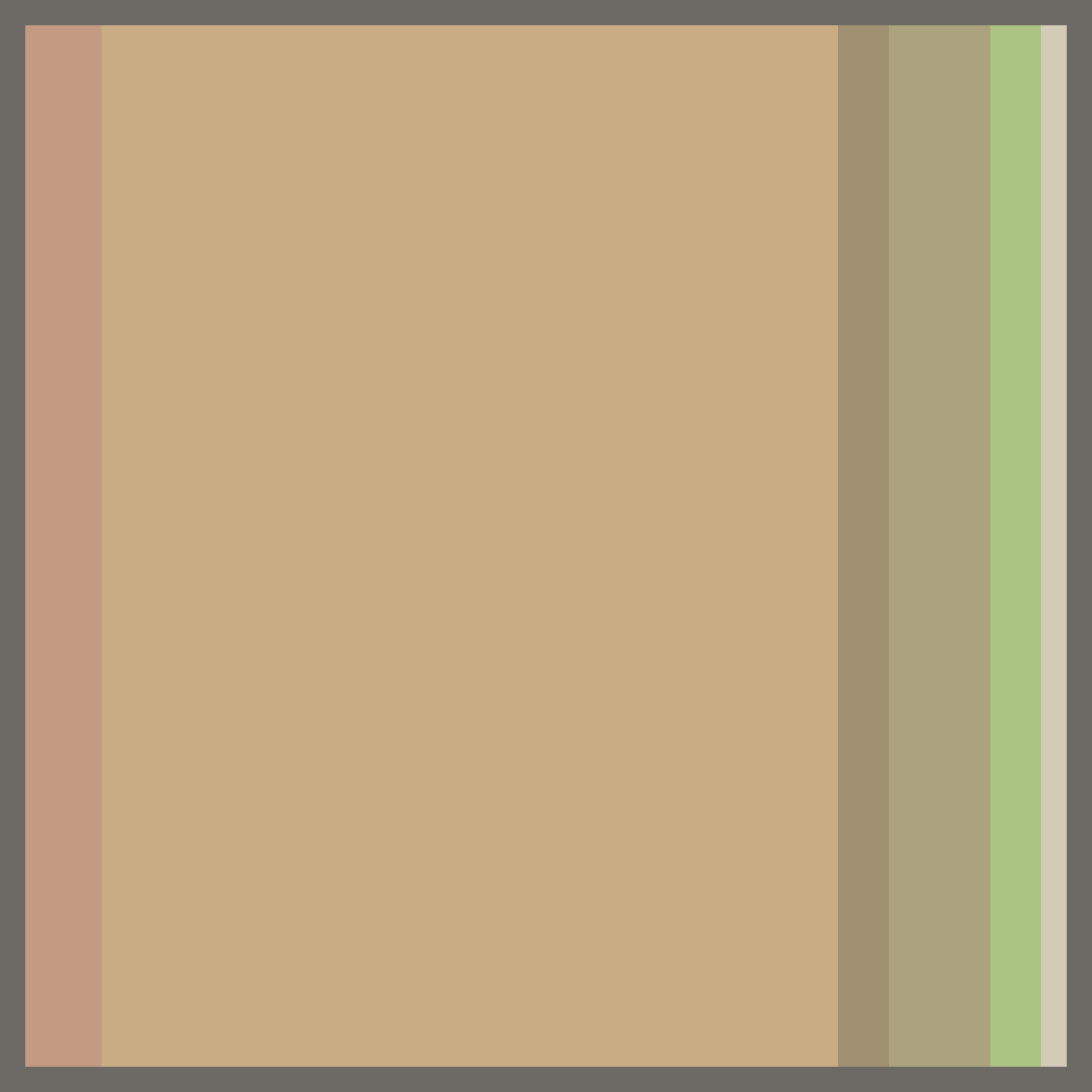
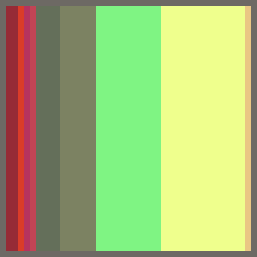
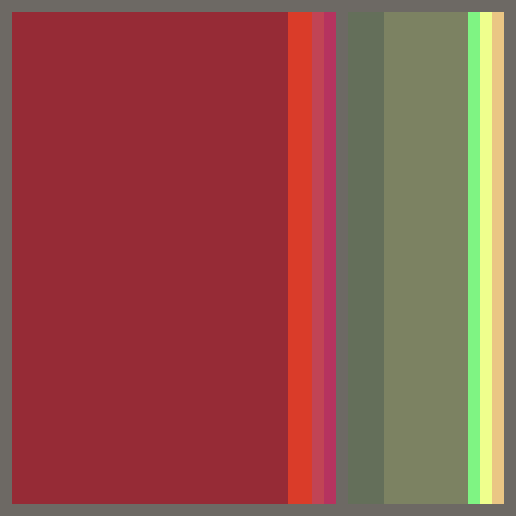
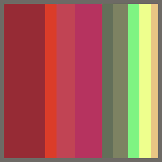
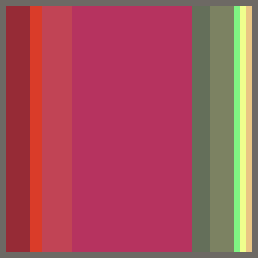
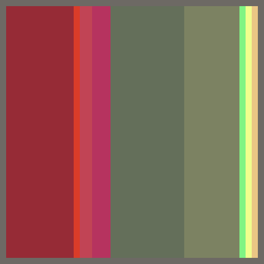
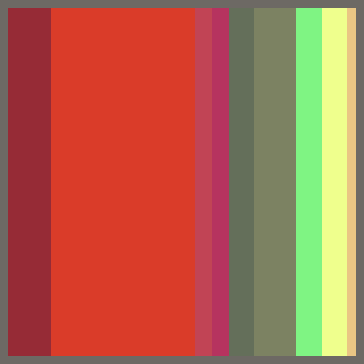
Create a small (3"x3" minimum) proportion study. The study should have swatches of all major colors in your color scheme.
The size of the swatches should reflect the proportion or prominence of that color in the scheme.
— Then you will prepare 5 variations on each of those 2 proportion studies, presenting at total of six different schemes based on each palette of colors. (note that "schemes", as I'm using the term, includes the issue of proportions, or amounts, of each color. A "palette", on the other hand, is simply a set of colors. A "proportion study", thus, represents a distinct color scheme .
So, for each of your two color studies, you'll create 5 original proportion studies.
Each proportion study will have all of the major colors present in the original color study.
But, you will now vary the proportions/amounts of each color so as to create a new scheme with new dominances.
— mount the proportion studies.
Include all six related color studies.
Place the original study (based on nature) in the upper left.
Mount on a neutral board with adequate margin for viewing.
Label your work the back, identifying yourself the and the project.
two sets of six color proportion studies.
Alternate Methods:
a) paint six separate proportion studies.
b) paint large swatches of each color. Overlap them to cover most of the swatch. Then photograph or scan the proportion study.
c) scan your color study. Edit/adjust for best color match. Use Illustrator or Powerpoint to create your studies (use the eye-dropper tool for easy color matches.)
d) Use a computer graphics program such as Adobe Illustrator or Photoshop to mix your colors and lay out your proportion study. You are responsible for producing good, matching color in your printed samples.see examples, below
4-Scheme Final Designs (4+)
Plan a larger scale, developed response to the color palettes from nature.
You will either:
a) create 4+ variations on a single design, each variation having its own color scheme or
b) you will create a single design/composition with four different regions — each region having its own color scheme.
(examples)You may propose any medium that allows you adequate control and range of color and form. Present your sketches and concept to the instructor for discussion and approval. Consider designs appropriate to your field of study.
Color Schemes: Develop four+ color designs whose color schemes are extended from your nature color studies.
All schemes are to be well-related to each other in order to build strong harmony.
Start with a "super palette" of colors. This is, in our assignments, most often based on an expanded palette of one of your Nature Color Studies. Such a "super palette" often offers far too many colors for most designs. Thus, you'll be able to select "sub palettes" of well-related but distinctive colors from the super palette. (see the section on "Selecting sub-palettes..." on this page)Your color schemes should not be too simple. Be sure that each sub palette has at least 6 colors in it. (note: 6+ colors are needed --- not 6+ hues)
If your designs really benefit from a smaller palette, you may offset that by creating additional color designs. For instance, it is not unusual for a package design to need only 3 or 4 colors. In such a case, the designer might provide 8 package design variations rather than 4. If you are designing your package or layout in Illustrator, switching color schemes is pretty easy -- so do take advantage of your software.
Hue Schemes (hue structure) should vary.
For instance, you might create...
a) 2 designs, one based on a 3-hue and another in a 5-hue adjacent scheme and
b) 2 more designs might be based on some form of complementary scheme.
Other hue scheme combinations are allowed, but the goal is to vary your approaches to hue relationship within your schemes..Minimum size: 8x10 each — larger is often better, and sometimes easier.
Color sketches and prepatory charting for final designs (3 sets)
Develop your final designs methodically. Explore how you will use your colors, and how the colors will be selected and refined. Develop your compositions by creating and observing sketches and color studies of your design — in short, develop your final design rather than jumping into it.
You will be working with dominance- and relationship-based scheme planning.
- Make preparatory studies for your designs as you plan your final color schemes. Look for other shades and tones of your hues that might be introduced – look especially for light and shadow colors that would add more variety and depth to your study.
Plan schemes with attention to a) value, hue and chroma dominances. And b) color relationships among each of the hues using similar value and chroma.
Your designs do not have to be realistic nature scenes, though they may be. You may compose purely abstract color compositions. Develop designs appropriate to your field. Note: Interior designer may replace one color design/rendering with a swatchboard.- Make proportion studies of each of the designs/regions. (5” square+)
- Mount and present final design for portfolio or for display. Make digital photos/scans of all. Prepare color charts for each final design.