Color Scheme Planning: Expanding the Palette

Art 2600 / Greg Clayton

Goal:  Develop a broad palette of well-related color  by exanding an existing palette.


Intro

Our initial experience with Palette Expansion involves observing a color scheme from Nature, but our start could be any other color source or color concept. 
Then we extend the set of colors — the palette — based on those initial colors.


The fact is, most any set of colors that work well together can be expanded into a much broader palette that offer more diverse, but still well-related colors. 
We'll simply reuse color traits -- hue, value and chroma.


Here are steps that can lead you from a simple color concept to a more fully developed palette of well-related colors:

Find or create your source color scheme — this might be a study from nature, another color composition you admire, or any basic set of colors that you feel work well. You are aiming to take a very simple palette of harmonious colors, and expand them in to a broad palette of well-related colors.

Chart your source colors in the usual way. This is the beginning of your palette... we'll build on this by adding visually-related colors to the palette.

Look for simplifications that maintain the essence of the scheme.
For instance, if I have greens at value 4 and blues at value 5, I might treat both as value 4.5.
I want to reuse traits, rather than having many many similar but separate traits.

Identify "gaps" or missing traits and add these to your chart.
— are there values used for one hue, but not for others. Apply that value to all hues. Reuse your values.
— are there chromas used for one hue, but not for others. Apply that chroma to all hues. Reuse your chromas.
(in short, reuse all values and all chromas for all hues -- recycle!)
— Is the range of value, or the range of chroma complete. Should I use some severe light values (val 7 or 8) or severe low values (2 or 3) so that I have more means for building contrast into my composition? This, of course, depends on the expressive and compositional goals for your work.
— Are any other hues needed. This is, again, artist/designer's choice. Would a stronger warm-cool contrast help create dynamism that I want? Would more subtle variants (analogous hues) make a more gentle and gradual composition possible?

Simplify? Consider whether you've gotten the color palette too diverse.
This is an artist/designer choice -- not a rule. You can simplify by eliminating traits (e.g. delete a hue, a chroma or a value) You can also simply by bracketing or grouping your hues, values or chromas. (e.g. if you're using values 2,3, 5,6 & 9, might you simplify to values 2, 5 & 9? ) (e.g. if you're using RRV, RV, and VRV, might you simplify to just RV? )
Simplify your scheme as needed -- erase unneeded traits to unify the scheme.

Eliminate colors that are impossible due to intrinsic value issues.

Build your full expanded palette.
Assess the hue, value and chroma of all of the colors in the palette.
Ideally, mix samples so you can make adjustments to color traits visually and intuitively.

If you are building several related designs, rather than a single composition, start to separate plausible sub-palettes from the expanded palette.


Here is a worksheet for expanding a palette
This worksheet includes charts for 4 schemes derived from the expanded palette.


An Example: Nature Study to Broad Palette

Select a Source Color Palette:
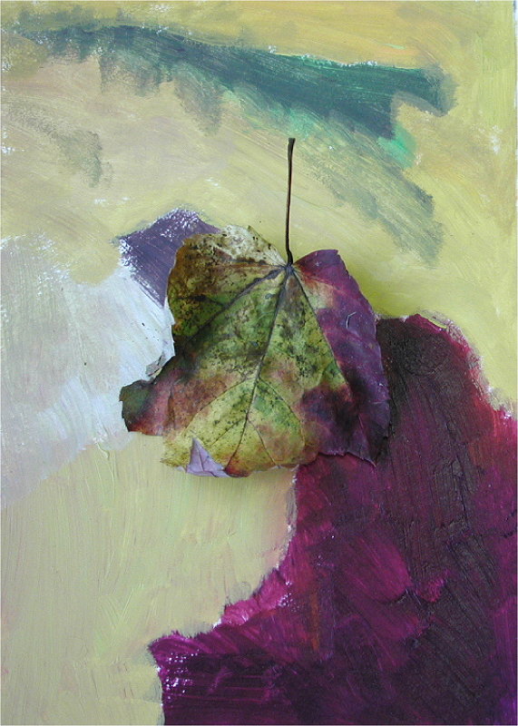
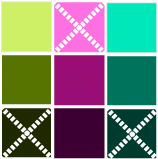
This is a color study based on the autumn leaf that is included in the photo. The leaf has already lost some of its color.

This color study from nature offers an interesting scheme that doesn't quite fit a standard structured scheme, but is comfortably close to a split complement scheme.

However, we'd like more colors based on this scheme to design with. So, we will "expand the palette" in such a way that we identify other colors that are related to these initial colors. The result is an "expanded palette" that includes "well related colors" — colors that are visually unified by varied combinations of similar hue, similar value and/or similar chroma.

If you are familiar with the color charting techniques we've used, expanding a palette is simply an extension of that process.

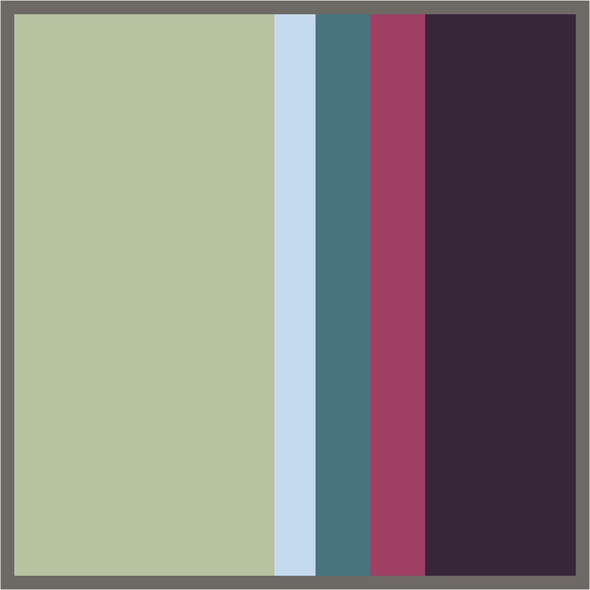
This proportion study breaks the prior nature color study down into only 5 colors — which is a bit sparse given some subtle colors present in the leaf, but is an adequate simplification.


So, this has the same colors and color proportions as the prior painting.  We've simplified the colors, and have eliminated the design/composition, but have preserved the key color traits.   


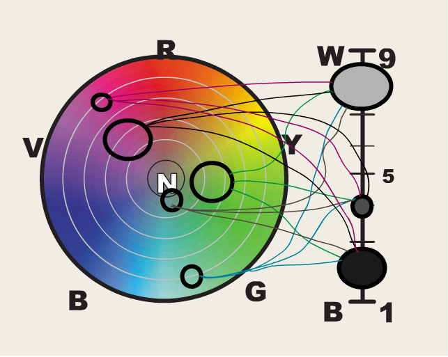
This is the basic charting of the color scheme from nature.

The colors that are included in the proportion study, above, are charted here.

Here we're doing exactly what we've been doing throughout the course — charting what we see   

Nothing new so far.


Here we've "expanded the scheme" simply by reusing existing chromas and values for the current hues.

All we've done is to connect every Hue-Chroma circle on the color wheel, to every value circle on the value staff.

Recall that each line/connection is a distinct color, so we've now got 15 colors rather than our original 5.
Thus, we've begun to expand the palette.

(5 hue-chroma circles connect to 3 value circles ...
5x3=15 total colors )

The real expansion comes next....


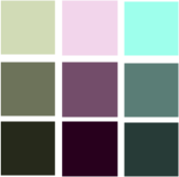
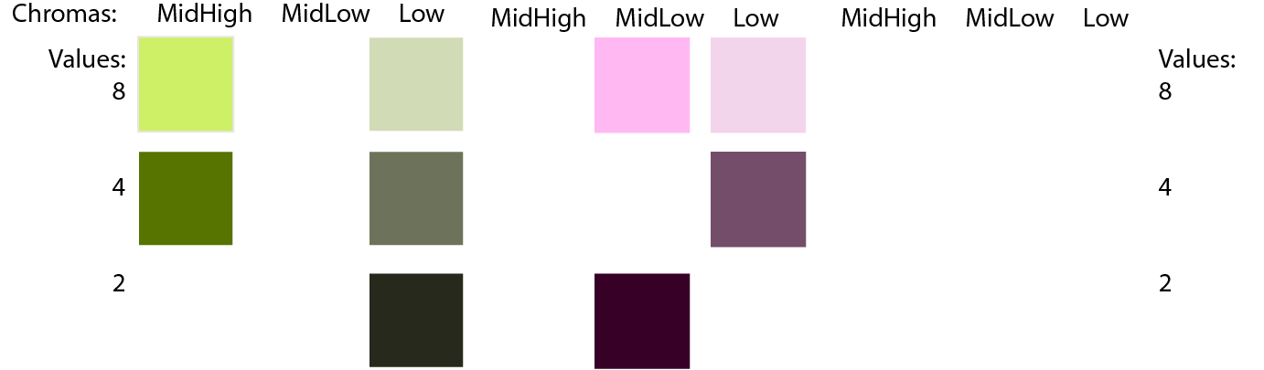
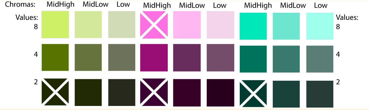
Here we expand the palette of chromas so that each hue in the original scheme is now present at each chroma used in the original scheme.

Mid-High Chroma was used for one hue (Red-Violet)(a), but we will now  also use MH Chroma for Blue-Green(b) and for YYellowGreen(c).

Low Chroma was used for Blue-Green(d).  We'll now  also use it for each of the other hues (e & f).

And Mid-Low Chroma was used for Red-Violet(g) and Yellow-Gree(h),but we add ML to Blue-Green as well (i).

So we're not really adding new traits to the color scheme, we're just reusing the traits that were already in the scheme. By so doing, we add more well-related colors to the palette.

To expand fully, we basically connect everything — connect the Hue-Chroma circles on the color wheel to the Value circles on the value staff. Recalling our basic charting, every connection consitutes a unique color.

The expanded palette adds color options to each hue in the scheme.

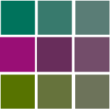
For instance, in the original palette, there were two Red-Violet colors (RV/2/ML , RV/4/MH).

Now there are potentially nine Red-Violet colors available. Some of these may be impossible due to intrinsic value issues, but several will be usable colors.

Now we have nine Hue-Chroma circle on the color wheel, and three value regions on the value staff. Thus we have 27 possible colors in this palette. ( 9 x 3 = 7)

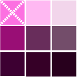
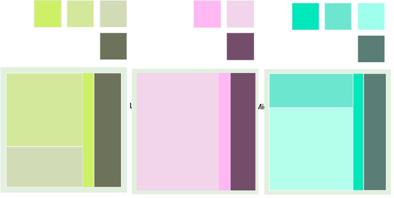
Here are the nine Blue-Green possibilities.

Most of these appear possible, except the MH chroma at value 2... (however, that may be possible with pigments, despite how poorly your RGB display presents it.)


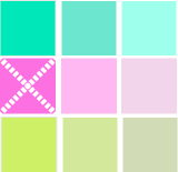
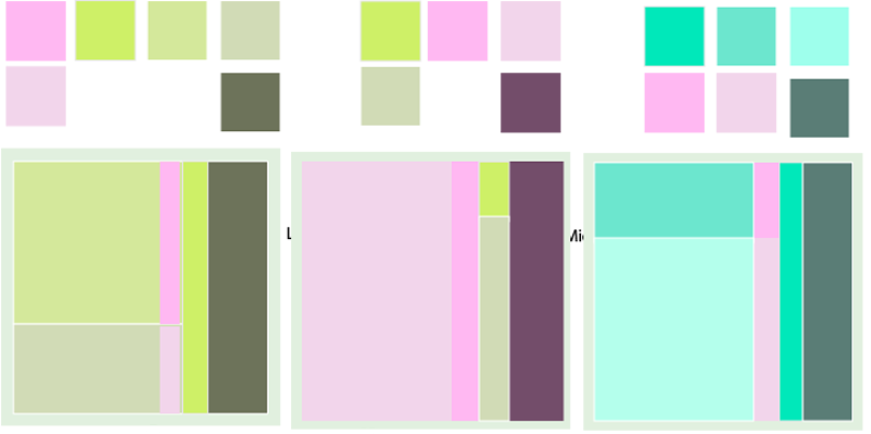
And there are nine Yellow-Green possibilities.
As with BG, the MHChroma, Val2 YG appears unlikely.


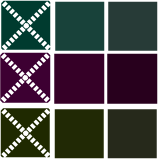
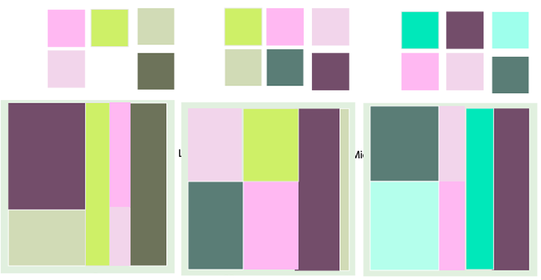
Below is the full expanded palette.

There are potentially 27 colors based on the five colors that we started with — we've expanded from five to 27 colors in our palette. (why 27? We identified 3 hues, 3 values and 3 chromas in our color study. 3x3x3=27)

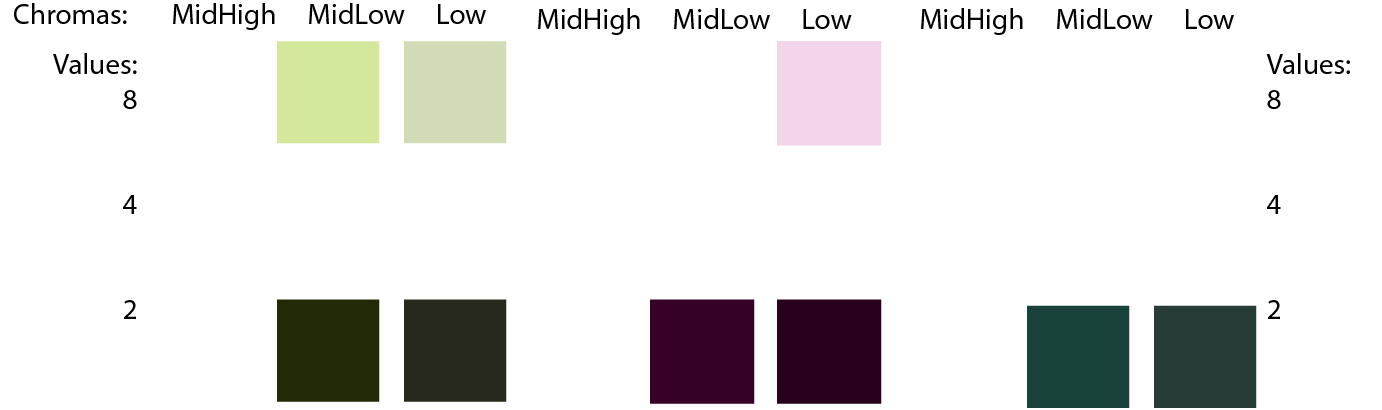
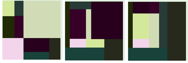
These colors are "well-related" in the sense that each color in the palette has several other colors that share visual traits. Some colors share a common hue. Other colors share a chroma. Still others share a common value. Thus there is a visual affinity or relatedness amongst the colors. A palette with well-related colors helps a designer build unity in the final composition. Variety or contrast is developed by selecting distinctive individual traits — several values, chromas or hues that are different enough to offer appropriate contrast.

Relationships Amongst Colors

So how are the colors related? What does that actually mean in practice?

In this palette there are 3 groups of nine colors that share a common hue.
Then there are 3 groups of nine colors of the same value.
Then there are 3 groups of nine colors that have the same chroma.
These groupings, then, present the ways that the colors in the palette are related -- we we what the colors have in common. As color designers, we count on the viewer to respond to relatedness amongst the forms in our compositions.

Note that the "X" colors are likely too high in chroma for the intrinsic value of the hue. In practice, our extended palette will lose colors that we can describe or specify, but not actually create.

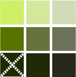
These nine colors, below, from the exanded palette have the same hue — a monochromatic Yellow-Green.
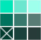
The colors vary in value and in chroma.

These nine color from the expanded palette also share a single hue — Blue-Green.

And these nine colors share a Red-Violet hue.

These nine colors, below, vary in hue — all three hues are present. However, they all share (roughly) the same value. These nine colors share a value of about 4 on a Munsell value scale. These nine colors are visually related by a common value of about 2 on a Munsell scale.
These nine colors, below, are related by a common Middle-High Chroma — roughly 9 on a Munsell chroma scale. These nine color colors share a Middle-Low Chroma — roughly 5 on a Munsell chroma scale. These colors are related by a Low Chroma — roughly 2 on a Munsell chroma scale.

Selecting (Sub-)palettes from the broad, expanded palette

The expanded palette, above, has far too many colors to use in most designs. Usually we will select a subset of these colors.
There are many "sub-palettes" that can be taken from this set of broad palette. For your Nature Study 4-scheme design, you will "extract" 4 different simpler schemes from this single elaborate scheme and palette.

Why would I create sub-palettes?

Selecting sub-palettes is especially useful in situations in which you want to produce several color schemes that...

a) are unique and distinctive
but
b) are related and so work well as a whole.

This might occur if you are a painter or printmaker and you want to produce a series of images. You want each image to have its own character, and you would like to use color harmony as a means of expressing those varied characters. At the same time, each image in the series needs to have an affinity -- some kind of similarity -- to the other designs in the series.
This sub-palette tactic is a useful method in such situations.

If you are an interior designer and your project involves several rooms in the same space -- whether a home or a commercial setting. Usually you don't want identical color schemes throughout the space -- that would be too monotonous and would become old rather quickly for the occupants. On the other hand, you need for all of the spaces to feel as though they are a part of the whole -- each space belongs with the rest.
This sub-palette tactic is useful in developing distinctive but harmonious schemes for each space in the project.

How do I select sub-palettes?

In many cases, there are many, many possible sub-palettes.
Your task is to develop schemes that fit your expressive intent.
Begin by getting to know the expressive intent of your design — explore your content concept and graphic concept to lead toward appropriate color traits for your schemes.

Do you want bold contrasts?
...via severe value contrast?
...or complementary hue contrast?
...or just dominating high chroma for bold impact?
...or two or three competing hues in roughly similar proportions (no clear dominant hue)

Do you want subdued contrasts?
...via soft value contrasts? (select colors whose values are similar.)

Do you want an extreme dominant value?
...mostly white or near-white, airy, light values?
...mostly dark values?

Do you want a prominent dominating hue throughout?

These sorts of questions lead you toward sets of colors selected from your "super palette" -- from your extended palette.

Some sample sub-palettes


The palette below uses mainly dark, Value 2 colors, with a few light, Value 8 colors.


Note that the palette, above is not yet a "scheme" --- a scheme includes decisions about proportions. You have to first decide which hue is dominant, which value is dominant and which chroma is dominant, etc.


Below are proportion studies of three different schemes that can be created using the palette above.

Notice that palette is the same in each of the schemes below — the colors are the same in each sample below.
The color scheme is create only when the proportions of those colors are chosen.

In the scheme on the left, Lighter values are somehat dominant.
In the middle scheme, darker values dominate, and Red-Violet is more prominent.
In the right scheme, dark values dominate, and greens dominate the hues.

Thus, we have three different color schemes based on only one color palette.


The next Palette, below, uses higher chroma, high value colors. Only two near-complementary hues are used.
Note that the choice of which color traits to use is a designer's choice -- there are no absolute rules here.

As a designer I may want to keep chroma low and vibrance subdued -- so I might not use the higher chroma colors.(as above)

I may want bold contrasts, and so I eliminate the moderating middle value colors and keep only the lightest and darkest values. (as above)


You can thus select a wide variety of palettes — drawn from a single extended palette — according to the amount of contrast or similarity you want for your specific design. You can go for boldness and drama, or you can go for subtlety and control. Your choice.

Here the design choice was to eliminate one of the hues and thus create a simpler complementary scheme.


The three sub-palettes below are each monochromatic, with high-value dominant, and mid-low chroma dominant.

Scheme contrast is generated with strong dark value contrasting the dominanting light value, and...
Strong chroma accects offsetting the dominating lower chromas.


Below are three more schemes based on our expanded "super palette."

All of the colors chosen are the same as in the three palettes above, except that they are combined differently here.

Here we create three different near-complementary schemes.


Below are three more sub-palettes and schemes based on the colors in the palettes above, and thus colors in our expanded "super-palette."

Here the dynamism is turned up — there is a more balanced presence of the near-complementary hues.
The moderating mid-tones have been removed — only light valued colors and dark values are now used. Thus the tonal dynamic range feels wider and edge-contrasts are more prevalent.

Note that, in the proportion studies, the colors have been arranged for strong contrasts — colors of opposing values are set next to each other, and colors of opposing hues are juxtaposed. Thus, that other essential factor in color harmony is intentionally manipulated for effect — color juxtaposition.


Articles and Links

Glossary | Color Theory Assignments | Course Schedule |


Greg Clayton
Design Foundations I
Design Foundations II

Senior Seminar

 
Photography Course
 
Course Schedule
Course Schedule
 
Independent Study
 
               © 2019 Greg Clayton/ gclayton@harding.edu