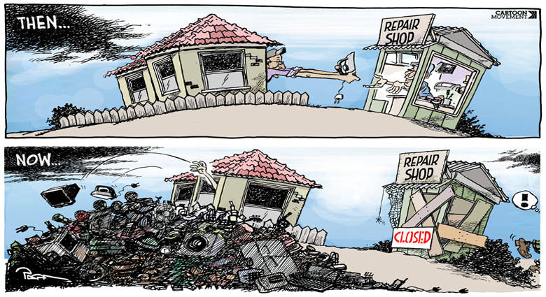
Art 1600 / Greg Clayton
Make an Impact
Your job is to make us aware of our own consumerism.
Make us aware of our role as stewards of the environment (and stewards of our own local environment -- Harding's campus)
Make us aware of the value of what we discard every day.
Whatever your view is of American materialism and our impact on creation, make your statement.
[note: you may propose other content -- your project may deal with concepts other than consumerism and recycling.
If so interested, write out a Content Concept and a Response Concept that declares what you will propose working towards.]
Response Concept:
What change would you like to introduce into Harding campus life?
What attitudes might you influence?
What outlooks or perceptions might you alter?
What actions or behaviors might you influence?
What motes and beams might you dislodge?Content Concept:
What message do you want to get across?
What would you like us to become aware of that we tend to overlook, ignore, or rationalize away?
What argument would you make?
What evidence might you offer... or help us not ignore?
Goals
Concieve, propose and present an outdoor sculpture, mural, relief sculpture or other permanent creation for Harding’s campus that reflects Harding student passion for environmental stewardship.
Raise and sustain awareness of environmental responsibility through a prominent creation made predominantly of recycled and repurposed materials.
Message/Content:
Raise and sustain awareness of environmental and material stewardship.
Make it fun to do the right thing!
Locations:
Propose works to be affixed to, or in close proximity to the Stevens Art Center or the Olen Hendrix building.
Materials:
Made predominantly of recycled and repurposed materials.
Use sustainable or renewable materials for the rest.
Materials are to be durable over time outdoors.
Size:
Size of the proposed concept is not limited, but feasibility of construction, installation, safety and long term maintenance will be considerations in the selection and approval of proposals.
Create works that will be large enough and prominent enough to be noticed on campus, but not intrusive to the character of campus architecture, landscaping or traffic flow.
__________________________________________________________________________________
What have other artists done...
...when commenting on the environment?
Chakaia Booker,
Edward Burtynsky(TedTalk | Photos ),
18 Green Artists,
7 Environmental Artists,
9 Artists on Climate Change
5 Environmental Artists
10 Eco-Friendly Artists...when working with recycled and repurposed materials?
tires, cans, bottles, paper, cardboard, wood (most of these involve craftsy use of castoff materials. )
Ideas come from information and understanding -- the deeper you understand a situation, the more ideas you'll get.
There are a lot of people paying attention to and thinking hard about issues related to recycling.
Take time to search and read until you have discovered at least 7 things you didn't know about the situation.
Dig for insights and ideas that give you an "aha! ... I didn't know that!" moment.
Whatever impresses you, may well be useful in impacting others.
There are plenty of topics you can search on and learn from:
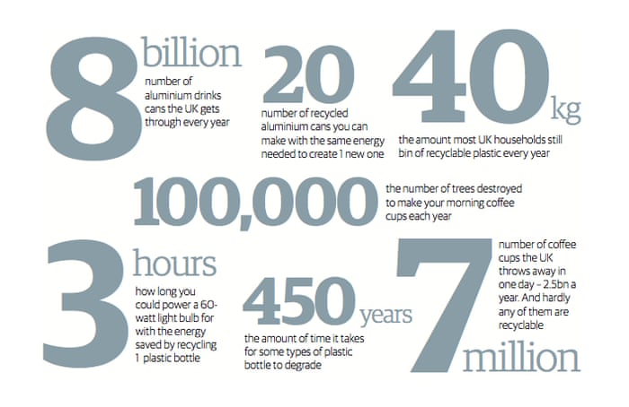
Nature, ecology, consumerism, waste, stewardship, pollution, global warming, landfills, environmentalism, monocultures, biodiversity, sustainability, deforestation...This UK/Guardian article highlights how western culture's habits (and packaging) have impacted shores far from home.
Included are links to sites, organizations and studies that work to address the problem -- explore this for ideas beyond what you think you know.Why isn't more waste recycled? Interview with the CEO of TerraCycle.
"America's recycling is actually declining."The Reign of Recycling NYTimes
"...virtually all the greenhouse benefits — more than 90 percent — come from just a few materials: paper, cardboard and metals like the aluminum in soda cans. That’s because recycling one ton of metal or paper saves about three tons of carbon dioxide"Consumerism, Mass Extinction and our Throwaway Society theArtOf.com
https://www.theartof.com/assets/images/articles/How-To-Manufacture-Desire-Web-Optimised-v2.PNGEffects of Consumerism globalIssues.org
"...our consumption patterns are so much a part of our lives that to change them would require a massive cultural overhaul, not to mention severe economic dislocation."
Be practical and accountable:
What can I do?
...not What can they do?(or Think Globally; Act Locally )
A Goal: Devise a distinctive graphic concept that can both unify your design, and express your content.
You may be tempted to focus on content and materials, but you must also think about form -- the aesthetic traits that will draw viewers and engage attention. Unity and variety, emphasis and relief are still very much at work.
So, what visual motifs might you design with? What traits will dominate -- line? shape? texture?
Model or Maquette (for presentation of your concept):
You may use actual recycled materials or found/scrap art materials (e.g. from our scrap bins/drawers or mat-cutting scraps)
You materials should be similar to those intended in your final design, but need not be the same materials.Final/Proposed Design (if your concept is constructed, what materials would you use?):
Made predominantly of recycled and repurposed materials.
Use sustainable or renewable materials for the rest.
Materials are to be durable over time outdoors
The model or maquette may be any size if you are presenting photos.
If you are presenting your model, 1'x1'x1' max. (about the size of a basketball.)
Presentation: 11"x17"
Format/features of submission:
- names and HU email addresses of designer.
- Sketch(es), photo(s) representing your design;
- likely dimensions;
- likely materials;
- location on campus (clearly describe or depict where this would be placed)- Artist statement: A description of how this work might encourage or affirm HU student commitment to recycling and/or environmental stewardship.
Focus on exactly what you’re trying to accomplish – what’s the point of this arrangement? What is your content concept -- your theme? How might simple forms express that feeling?
Study each design specification and visualize what it means graphically—sketch it out. These are simple designs, but problem-statements are specific.
Try several arrangements side-by-side so you can see what difference it makes – always give yourself visual options before deciding — let your eyes and your intuitions influence your choice.
Start in several directions... try different type of concept perspectives:
Content Concept: what is it that I really want to say? What is it that bugs me enough to say something? What are we overlooking that we need to be noticing? What habits do I have about what I buy and what I discard that I would like to break? How might I, by my everyday actions, make a difference?
Find what matters to you.
See where that leads.Impact Concept: How could I get others to notice what I have to say? What might I do to get others to think about what we usually ignore?
Graphic/Materials Concept: Since this is about discarded materials, start there. What materials do I send to land fills? What waste am I involved with?
What could be made out of the things that I find... cans, bottles, tires, paper, etc.?Response Concept: What do you want others to think, feel or do? If you could alter someone else's actions, what actions would you change? Do you want them to be more aware of what they ignore?
Just what is it you want out of your viewer?Try each of those.
At least one of them, if followed sincerely, will generate ideas worth following.
Dig in!
Do I have a clear set of unifyng traits?
(If I can't clearly and obviously see which traits are prominent, then I probably don't have a strong, well-established set of unifying elements.)Do I have a singe, prominent, dominant graphic element?
(there needs to be something — some kind of line, some shape, some pattern, some texture or some color — that just keeps reappearing in the design. If needed, go over-the-top.)
Mount designs on contrasting backing board.
Placement on the Backing Board:
Give more space around the outer border and on bottom margin.
This is a matter of visual balance. Extra space around a collection of elements helps "contain" or "frame" the design. Often this is helpful. On the other hand, when elements crowd the edges of a field, they can feel as though they are escaping -- pressuring the outer edges. This tension can be useful, but often it distracts from the design's content. When figures in a design overlap the edge of the field, there is a sense that the design goes on — those figures are either coming or going, extending the space of the design. This trait is either useful or distracting, depending on the content you're aiming to express.Use guidelines to help place your designs on the field. (use ruler and very light pencil marks to show you where to position elements.)
Glue securely.
Don't let elements buckle or peel away. Why? Because it distracts the viewer from whatever the design is doing.
Avoid glue stains. Experiment with your adhesives and your papers before gluing your final project down. Know how the glue interacts with the paper. Know how much glue to use — very often you can use very little and thus avoid glue stains or buckled paper.
Label each designwith neat, consistent and legible title. Design a label that informs but does not distract from the design.
[not required]
Personal Label . Design a small self-identifying label that is neat and legible. Include – “2D Design”, “Intro Order-Disorder 1 Design”, your name, and the date. [ H-number for IntDes students ]
Mount this on the BACK of the presentation board.
All labels should be consistent, sharp, and legible –not distracting.Give attention to general craftsmanship:
Details matter.
Avoid rough or ragged edges, cuts or tears.
Align and orient all features carefully.
Avoid glue stains or smears.
Erase pencil marks and other unneeded marks.
1st Day
— Assign and Discuss
2nd Day
— Sketches for three different concepts. Include any notes on materials, imagery or text.
3rd Day
— Concept presentation sketch of entire design.
— 1st and last design completed in final materials.The designs do not have to be mounted, but should be ready to set side-by-side for discussion.
Feel free to glue/tape your motifs down lightly — rather than permanently. That way any adjustments that become obvious during critique can be easily made.
Have materials on hand to work on designs 2, 3, 44th Day
— Have full design ready for critique.
Note that this is a critique day, not "final turn-in day." Your work is expected to be finished — to be as completed as you know how to make it. We'll critique and look for any changes or ideas that might enhance your design. Then you'll have until next class to complete it.5th Day
— Turn in.
Greg Clayton |
Design Foundations I |
Design Foundations II |
Senior Seminar |
|||||
Photography Course |
Course Schedule |
Course Schedule |
Independent Study |
|||||
© 2019 Greg Clayton/ gclayton@harding.edu |