Personal Preference Palette II

Art 260 / Greg Clayton

Explore varied schemes based on a single palette

Color Use by Professional Designers/Artists

Color Specifications

Color Designs

Scheme Variations by Dominances and Placement

This project involves fours stages:

1 — Create a design/painting using your preferred colors

2 — Find designs created by professional artists/designers that use a similar scheme

3 — Create sets of color specifications for your palette

4 — Create proportion studies that vary the impact of your palette

5 — Alternate designs

Required Components

Concept Statement

Painting, Rendering or Illustration
minimum size — 1' x 1' (or of similar area)
medium — acrylic paint, or any proposed and approved medium that offers a broad and controlled range of color. (alternatives: color pencil; designer markers; designer markers and colored pencil; CGI with color-matched prints )

Preparatory Color Sketches & Charting of Scheme

Color Specfications
Create a specification and swatch board using using any six of the listed color specification standards.
See notes, descriptions and links for Color Specifications.


[Described below, but NOT required for F09: Proportion Studies & Variations ]

Goals

      1. Explore your intuitive color sensibilties.
      2. Work with various color specification systems.
      3. Experience the range of harmonies possible with a single color palette.
      4. Distinguish between the concept of "color palette" and "color scheme."
      5. Explore proportion studies as a visual tool for exploring and representing color schemes.
      6. Develop your ability to specify or describe your colors.
      7. Refine your ability to control mixes of intended (target) colors.

Methods

Samples


Your Design, Your Palette

Objective: Create a small abstract design/painting using your preferred palette of colors.

The Design
You may devise an abstract color composition, an expressive self-portrait, or an interior.
Feel free to propose alternative formats to the instructor for consideration.


Theme/Concept: The Color That is Me.
This design is to express who you are, using color language as the means of expressing who you are.

Take time to explore which aspect of yourself that you want to express — develop a concept statement that articulates the particular you that are expressing. You might explore who you want to be or who you are becoming. You might explore who you once were. You might explore the varied personalities and attitudes that are you.

Design and Composition:
Develop a prominent focal area
How? Recall your basic compositions tactics for developing graphic emphasis.
Try: heightened value contrast, heightened hue juxtapositions, converging directional elements, location, heightened clarity of edge...

Develop at least a couple of minor focal areas.

Develop relief areas to support and complement your focal areas.
How? Recall basic composition tactics for relief — they're basically the opposite of emphasis.
Try: subdued value contrast, subdued contrast of hue, lower chroma colors, peripheral locations, softened/blurred/obsurred edges...

Consider a dominating shape type or a dominating line type.
Begin sketching with simple, similar, repeated shapes. Then vary those shapes to build more interest.
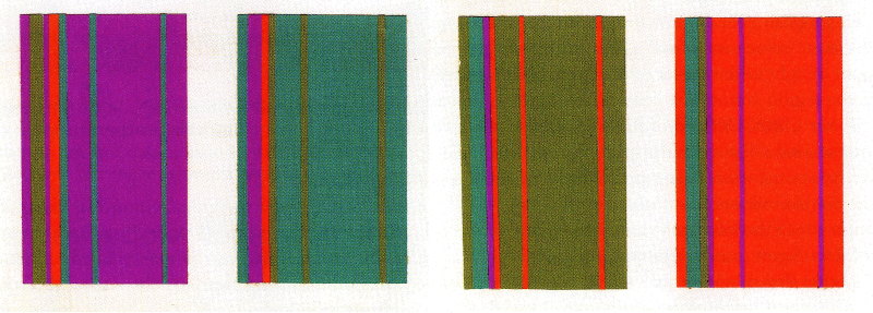
The Palette
Design a pleasing palette of seven or more colors. There really aren't many rules or suggestions for this color-selection other than you feeling that they work well together and you would like to try designing with them.

Recall that a "palette" here, is a "set of colors that work well together". Take time to relate these colors well, by hue, by value and by chroma — chart their relationships.

You MAY begin with your Personal Prefs I set, or you may invent an entirely new palette. Its your choice.

All colors should be mixed — no strait-out-of-the-tube colors allowed. (yes, even if you want black or white, you need to mix an off-white or a near-black — preferably using complementary source colors.)

Your palette does not need seven hues — though that is possible. Consider chroma and value variations on your basic colors. You might choose three analogous hues, and 9 colors — a low chroma version of each hue, then a mid-chroma and a high chroma.

You might use a color-planning tool such as Kuler to explore your palette. (though Kuler, so far, only allows 5 colors per palette.)

You might select your palette by finding images and designs that you simply enjoy. Look for several designs that use roughly the same colors. You can then use Kuler's Create: From an Image tool to begin building your palette. (go to Kuler. Click on the Create link. Then click on the "From an Image" link)

Mixed Samples

Painted Design

Professional Samples

Find 3+ examples of professionally designed works that use your palette.

Save/scan as JPG images.

Color Specifications

This stage of the project involves experience with a variety of color specification systems that are currently in use. Each spec system has advantages that make it useful for a particular techology or industry.

Pantone (PMS) (use swatch books or Illustrator/Photoshop color palette tools)

RGB (Red-Green-Blue) (via Kuler ; go to Create page ) (may also be completed via Illustrator/Photoshop color palette tools)

Hex (Hexadecimal) (via Kuler ; go to Create page) (may also be completed via Illustrator/Photoshop color palette tools)

Paint Manufacturer (Sherwin-Williams, Behr, etc.) (swatch books or, if necessary, online swatch selectors)

CMYK (via Kuler ; go to Create page) (may also be completed via Illustrator/Photoshop color palette tools)

HSL (via Kuler ; go to Create page) (may also be completed via Illustrator/Photoshop color palette tools)

LAB (via Kuler ; go to Create page)

Munsell (see samples; right-click to enlarge them; Munsell specs are beneath each swatch. Compare your colors to Munsell colors by eye. Note the Hue, Value, Chroma Munsell specification.)

Scheme Variations via Proportion Studies

The goal is to explore just how varied the mood, connotations and impact of a single palette can be.
You will create several different schemes based on a single palette. Note that a color scheme includes the concept of dominances and subordinates — that is, the proportion of each colors used is important, not merely which colors, but how much of each. Our eye responds to relationships between colors — thus the actual colors selected, the amounts of each color, and the juxtapositions all influence our response to a color design.

Required:

4 different proportion studies, each based on the same color palette.

Methods:

a) Paint each proportion study, varying the stripe-widths according to your intended proportions.
(note that artist's masking tape offers a convenient way to paint very straight lines....if you want straight edges.)

b) (ALT) Mix one of the colors from your palette. Use your palette knife (or a brush) to apply a thin layer of paint on card-stock. Let dry. Do this for all of your colors. Cut samples from each sheet to use in each proportion study.

c) (ALT2) Paint sample sheets, as described in ALT1, above. Note that thinner paper might be helpful. Cut extra-large samples. Overlap samples and adjust position to get correct proportions. Use glue, sticky-tack, or double-stick tape to position each sample.

Alternatives and Suggestions


Glossary | Color Theory Assignments |


Greg Clayton
2D Design
Color Theory

Back

 
Photography Course
 
Course Schedule
Course Schedule
 
Independent Study