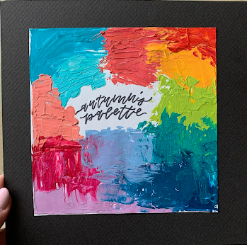
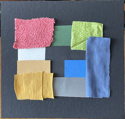
Quick Design: Personal Preference Palette I


Art 2600 / Greg Clayton

Find your inner color scheme

This quick-turnaround project aims to get you thinking about something that you likely take for granted — your personal color preferences.
Everybody's got 'em.
Its good for a designer to know what his/hers are.
Now's your chance.

You might start by looking in your closet or drawers...if you've already unpacked. See what colors are there. Take a look at the clothes you like to wear as opposed to those you have to wear when nothing else is clean. Look at what's hanging in your room...the skins on your ipod and phones...
You might also think about the colors that you absolutely don't want to wear or use...like that outfit your roomate put on this morning.

When you create your palette, show lots of the colors you especially like, and less of those that make nice accents, but you wouldn't want to cover yourself with. (the proportions/amounts of each color in a design affects the whole)
Aim for a set of colors that behaves well together — though there are many schemes that can be built with any palette, show us one grand scheme that is you.


Problem Statement

Select, organize and present the set of colors that best represents you — your personality, attitude and preferences.

Select 6-12 colors.

If you were to use just one palette of colors, what would it be?
If your dorm room could have only these colors…
if you could only buy clothes with these colors, what would they be?
If your car, cell phone and Facebook page had to match, what colors would you use?

Vary the proportions/amounts of the colors — decide which colors dominate, and which are subordinate accents.

Compose/arrange the colors as a design.

Keep in mind that color juxtapositions matter — what colors are placed next to each other matters. So rearrange your colors for best effect.


Materials: 
Use found color only— torn or cut paper, fabric or other light, thin materials that can be cut and glued/mounted to a board.

Method/Presentation:
Glue color samples to cardstock or other board. 
Create a 6" square field of color samples. Mount on an 8” backing board.
(any rigid matt board or foam core is fine. Look for scraps near the various matt cutters around the Art Bldg.)

Concept Statement:
Write a short (50 words or less) "concept statement" for this color palette.
Describe the attitude, mood or effect that these colors are to evoke.
Attach the concept statement to the back of your board.

Label:
Label your board on the back with name (and H-number for IntDes majors)) and email address.
Make sure the label is bold and legible — pencil on black foamcore doesn't cut it.

Note: bonus points if you come dressed in your scheme.

DUE NEXT CLASS


Goals

      1. Explore your intuitive color sensibilties.
      2. Become aware of your current color preferences and biases.
      3. Distinguish between the concept of "color palette" and "color scheme."
      4.  

Suggested Methods

Select your colors.
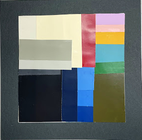
You might tear some scraps of paper or fabric to use as handy color swatches. You might use colored pencil or some other medium to play around with combinations. Whatever color medium you use, give yourself colors to look at — let your eyes help you decide. Don't pick what you think you like, pick what you keep coming back to.

Pick 6-12 colors.

Prep a board
Trace a 6" square on an 8"x8" board — find a nice scrap of foam core or presentation board.

Collect Color Samples
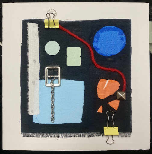
Collect enough samples of your color to more than cover the square. Suggested materials are torn paper — magazine fragments are fine. Cut fabric works well. Almost any found material that you can cut and glue will do — as long as the colors are right.

Try to find variations on each significant color — lighter tints, darker shades, muted chroma and hot chroma samples.

Compose a pleasing arrangement
Play around with arrangements and patterns a bit — you are a designer, after all. Selection matters, but so does arrangement and juxtapostion (which color butts against which color).
Play around with how to organize them...what structures are right for you...just how much order is right for you?
Play with the proportions...just how much of each color is right? Should there be a lot of navy and a tiny bit of white? Proportions change a scheme's effect a lot.
Play with juxtapositions...which colors can be next to each other, and which colors are better far apart, well separated? A color's neighbors make a difference in how the whole looks.

Glue it down
Glue your samples down (rubber cement, Elmer's type, or hot glue — whatever is right for your materials.
(always experiment with spare materials to see a) if the glue holds, b) if the glue soaks through or c) if the glue wrinkles everything.)

Clean up and Label it
Make sure to add a label on the back with your name (and H-number (IntDes)) and email.

Write a concept statement and mount it on the back:
Describe the attitude or qualities that this scheme expresses. What does it offer....what does it do? If you were trying to convince a client to use this scheme for a project, what distinctive and compelling traits would you claim your color scheme offers?
Now, in practice, a concept statement usually comes before the design, but in here you're describing what you've already selected and organized.


Glossary | Color Theory Assignments |


Greg Clayton
Design Foundations I
Design Foundations II

Senior Seminar

 
Photography Course
 
Course Schedule
Course Schedule
 
Independent Study
 
               © 2019 Greg Clayton/ gclayton@harding.edu