[See instruction handout (pdf)]
On the left side (column1) are your source colors.
From top to bottom, every color is either complementary to the next color, or a near-complement.Thus the source hues progress around the color wheel in alternating pairs. We are working to identify ideal mixing (subtractive) complementary hues and pigments.
Selecting your Source Colors:
Column 1: Source Colors.
Note that every other color is analogous — neighboring colors on the hue wheel.
ADD NOTE: list the actual paint(s) used.You will normally need to mix several of your source colors rather than using "from the tube" colors. However, be sure to document the colors used in your mixtures — note source colors on your plate — list them next to your source color sample.
Mixing the right source colors:
You might use this site as a visual reference for the hues. It allows you to spec the Munsell hue fairly accurately, assuming your computer monitor is adequatly calibrated.
To set the hue, click on the hue swatches until the Munsell Hue Spec is close to the hue you want.
In the screen-clip, above, the Munsell Hue Spec is "10G". (note that the website does't display any and every Munsell hue, only the "5" and "10" positions.)
If you press on any color swatch onscreen, a large sample of the color will display.
NOTE: You might find it helpful to explore nuances of paint mixing this Online Paint-Mixing Tool
This Golden Colors resource appears to do a very nice job of emulating the methods and effects of paint mixing.Note that your Intrinsic Value Plate is a good source of accurate primary and secondary hues, based on Munsell's major and minor hues. Those colors will be close to what you need here.
Rood vs. Munsell Color Wheels
Ogden Rood's color wheel was designed specifically to explore optical complements — which are similar to what we need here (we're working with mixing complements, which actually vary somewhat from optical complements)
Based on Rood's Wheel, using Munsell's hue specifications, your source colors might be:
(BG5) Blue Green
Thalo Green (add Thalo Blue ? don't use pure Thalo Blue... most are close to B5)(R5) Red
Cad. Red Med., Quinacridone R., or Pyrole R.(G5) Green
Deep Green Perm. or Hooker’s Grn(RV5) Red Violet
Deep Violet, Deep Magenta, or Quin. Blue Violet(YG5) Yellow Green
Vivid Lime Green or Briliant Yellow Green(BV8) Blue Violet
Cobalt Blue Hue or Ultram. Blue with added Diox. Purple(Y1) Yellow Orange
Cad. Yel. Med. or Yel. Med. Azo(B8)
Blue Purple
Cobalt B. Hue or Ultramarine B. (or Brilliant Blue and Diox. Purple)(YR2 or O2) Red Orange
Brilliant Yellow and Cadmium Red, OR Cadmium Orange
The Mixtures
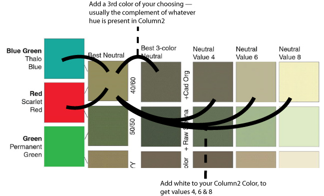
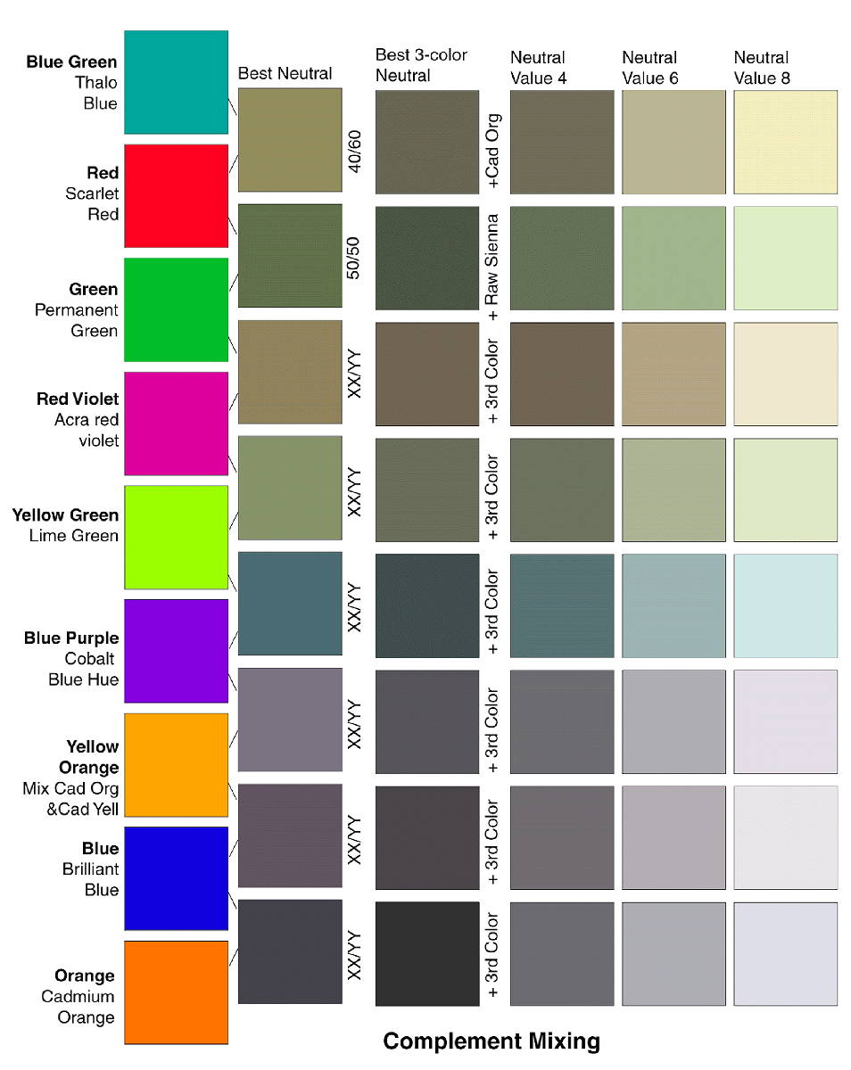
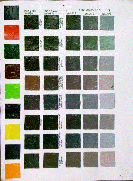
Column 2: Best 2-Color mix — Aim for the lowest chroma color possible, mixing two and only two colors.
The mixed color may get quite dark. To see the hue-chroma traits clearly while mixing, drag a bit of the mixture aside, and add white to see the hue-condition of the mixture. At a higher value, you'll be able to "read" the hue more easily.
ADD NOTE NEXT TO YOUR COLOR SWATCH: list the approximate proportions of the two colors you used.
(e.g. 40/60 or 50/50 depending on the amount of each of the parent colors) This gives you a clue to the tinting strength of each pigment/paint you're using. Recall that every pigment has its own ability to influence color in a mixture. Recall also that every paint manufacturer has their own recipe for their paint — different manufacturers add differing amounts of pigments to their paints. Thus, one brand of paint will not mix in the same way as another brand.Column 3: Best 3-Color Mix — Begin by looking closely at your 2-color mix. You're aiming for a pure neutral gray or black — but you likely didn't get it. In what way is it "off" or wrong — what hue is still present?
Find the complement of that hue, and mix it into your 2-color mix. Adjust your mixture until your mix is as neutral as possible. You'll likely need to add white to a sample of your color in order to actually see the hue traits — do so as needed. (thus, you'll need to mix a bit more paint than is actually needed for your final sample/swatch.)
ADD NOTE: list the 3rd paint(s) used.Column 4: Two-Color Mix @ Value 4
Usually you'll need to add white to raise your 2-color-neutral to value 4.