Value Staff Plate

Art 260 / Greg Clayton

Study of Munsell Values Scale

Create a set of color samples representing each of the 9 Munsell values, evenly distributed from black to white

This is another very basic exercise that is surprisingly demanding. While it is not hard to mix black and white paint, it is challenging to discern contrasts instead of colors — to see the differences between colors rather than the colors themselves.
When composing and harmonizing color, it is important to be able to discern and then control contrasts — relative conditions between colors. It is these relationships that build visual experience, even moreso than the individual colors present.
In order to create an even-stepped value scale from scratch, your eye must become more attuned to the differences between each pair of values.

Goals

      1. Train your eye to discriminate fine differences in value — develop your ability to discern contrast.
      2. Improve your ability to distinguish just what value a color actually is.
      3. Get accustomed to the "value spec system" that we'll use in class discussions and crit.
      4. Refine your ability to control basic color mixes.

Methods

Getting Started:
Get one of the large ~8.5"x11" plates.        (these are on the black filing cabinet in the classroom)
Get (at least) 9 of the small 1" squares.     (these are also on the black filing cabinet)

Suggested Working Method:
— Mix your best approximation of a #5 gray (mid-value gray).
— Use your #5 gray and your black to mix #2-4.
— Use your #5 gray and white to mix #6-8.

Self-Crit:
Let the paint dry completely (colors/values will shift a bit due the matte finish of most acrylics)
Step back and compare.
Position your samples equidistant apart for best critical viewing. (even spacing is important to how you see contrasts)
Make sure the background is a constant color — usually white.
Ask yourself the self-crit questions listed later.
Identify contrasts that are too bold and those that are too weak — look at pairs of colors, not individual colors.
Add, remove or adjust samples as needed until there is consistent contrast between each pair of value samples.
Refine and repeat as needed.

Finishing Up:
Position the samples along the right edge of your backing sheet— about 1/8" from the edge. Space them evenly.
Punch holes
through the sample and backing sheet so that your value staff can more easily be used as a value-comparing aid.
Include value numbers, labeling each sample from 1 (black) to 9 (white).
Note Tints, Tone and Shade regions

Samples

 
Note that the holes are punched all the way through the backing sheet.
That way the value scale can be easily used to view and compare values in other compositions.
Note also that in order for a standard hole-punch to reach a color sample,
the samples (your squares) need to be positioned near the edge of the backing sheet.


Alternatives and Suggestions

The most common problem will be value scales that are predominantly dark — too low in value. Low value swatches will have little contrast between them, and the high values will have abrupt contrasts between them. Since you have no absolute sample for your #5 (mid-value) color, you will have to mix your samples carefully, and then adjust. In practice, this takes longer than expected, but methodical mixing and careful comparisons of contrasts will speed up the refining process.

Another common error, usually a by-product of problem #1, is that the biggest "jump" in value will be between value #8 and #9 — at the top. It is particulalry challenging to control that highest pair — so watch carefully.

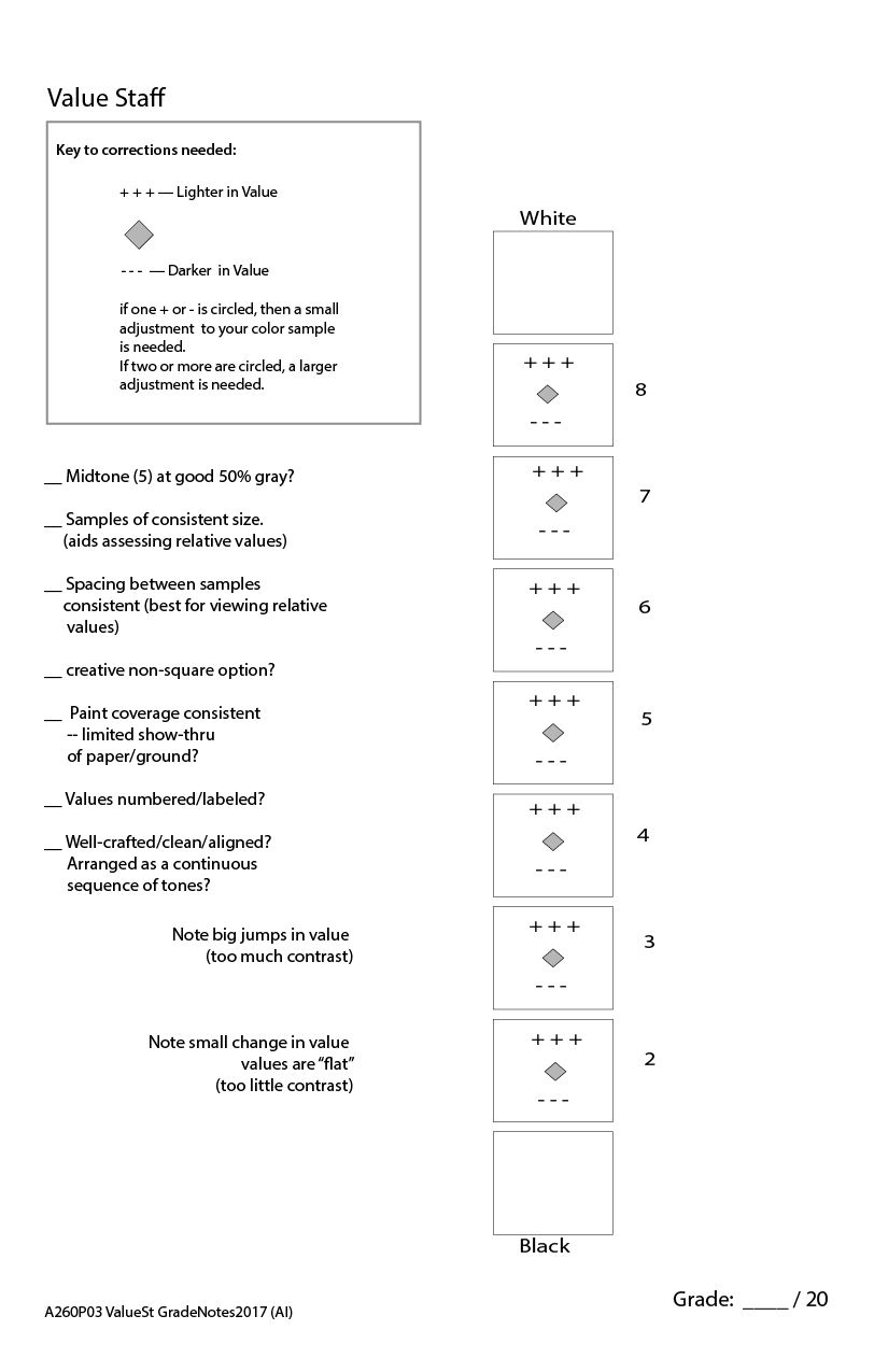
Self-crit questions:
— Does my value staff seem very dark?    ...very light?     ...or successfully balance?
— Is the contrast between the top two samples too abrupt?
— Are the bottom (darkest) two or three samples almost identical?
— Which pair of values has the biggest jump? (the greatest contrast?)
    [ You may need to add another sample between these...and remove a sample elsewhere. ]
— Which pair of values are almost identical? Which pair have the least contrast?
    [ You may be able to remove one of the two most similar samples. ]

Adjusting samples with GLAZES:
One way to adjust a dried color, without mixing a color from scratch, is to use a glaze color to "pull" the color — to shift its color just a bit. Glazing techniques involve a transparent body of thin color. Use acrylic medium and a small among of correcting color to mix a glaze. Paint it on in a thin, even coat. Let it dry. Then look hard again to see if more adjusting is needed.

For instance, to slightly darken a swatch, mix some acrylic medium...a mound about the size of a dime... along with a very small dab of black paint. Mix well. Then paint a thin even coat on your swatch. NOTE that acrylic medium is milky white while wet — so you don't know what the final color will look like until it dries. This is, admittedly a disavantage to glazing in acrylic.

To slightly lighten a swatch, mix some acrylic medium...a mound about the size of a dime... along with a very small dab of titanium white* paint. Mix well. Then paint a thin even coat on your swatch. NOTE that acrylic medium is milky white while wet — so you don't know what the final color will look like until it dries. This is, admittedly a disavantage to glazing in acrylic.
* Titanium White is on your course supply list. However, for glazing, its not the ideal white. The preferred option is Zinc White, or Transparent Mixing White, both of which use Zinc Oxide as their pigment. Zinc White is transparent, rather than opaque like Titanium White, and thus is better for glazes. Titanium white is generally fine for glazing in a color exercise.


Crit Sheet

Most crit issues involved in grading this exercise are noted on the crit sheet below:

Glossary | Color Theory Assignments | Color Theory Course Home | Greg Clayton HU Home