Mix the colors that are in your Personal Prefs Palette.
Select (at least) 7 colors from your prior project.
— what if my palette had fewer than 7 colors? Then expand the palette, adding whatever colors needed to get to seven. Consider varying the value or chroma of colors already in your palette.
— What if my palette has more than 7 colors? You can use more than 7 in this assignment, or you can simplify your palette to the 7 most important colors.
— What if I really didn't do much with proportions in my Pers Prefs Palette? Well, now is the time to think about it. Which colors do you want to dominate? Which color should be reserved for special accents, in small quantities but carefully placed?
Materials:
Use acrylic paint to mix your colors.
Method/Presentation:
Create a 6" square field for the color samples of your proportion study.
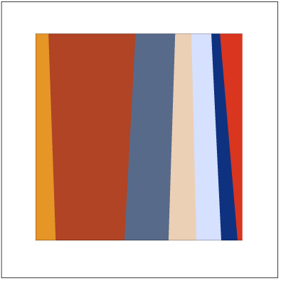
Paint a color proportion study of the colors in your personal prefs palette. Vary the amount, or size, of each color area according to its prevalence in your palette.
Usually, vertical stripes/bands/rectangles are used for color samples in proportion studies, but feel free to build your palette with simply-shaped areas of constant color.
Mount on an 8” board. (any rigid matt board or foam core is fine. look for scraps near the various matt cutters around the Art Bldg.)
Label:
Label your board(s) on the back with name (and H-number for IntDes majors)) Make sure the label is bold and legible — pencil on black foamcore doesn't cut it.Specify Colors (Munsell):
Create a swatch of each color in your palette.(see example below)
Note its hue, value and chroma. (see info on hue, value and chroma notation/specs)
Note the (tube) colors used to mix your color.
(you might fit these color specs on the back of your proportion study, or you can use a separate board.)
Color Swatch Source Colors Raw Sienna, Cadmium Red Medium
Thalo Blue, Titanium White, Mars Black
Brilliant Blue, Thalo Blue, Titanium White
Raw Sienna, White, Cadmium Orange
Thalo Blue, Titanium White
Cadmium Red Med., Raw Sienna
Raw Sienna, Titanium White, Cadmium Red Medium
DUE NEXT CLASS