Color Scheme Charting Intro

Art 260 / Greg Clayton

Exploring Color Structure

see also: Color Proportion Study Examples | Color Charting Examples | Color Charting Exercises

Color Scheme Charting

We're looking for a way to see how color can be used; we're aiming to understand color structure, color harmony and, generally, color design.

This charting strategy offers a way to represent the structure of a color scheme in a logical and visually expressive shorthand.

Several aspects of color will be represented:
for each color in a design, hue, chroma, value and proportion are identifed and noted.
Dominances and limitations can be easily recognized. (the proportions/amounts of colors, and color component are noted.)
The hue-structure is made obvious. (the pattern of hues; e.g. complementary schemes, analogous schemes, etc.)
The only major color-scheme trait that is not represented is proximity or juxtaposition — that is, we do not note which colors are positioned next to each other.

A color proportion study presents the same raw color information, but in a largely unstructuured way. With Elsen's charting technique, we can observe the structural relationships between the various colors within the scheme. We can recognize clusters of colors with the same or similar hue; we can easily notice colors that are related by common value, and we can quickly identify colors with a similar chroma. Further, traditional hue schemes — e.g. analogous, complementary, triadic, etc. — can be recognized by their characteristic patterns. In short, a lot of color information is packed into a small space.


Goals

Be able to discern the color strategies that other artists and designers have used.
In effect, learn to learn from the masters. Learn to see just how organized and intentional was the color of the artists and designers that you enjoy and respond to.

And, learn to plan your own color designs in terms of valid color relationships.
Have a tool or strategy available to think about color and color only — separate from other design issues.

Learn to think in color relationships.
As you select colors and then color palettes, and as you arrange and design with color, discerning and conceiving valid, visual relationships among the individual colors you pick will help you notice alternatives that you likely would not have considered otherwise.

Note that the goal is NOT to eliminate your color intuitions and personal color sensibilities, but rather to expand and hone those abilities. By adding an analytic approach to your intuitive color use, you can solve a broader range of design problems and offer a wider range of color alternatives in your work.

This charting does not address issues of color symbolism, meaning or connotation. Charting aids our awareness of pure visual, formal color structure.


Methods

The basic Chart:

Below is a (full color) version of the charts that we use. For in-class charting we usually use only a b/w line drawing. The color wheel on the left is more than a standard hue wheel. Note two differences:

5 Primaries or Principle Hues: Instead of the three traditional subtractive primary hues(RYB), there are five primary hues represented here. This color circle is based Albert Munsell's color model and color specification system (5 primaries; 5 secondaries...plus we sneak in tertiaries between Red and Yellow.) See Color: p.18-20 (6th ed.) for an intro to Munsell's color model.
(Note that Munsell calls his 5 base hues "principal hues", not "primaries." I'll usually just go ahead and call them primaries.)

Chroma Included: Second, this color circle changes from the outside-to-the-center. Unlike a common hue wheel, in this color circle, chroma is represented, changing from the outer circle (high chroma) to the center (neutral).

Value Staff: On the right side is a fairly standard value staff, using our in-class numbering system from 1 (Black) to 9 (White).
(note that the actual Munsell system uses 0(black) -10(white) )

Thus, all three dimensions of color can be represented on this 2D chart.


Hues and Hue Notation

For convenience, we'll abbreviate hue names with letters.
As long as you recall your grade-school primaries and secondaries, its pretty easy.

Primary hues have a one-letter notation: R Y G B V
(sometimes we'll use P for Purple and V for Violet — I really don't distinguish between the two, though some folks see Purple as a bit more Red-Violet, and Violet as somewhat more Blue-Violet. For our conversations and charting, Purple and Violet are the same. P = V)

Secondaries (usually) have a two-letter notation: RV, BV, BG, YG, O (or YR, according to Munsell)

Tertiariies usually have a three-letter notation: RRV, VRV, VBV, BBV, BBG, GBG, GYG, YYG, YO, RO

Occasionally we'll refer to still finer distinctions among the orange hues: RRO, ORO, OYO and YYO


Munsell's color specification system

Albert Munsell is an American color theorist who developed both a 3D Color Solid (or Model) and a color specification system based on the visual phenomena of color — whichis to say, his work closely follows what we see, rather than how we create, mix or project color. From a standpoint of color design, or more particularly, color-harmony design, Munsell's system is, I believe, the most helpful and applicable.
Once accustomed to Munsell's conception of color description, it is far easier to concieve of color harmony in terms of relevant color relationships — and such perceptual relationships are the core of harmony itself.

Jumping ahead a bit, a Munsell color specification looks like this...


3R 5/8       Red (RV), value 5, chroma 8
 
4O 6/2
 

8Y 7/2

 
8BG 8/3    Blue-Green, value 8, chroma 3
 
4O 6/12
 
8Y 7/14
 
1P 3/11     Violet (BV), value 3, chroma 11
 
9O 3/2
 
8Y 3/2


Now, let's see how those are actually a very sensible shorthand for describing colors.

Hue Specifications

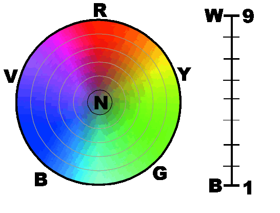
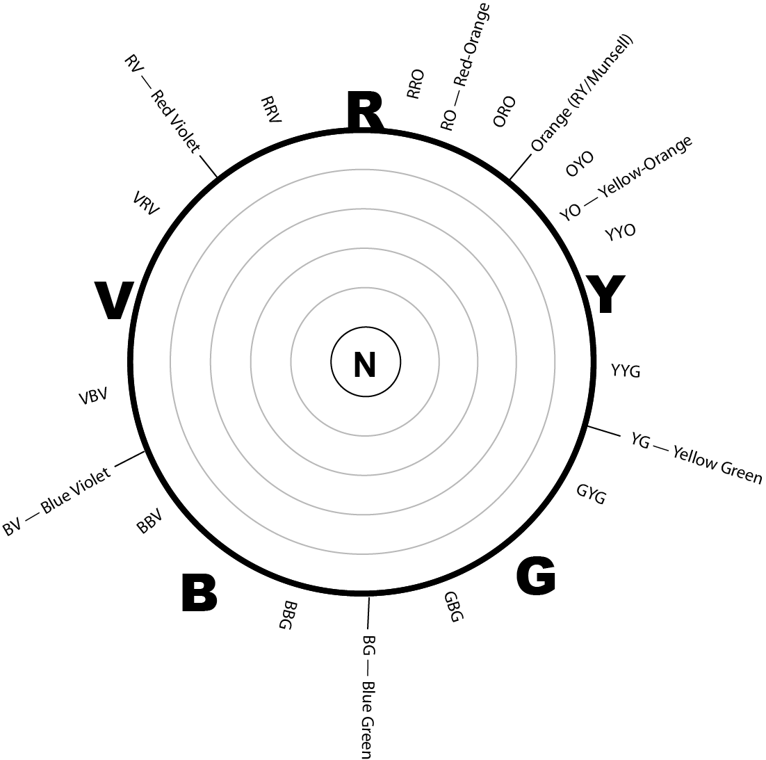
Munsell's spec system divides the hue wheel into 10 neighborhoods.* In the color wheel, below, note the 10 circles that label each hue "neighborhood." The hue descriptors, (e.g. Red (R) , Yellow-Green (YG), Blue-Purple (BP) etc.) are common, familiar hue names, with the exception of Yellow-Red, discussed further down.)

Within each neighborhood, hues are numbered zero-to-ten in a clockwise direction (generally, "pure" hues are at the 5 position. e.g. primary red would be at 5R).

For example, a "2R" represents a rather red, red-violet.
A "4R" is a red with a hardly discrernable violet cast.
A "9R" is a Red-Orange.
"7R" is a red with a bit of an orange cast.

Note that the color regions overlap in one sense — a "10R" and a "0YR" are the same hue.

Note also, that Munsell describes Orange as "Yellow-Red". I'm not sure why he chose that. But be assured, throughout this course, I'll usually say "orange", and rarely "Yellow-Red". Also, I'll speak of "Yellow Orange" (YO) -- which is equivalent to Munsell's "10YR" or "0Y". Also, "Red Orange" (RO) is the same as Munsell's "10R" or "0YR" (or "0O" ... zero-orange). (see the hue-labeled color wheel, above)
Some of that gets a bit messy, I'll admit. Suffice it to say that as artists and designers, we need to have language by which to describe and discuss color — our language needs to be both accurate and intuitive or natural. Munsell's system is the best starting point I know of, and, after tweaking discriptions of the Orange neighborhood a bit, its very clean and natural.

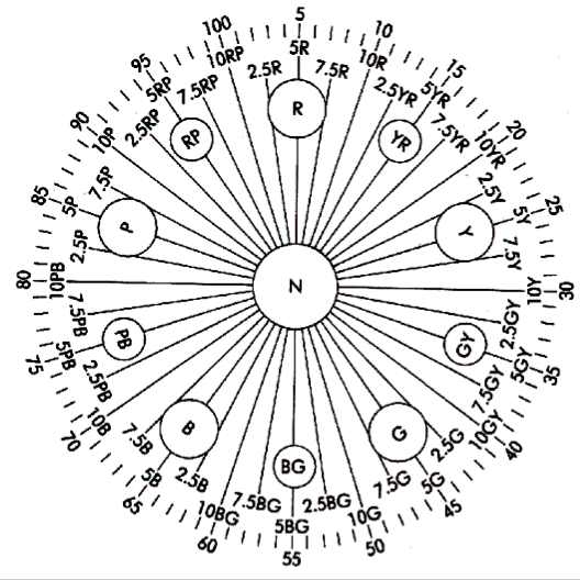
* Actually, there are two variants on the Munsell's color spec system — the other system of hue specifications divides the color wheel into 100 increments (see the outer-most markings on the Munsell color wheel, below). Using the 100-hue system, a primary red = 5, a primary yellow = 25 and a primary blue = 65. Its a perfectly function hue-spec system, but, like most color specification systems, it is hardly intuitive to grasp. What's intuitive about green = 45?
In any case, in this course, we'll ignore the 100-hue system, and stick with the far more intuitive 10-hue-group Munsell spec system.

Value Specification

Munsell's actual specification designates value between 0 and 10, with zero=Black and 10=white.
In this course we simplify that a bit (or confuse it) by using a value scale between 1=Black and 9=White. (why? because it more conveniently fits an intrinsic value scale of hues, and 9 steps is accurate enough for most design contexts. Admittedly, a 0-10 scale may make more sense in a digital age of on-screen color-pickers, but, for now, I stick with my tradition of a 9-step scale.)


Chroma Specification

Munsell's spec system designates Chroma from zero = pure neutral (black, white, gray) to, well, there's no official upper limit.
For purpose of in-class color charting, I use ten-or-greater as "High Chroma".
The absence of an upper limit on the chroma scale may seem like an oversight, but unlike many color spec systems, the Munsell system is based on the phenomena of color — what we see and experience. Since new and more intense pigments are gradually found, or, more typically, synthsized, we continue to expand the intensity of chroma actually available — Munsell's color solid is thus an expanding universe.
I don't know of a way to precisely quantify chroma within a Munsell system — in practice, we'll do it by eye. Its not rigorously scientific, but it will fit how artist/designers generally select color.
We'll use six stages of Chroma: Neutral (N), Low (L), Middle-Low (ML), Middle (M), Middle-High (MH) and High (H)


Terminology: Limitations, Dominances,

The next stage of our charting involves identifying traits that help unify a color composition — the Limitations and the Dominances.


In each row of this table, you'll deal with one dimension of color — either hue, or value or chroma.

 
Limitations
Dominant
Value
1, 2, 3, 4, 5, 6, 7, 8, 9

 
Hue
R, RO, O, YO, Y, YG, G, BG, B, BV, V, RV

 
Chroma
High, Middle-High, Middle, Middle-Low, Low, Neutral
 

Limitations (LIM)

A "Limited Palette" produces a color scheme that limits itself to only a few hues — rather than using an endless variety of colors from all over the color wheel. In practice, the vast majority of color designs use limited palettes. Limiting the diversity of colors within a design is a basic unifying strategy — it helps build a more cohesive composition. (in contrast, there are "Open Palettes" which might use a wide variety of hues from anywhere on the color wheel. (see the Fauves, Matisse A B C , Derain )

Inventory Color Traits: If the term "Limitations" feels odd, just think "inventory" — because what's needed here is no more than an inventory of everything that is actually being used in the color scheme.

Hue row: Your job, here is to list all of the hues that are used in this scheme. List hues according to our Munsell-based notations.

R = Red RO = Red-Orange O or YR = Orange YO = Yellow-Orange Y = Yellow YG = Yellow-Green
G = Green BG = Blue-Green B = Blue BV or BP = Blue-Violet V or P = Violet or Purple RV or RP = Red-Violet
  N = Neutral (white, black and/or gray)        


Value Row: list each of the major values that are used.

Values vary from 1 to 9 in our charting system. (Munsell actually

uses 1 - 10)
Value 1 = Black, (most extreme dark; low value).
Value 9 = White (maximum lightness; high value)
Value 5 = mid-value or 50% gray


Chroma Row: list each of the chromas used in the scheme.
We use six different chroma designations:
High chroma (H) — rich, vibrant chromatic color -- pure or very nearly pure hues.
Middle High Chroma (MH) —
Middle Chroma (M) —
Middle Low Chroma (ML) —
Low Chroma (L) — barely discernible hue ....very little "color". Many brown are low chroma yellows or oranges. Warm and cool grays.
Neutral (N) — pure neutral (white, black or gray); non-chromatic colors; achromatic color.


Dominant (DOM)

In each of the three boxes, you list the one dominating color trait in the color scheme.

Hue Row: List the hue that is most prevalent OR the most graphically prominent.
Sometimes this is a bit unclear. Aim to identify the hue that is the most essential and the most influencial to the mood and composition. Usually this is the most prevalant hue — the hue that takes up the most space.
Look at your color wheel — where are most of the circles...or the biggest circles?

Value Row: Identify the most prominent value in the design.

This will be the value charted on your value staff with the largest circle or cluster of circles.

Chroma Row: Identify the most prominent chroma in the design.
Look at your color wheel — look at the concentric rings around the center. Each ring represents a different level of chroma. At which ring are the most circles located?


see also: Color Proportion Study Examples | Color Charting Examples | Color Charting Exercises

Glossary | Color Theory Assignments | Color Theory Course Home | Greg Clayton HU Home