Color Mapping
Art 260 / Greg Clayton
Map and organize the colors you own
Specify and chart each of the colors you own so as to organize them for mixing.
One of the main purposes of this semester's study of color, is to enhance your ability to think in terms of color traits and color relationships.
Whatever strategies you eventually choose to use in order to select, harmonize and arrange colors within composition, you must first think naturally and comfortably within a color paradigm—you need a head for color.
This exercise focuses on some of the most basic aspects of such color thinking.
Goals
- Create two 2D maps of the colors that you will be working with during the semester (i.e. the particular paints that you own).
- Become familiar with the hue, value and chroma traits of each color/paint.
- Become more familiar with color as a three-dimensional phenomena.
- Become familiar with the Munsell hue wheel and the Munsell Color Specification System.
- Become familiar with disparities between technical chroma values and practical chroma traits and tinting strength. (e.g. Dioxazine Violet and the Pthalocyanine colors have a very low Munsell Chroma values, yet are powerfully intense in mixes.)
- Become familiar with how your colors are related to each other. (their positions on the color maps represent how their visual traits are related -- and thus suggest their mixing and harmonizing traits.)
- Begin to anticipate practical color mixes that are possible using your colors.
What to do ...the short version
- Get a blank copy of the Personal Palette Color Map. (PDF — print at 11x17 on card stock — usually there are blanks in our classroom.)
- List each one of your colors. For each tube of paint, list its name and its Munsell Hue, Value & Chroma.
- Map each color's Hue and Chroma on the color wheel.
- Map each color's Value and Hue on the hue-value table (the Color Map).
Methods
Get a blank Personal Palette Color Map (PPCM) (11x17 sheet)
They should be available in the classroom ...either pinned to the bulletin board, or on top of the black filing cabinet.Complete the Listing of Colors and Color Specifications
- Collect all of your paints and get a Munsell Color Specification for each color.
Figure out the Munsell Color Specification for each color
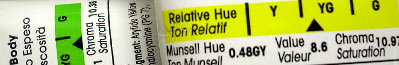
Note how to find Munsell H/V/C info on your LIquitex paint labels, below:
- Option 1: Examine the Munsell color specifications that are printed on the back of each tube.
NOTE: Liquitex appears to have removed the Munsell information from their paint labels (Fall '14), so the images below may be useless to you.- Option 2: Download this PDF of the Liquitex heavy body paints. The lower portion of the chart lists each color along with its Munsell Hue/Value/Chroma rating.
- Option 3: Try the Golden Paint site's Interactive Color Chart. For each color, they provide a Munsell spec — just click on the color you're interested in. Some of the Liquitex colors do not perfectly match the Golden colors -- that's fine. Just select colors that best match what you have, and use the spec provided.
• Option 4: Compare your colors to the online Munsell color swatches at VLCConsulting's Color Atlas. See the notes/images below. Use the best display monitor your can find for your comparisons. If possible, calibrate your monitor first.
-
Yellow Light Hansa Acra Magenta Vivid Lime Green 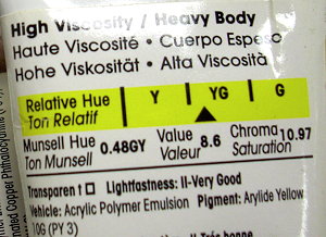
Hue: 0.48 GY ( A yellow-green that is leans far towards yellow.
GLC NOTE: this hue value is suspect. I read this as closer to a 8Y ... a yellow that leans towards YG.Value: 8.6
Chroma: 10.97 (a high chroma)
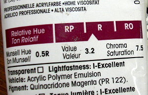
Hue: 0.5 R ( A Red that leans towards Red-Violet)
Value: 3.2
Chroma: 7.5 (a medium-high chroma)
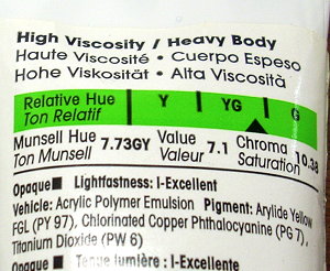
Hue: 7.73GY (a Yellow-Green that leans towards Green)
Value: 7.1
Chroma: 10.38 (a high chroma)
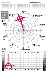
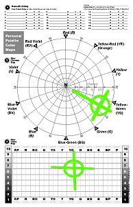
In the color maps, below, each of the colors above are mapped according to the Munsell color specification printed on the paint label. The lines one the charts, below, are just temporary notes — the circles are the "real" notation, indicating the combined color traits.
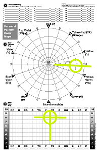
Complete the Hue-Chroma Mapping (sample and more notes)
The upper color circle allows you to map, or place, each of your colors in a position that represents its hue and chroma traits.
All of the information you need is in the Color List that you just completed.Get familiar with the Munsell Color Wheel and the Munsell Color Specifiction System. They work together.
As discussed in class, the Munsell Color Wheel has 10 pie-shaped regions. Each region represents one hue.
Each of these regions is then divided into smaller increments, from 0-to-10 (clockwise). The "5" position is the "pure hue" position. ("pure" red or "pure, perfect" yellow, etc.).
Thus, "Hue Positions" rotate around the wheel like the hands of a clock.
"Chroma Position" is measured from the center ( 0 - zero ) for pure neutrals, outward.
Intense, high-chroma colors are positioned at or near the outermost circle (chroma 15+)
Pure neutrals (e.g. black, white, gray) are located in the center.Place a number and circle on the Munsell Color Wheel such that each color's hue and chroma are accurately represented.
Special Colors: Place an arrow on any colors that appear to have far more chromatic power than intiailly appears (e.g. dioxazine violet, pthalocyanine green/blue, some synthetic reds).
Note the outward-pointing arrows on the example chart, below.Complete the Hue-Value Mapping (sample and more instructions)
The Hue-Value map is similar to the Hue-Chroma map. It is modeled on the 12-hue Liquitex Color Map. You have a printed version of the Liquitext Color Map in your textbook (Color, 6th Ed., pp 78-79 )
(Note that this 12-hue group chart vs. 10-hue group wheel is admittedly confusing if not contradictory. Sorry - but there are, in fact, many different color models out there.).
Thus, each vertical column represents a different hue.
Each row represents a different range of value — black at the bottom (1) and white at the top (10).Place a number and circle on the Hue-Value chart such that each color's hue and value are accurately represented. (note how black and white appear all across the bottom and the top.)
Samples
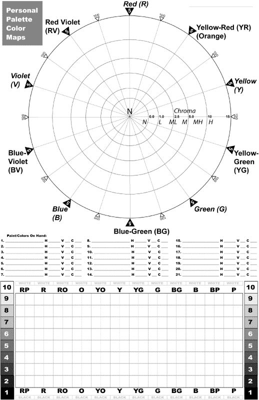
The blank Personal Palette Color Map form looks like this (left).
( Well...actually, the newest color map is arranged just slightly differently...now the paint listing section is at the top...not in the middle.)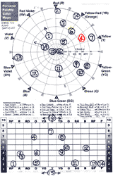
The completed color map is similar to this (left).
You're welcome to paint a swatch of your color on the color wheel and color map — most folks just squeeze a dot of color from the tube.
See links below for more details and enlarged views.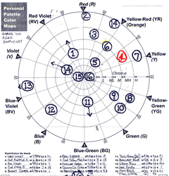
Here's the top half of a completed color map. (left)
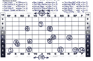
Here's the bottom half of a completed color map. (left)
Alternatives and Suggestions
-
What if I don't have Munsell Hue-Value-Chroma specifications printed on my paint label?
A few paint manufacturers include Munsell colors specs on their paint tube labels — but not all.
If your paints don't include color specifications, here are other ways to get "good enough" color specs.
— Option1: Compare your paints with online Munsell color samples:
This website offers an excellent digital representation of Munsell color samples and Munsell color specifications.
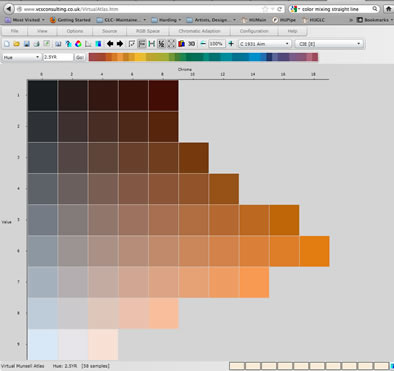
Be sure that the chart is set to display Munsell color model:
( View menu: Munsell)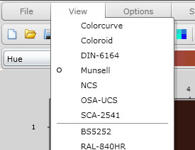
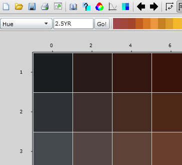
Notice that the Munsell color specification information is presented:
HUE: in the text box is the hue designation
(here, 2.5YR)VALUE: Along the left side are the value designations
(here we see rows 1, 2 & 3)CHROMA: Along the top edge of the color samples, each column has a Chroma designation.
( here we see 0, 2, 4 & 6 )So the color in the lower right is: 2.5YR 3/6.
— Option 2: Compare your paints with Liquitex Paints:
Liquitex Artist's color labels do have the H/V/C info. (well, prior to Fall of 2014, at least. They appear to have been removed.) If you can find a friend who has that brand of paint, try comparing your colors to theirs — find a tube of their paint that best matches one of your tubes. Then use the Munsell info from their labels.
— If your color is darker than theirs, assign a lower value. If lighter, then a higher value.
— Compare chroma as best possible — use the Chroma value on their paint as a reference, then adjust as needed.
— Option 3: Compare your paints with the Liquitex Color Maps:
We've got a copy of Liquitex Color Maps mounted on the classroom wall.
Your textbook has a (crude CMYK) version of the Liquitex Color Map on page 78-9 (6th ed. of Color).
Compare your paints/colors to the color swatches to get the hue and value info. Just open your tube/jar and compare paint to swatch. Note that the Color Maps use the correct 0-10 step value scale, while we chart with a slightly simpler 1-9 step scale -- so a bit of adjust might be needed.
For Chroma/Saturation, give it your best guess based upon your color charting experience — that should be accurate enough for your color mapping.
— Option 4: Refer to Liquitex Technical Info:
This PDF lists technical information on Liquitex paints, including Munsell H/V/C color specs.
Note that Liquitex may have updated this information since this document was posted.
-
Glossary | Color Theory Assignments |
Greg Clayton
Design Foundations I
Design Foundations II
Senior Seminar
Photography Course
Course Schedule
Course Schedule
Independent Study
© 2017 Greg Clayton/ gclayton@harding.edu