Simultaneous Contrast

Art 260 / Greg Clayton

2Colors as One/ One Color as Two

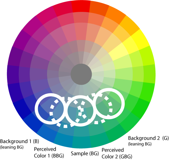
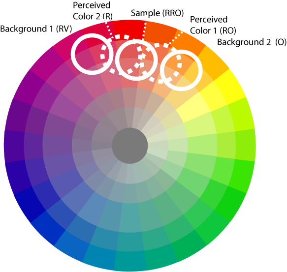
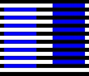
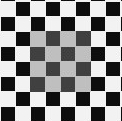
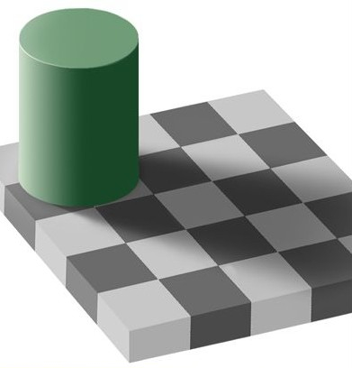
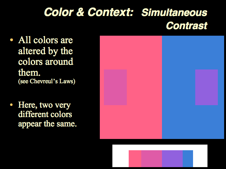
Michel Eugene Chevreul's 13 laws of Simultaneous Contrast made clear that color is not static, but is dynamic and relative.
In short, the appearance of a color changes according to its context.
More particularly, a color pushes the appearance of its neighbor away from itself — in terms of hue, value and chroma.

"In the case where the eye sees at the same time two contiguous colors, they will appear as dissimilar as possible, both in their optical composition [hue] and in the height of their tone [mixture with white or black]."
The Principles of Harmony and Contrast of Colors by Michel-Eugène Chevreul

(Chevreul: HandPrint | WikiP | ColorSystem )

Explore online examples and demonstrations of Simultaneous Contrast. A few links to online intros/discussions of simultaneous contrast are here. If you find more or better online content, pass it on to be added to our site.

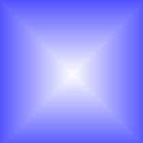
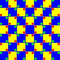
ValueSC note pyramid notes grating notes stripes notes checkerbd 2

circle1 notes
(alternate)

checkerboard
     
  Star notes grid2 notes grid1 notes Bulge    

Assignment

This project involves three color compositions:

1 — Create an arrangement of well-selected colors that demonstrate that one color can appear as two (or more) colors.
Color-selection strategy described below.
Consider varying color massing for effect -- consider and exploit how large color regions behave differently than small.
(minimum size: 4x6 mounted on 7x9.5 plates)

2 — Create an arrangement of well-selected colors that demonstrate that two colors can be made to appear as one color.
Color-selection strategy described below.
Consider varying color massing for effect -- consider and exploit how large color regions behave differently than small.
(miniumum size: 4x6 mounted on 7x9.5 plates)

3 — Create a logo, personal mark, or repeating-pattern design* using no more than 4 colors.
Select and juxtapose colors so that there is greater percieved variety of color because of careful selection of colors and well-planned placements of colors, and color proportions..
(miniumum size: 5x5 mounted on 7x9.5 plates)
* such as wall paper, gift paper or fabric patterns. Look into Adobe Illustrator's tools for creating repeating patterns.

Goals

      1. Control Color Mixing among subtle/sensitive colors
      2. Refine visual discernmnet of fine distinctions in color and in color contrast
      3. Become more aware of the pervasive influence of simultaneous contrast in color design.
      4. Get experience with, and become aware of the nature of the "push" of color opposition occuring within Simultaneous Contrast
        • Explore the influence of color massing and color fragmenting — basically "large expanses of unbroken color appear higher in value and higher in chroma."

Two Colors as One

Create an arrangement of colors in which a two (or more) colors is appear to be the same color.

Also present your color swatches on a neutral ground.


Notice how these four colors are related.
The two colors that change (the RV and the V) are "between" the background colors — R and B. Look at them on the hue wheel.

The red "subtracts" redishness from the RV, making it appear somewhat more violet.
The blue background "subtracts" blue-ishness from the V swatch, making it appear more RV.
The blue background is lower in value than the red background, and causes the V swatch to appear a bit lighter than it is.
These effects combine to cause the two swatches, the RV and the V, to appear quite similar.

Note, however, that the longer you look at it, the more clearly you will see that the two swatches are different — it is as though experience gradually trumps Simultaneous Contrast.

This is not the only way to achieve the "two color as one" effect.

Suggestion: Try setting up a 5-hue analogous scheme in Kuler...then rotate hues, spread/narrow hue range, and raise/lower Chroma to explore alternate palettes.

One Color as Two

Create an arrangement of colors in which a single color is presented several times, and appears to be a different color in each instance.

Present the sample color on at least two different backgground colors.
Also present your color swatches on a neutral ground.


Above, one color is made to appear as two.

The lower 3 color swatches are the "key" to this one.
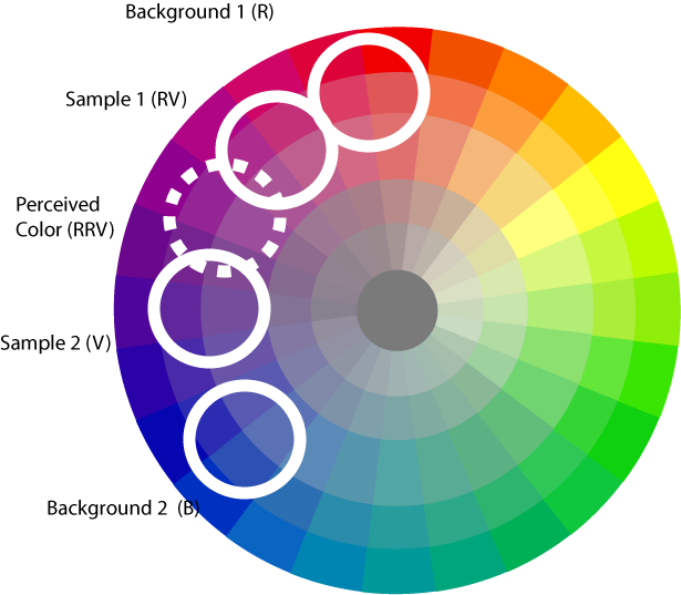
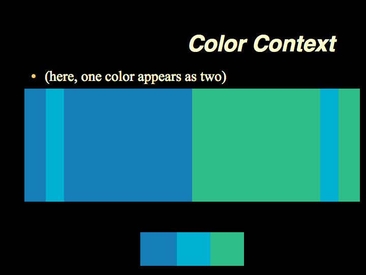
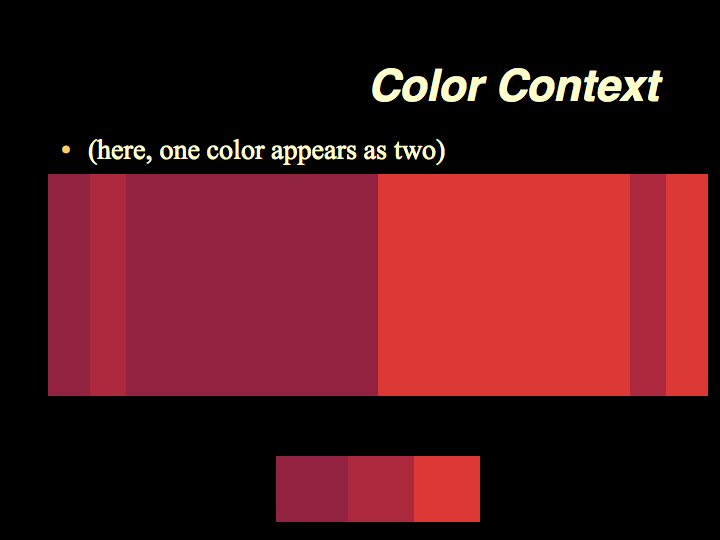
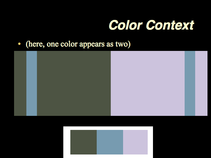
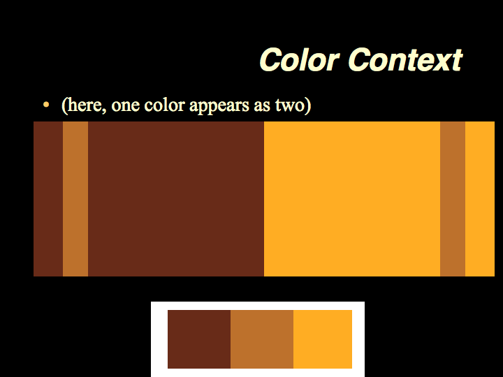
The left color is the background on the left.
The right color is the background on the right.
The middle color is the stripe on both left and right sides.
This is the color you're trying to "push" around — the stripes need to be percieved as two different colors — even though the swatches are identical.

Note the relationship between the colors — the "variable color" ( the color that most obviously changes its appearance ) is "between" the other two colors. Look at their positions on a color wheel.

Suggestion: Try setting up a 5-hue analogous scheme in Kuler...then rotate hues, spread/narrow hue range, and raise/lower Chroma to explore alternate palettes.


One color appears as two.

Again, the hues are well related, analogous hues. The variable color — the RO, is between the RRV and the O hues.

It is as though the RV "pushes" the R sample away from itself, towards the appearance of RO,
while the O "pushes" the R sample away towards the appearance of RV.


Here hue and value are "pushed" via Simultaneous Contrast.


  Here Chroma and Value are pushed via Simultaneous Contrast.  
 

Alternatives and Suggestions


Glossary | Color Theory Assignments |


Greg Clayton
Design Foundations I
Design Foundations II

Senior Seminar

 
Photography Course
 
Course Schedule
Course Schedule
 
Independent Study
 
               © 2019 Greg Clayton/ gclayton@harding.edu