Color Proportion Studies

Art 260 / Greg Clayton

Exploring Color Structure

Proportion studies can be used...
...to study the color that other artists/designers have used.
...to record or document the color used in a scheme.
...to plan or explore colors that you might use in an upcoming design/painting.

Proportion studies "record"...
...the major colors used in a scheme (the palette) and
...the amounts or relative proportions of those colors.

Proportion studies are graphic, rather than specifications. That is, we use color swatches/samples, rather than color descriptions to describe our palette.

see also: Color Charting Intro | Color Charting Examples | Color Charting Exercises

Examples

The examples below are color proportion studies.
Here are some examples of Completed Color Charts.

The basic method:
— Identify all of the major or prominent colors in the scheme.
— If needed, simplify several very similar colors into one color to represent the group.
— Limit your palette to no more than 12 colors — often fewer will be fine.
— Be sure to include any significant accent colors. These are colors that appear in very small areas of the composition, but provide a kind of surprise or exclamation for the entire composition. Example: in the painting below, by Edouard Vuillard, there are small swatches of rich blue violet — that blue is minor in size-proportion, but important to the impact of the composition. Thus, you Color Proportion Study should include that blue-violet. Also, Vuillard's paintng has a small, intense stroke of red-orange on the plate. That accent of Red-Orange should also be included in the proportion study.
— create color swatches of each of the colors. Vary the size of each swatch according to its presence in the scheme.
— mount the swatches next to each other in an orderly arrangement.
— mount the arrangement on a neutral backing board.

Examples

The examples below are color proportion studies.
Here are some examples of Completed Color Charts.

Vuillard's painting is dominated by Yellow-hued colors. Most are mid-chroma and low-chroma ochres and browns. The small accents of BV (blue-violet) and orange enliven a potentially sedate scheme.


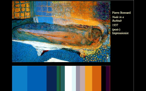
Bonnard's painting is a rich play of many, many varied mixtures of his basic palette. There are far too many particular colors in this painting to chart. Our aim, then, is to simply and generalize the palette.
There may be many variations on the rich Blue-Violet color -- but we'll simplify the many Blue-Violet colors into three generalizations that are close to, but not exact matches of the many Blue-Violets that Bonnard presents.


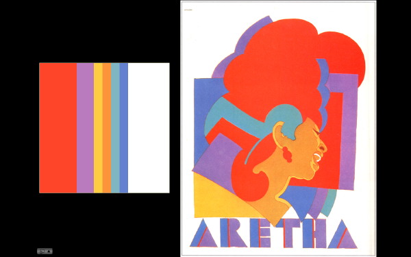
Milton Glaser's Aretha poster uses incredibly bold (high chroma) color — yet he manages to create a cohesive composition with interlocking shapes.
Note also how several of Glaser's intense colors have the same value — his red, blue and purple are each roughly the same value. His orange-brown and blue are similar. This repeated use of the same values help unify a potentially explosive color design.


Bruno Paul uses very few colors — all mid-chroma and fairly similar in value. The Y-YO colors provide a dominating foundation, but BBG and RV offers some near-complementary punch.


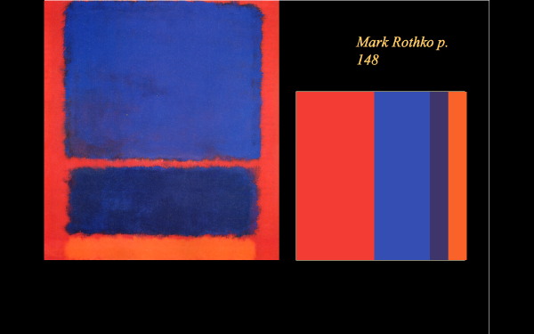
Mark Rothko's paintings are never well represented in photos — only vaguely suggested. His thin veils of layered transparent color simply do not project in reproductions – we see a simplification, a sort of washing out of subtleties.
When his many subtle variations are simplified, there are very few distinct colors in use.


see also: Color Charting Intro | Color Charting Examples | Color Charting Exercises

Glossary | Color Theory Assignments | Color Theory Course Home | Greg Clayton HU Home