Color Scheme Planning

Art 260 / Greg Clayton

Developing well-related palettes using structured hue schemes and Ellinger's dominant-subordinate planning tactics.

Intro

We are accustomed to structured hue schemes — monochromatic, analogous, complementary, etc. schemes.

However, hue schemes only deal with selected related hues. They do not help with value, with chroma, with color proportions and not with color juxtaposition.
That is, hues schemes provide only very limited help when planning color compositions.

The tactic we're exploring here deals with all of these, except juxtaposition.
We will be able to plan a full palette of colors for our design, rather than just selecting hues. This method is both flexible and, once familiar, pretty easy to work with. It doesn't guarantee good design, but it does offer help developing a scheme of well-related colors.

The underlying premise is that a collection of colors that are selected according to their visual relationships will appeal as a unified collection of colors.

This color-planning stragegy is based on our color-charting techniques. Basically, we do the same thing in reverse order. While color charting helps you recognize the color relationships that a designer has chosen, color planning allows you to conceive a color strategy or attitude, and then to devise one or more particular color palettes that might express that strategy or attitude.

An Example: Monochromatic

Our palette planning exercises will look like this, below.

The top lines describe the scheme's plan — what is the hue scheme? what hues are dominant and subordinate?
What value is dominant? What values are subordinate?
What chroma is dominant? What chromas are subordinate?
This information is enough to generate a palette of particular colors that are likely to be well-related visually.

On the lower left is color-chart for hue-chroma, for value, for scheme limitations and scheme type.
Here we will chart the color-scheme plan in the same way that we would chart the colors present in a finished design. The only difference is that here we are doing the process in reverse order — instead of viewing a color composition and charting the structure of the colors used, we are charting a color scheme concept that can later be used for a color design.

To the lower right is the palette itself. Each color in the palette is here specified in terms of Hue, Value and Chroma.
As elsewhere in this course, we simplify Munsell's color specifications to...
... a Hue      (R, RO, O, YO, Y, YG, G, BG, B, BV, V, RV)
...a Value     (1 = Black... 5=Mid-tone ... 9 = White )
...a Chroma ( N = Neutral, L= Low, ML = Mid-Low, M=Middle, MH = MidHIgh, H=High )


Start by doing what you already know... chart the scheme

You are taking a color plan and representing it graphically.
The steps noted on the right simply outline what you've been doing in your earlier charting.
Figure out where colors occur in the hue-chroma wheel, and in the value staff.

What hue is in the scheme?
Blue Green

Which chroma is dominant?
Low. So draw the largest circle at BG - ML

At what other chromas is that hue used?
MidHigh. So draw a smaller circle at BG — MH

What value is dominant?
Value 3. So draw a large circle at value 3 on the value staff.

What other values are in the scheme?
Value 1 and Value 7. So draw smaller circles at those values.

Go ahead and connect each Hue-Chroma circle to each Value circle to indicate the colors.

Fill in the Color Specifications for each color in the palette

Each row describes, or specifies a particular color.
Recall that each circle on the left, in the hue-chroma wheel, is to connect to a circle on the value staff, and that each connection represents a Hue-Value-Chroma combination — that is, a complete color description.

Note the BG-ML circle ... it is connected to the Value 3.
So, our first* color is:
Hue: BG     Val: 3      Chroma: ML

then...
Hue: BG     Val: 7      Chroma: ML

then...
Hue: BG     Val: 1      Chroma: ML

*There is no "right order" for the colors you list ... any order will do. Just list all of the colors in the scheme.


The finished Palette Plan with notes:


Basic Tactics

The Exercises

The goal is to progress from a color scheme concept, to an actual palette of specific colors.

We will describe, or specify each color within the palette in terms of its hue, value and chroma. In effect, we'll use a simplifed Munsell color specification to describe each color.

Method:

For each hue in the scheme, identify the values and chromas at which the hue will appear. Write/note the hue, value and chroma specifications (in the table on the right) and chart each color on the wheel & value staff on the left.

You may find it convenient to work with a single hue, then the dominant value, and each chroma.
Then continue with the subordinate values and each chroma.
Repeat these steps for each hue in the scheme.


Identify Missing Hues:

Often you will only be given some, but not all, of the hues in the scheme.
Your job it to use the specified hues, and the hue-scheme to deduce the remaining hues.

For instance:
Scheme: Complementary
Dominant Hue: Yellow
Subordinate Hue: ______ ? _________
(note: if know one hue, and you know what a complementary scheme is ... you can figure out the second hue in the scheme.)

Scheme: 3-hue Analogous Scheme
Dominant Hue: Red
Subordinate Hue: Violet, _______ ? __________
(here you can assume that hues will be close together -- in tight intervals on the color wheel -- unless otherwise stated. There are, after all, no official rules about the intervals between analogous hues.)

Scheme: Split-Complement-Bridged
Dominant Hue: Yellow
Subordinate Hue: Blue-Violet, Yellow-Green, ______ ? _________


Pointer: Maximum number of colors in the palette:

You can figure out the maxiumum number of colors within a scheme by multiplying the Hues x Values X Chromas.

For instance, if you have a complementary color scheme (2 Hues) ,
with a dominant value of 7, and subordinate values of 9 and 3 (3 total values) ...
and a dominant chroma of Middle, with subordinate chromas of High and Middle Low (a total of 3 Chromas)...
...then your palette has, at most 18 colors in it.
(2 Hues X 3 Values X 3 Chromas ---- 2 x 3 x 3 = 18 )


Repeated Colors:

Some colors "drop out" because they repeat. Particularly, if you are using "Neutral" chromas in your scheme, then each hue will reduce to only a single, neutral color when planning the palette.
For instance: A Red/value3/neutral and a Green/value3/neutral are both the same color. (unless you shift each to slightly chromatic neutrals...which can be a useful tactic)


Out-Of-Range Colors:

You can describe some colors that are not visually possible — thus, you can chart them and specify them, but you cannot paint or design with them. Intrinsic value is the main culprit here.

Your scheme may be complementary,
Yellow-dominant, Blue-Violet-subordinate;
Dominant value 7, subordinate values 8 & 3;
Dominant Chroma MH, subordinate Low.


Background

Color Structure and Design, by Richard G. Ellinger ---

Ellinger offers a well-defined stragegy for developing harmonious colors schemes. Unlike most color harmony strategies, Ellinger deals with more than hue selection — in fact, hue selection is only a minor aspect of his theory. Ellinger's strategy involves designing colors according to relationships among the colors (not hue, colors) — he structures color, establishing unifying relationships within the palette.

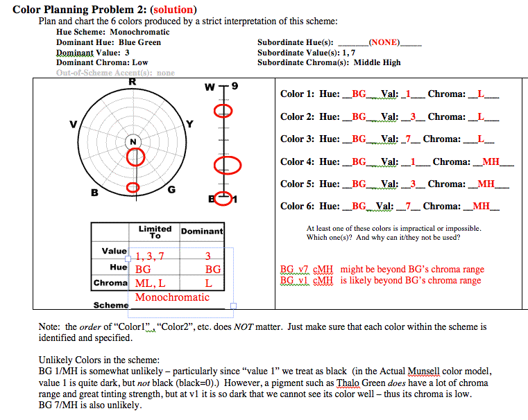
Our color scheme charting system is based on Ellinger's work and is his model for planning color schemes. Thus, if you know how to chart color schemes, you are well on your way to planning schemes based on color relationships — we basically do the same thing, but in reverse order.

The rationale:
Designers select colors for effect — for the viewer's experience, not for theoretical or structural neatness. That said, what does the viewer look for? Or, what might the viewer respond to?

The answer posed by Ellinger is that we respond to relationships among colors. We see one color in the context of its neighbors, not alone — color is thus always a community affair — it is the neighborhood, not the individual color that matters most.

Further, the human mind is an order-seeking engine — we search for patterns and seem to respond to patterns — we "read" relationships of both similarity and of contrast. Color design strategies need to respond to this condition.
We here aim to select colors according to visual relationships — we aim to select a palette of colors which offer both adequate relatedness and adequate contrast to satisfy the viewer, as well as the expressive intent of the designer.

Artists and designers recognize that color design involves narrowing the vast array of possible colors down to a small set of manageable, expressive and harmonious colors — we often resort to a limited palette.

Color design has long recognized that a limited palette of hues works well. Our traditional hues schemes (monochromatic, analogous, complementary, triadic, etc.) suggest basic guidelines for hue selection. Very few distinct hues are used in most traditional limited palettes.

Value and Chroma are generally unrecognized aspects of palette selection. Ellinger addresses them.

In theory, each scheme should have well-established dominances — a dominant hue, a dominant value and a dominant chroma will serve to unify the composition. These dominances provide the foundation of the color design.
All colors outside the dominances will offer contrast, variety and energy.
The degree* and quantity** of contrast offered influences the emotional drama of the design. Thus, in order to control (or influence) visual drama, a design needs to establish colors to react against — something to contrast with. Dominances provide this.
(we can also give attention to dominant contrasts — is the image "built on" strong, bold contrasts, or on soft subtle contrasts. This depends both on the range of color used, and on the juxapositions arranged within the design, and the character of the transitiions between colors.)

The concept of "dominance" is a matter of proportion — just how much of "this" is there compared to how much there is of everything else? How much space, or presence, of one color is there compared to another? Dominant traits establish the visual foundation — the visual ground against which other colors interact. As Chevreul discovered, and the Bezold effect exploits, context matters. The dominant color might be considered the color key of a design — similar to a musical composition's key. Everything else relates to that.

*By "degree of contrast" we mean the severity of contrast.
For instance, do prevalent juxtapositions of color involve vast differences in value...in hue...or in chroma? These tend to be bold, dynamic and energetic -- and potentially chaotic or disruptive to the composition.
Are prevalent juxtapositions subtle — between close or similar colors? These are calming contrasts, subduing the energy of the composition.
We might also talk about the "intervals of value" (or of hue...or chroma). When neighboring areas of color are vastly different in value, the interval between them is great — thus, the degree of contrast is high.

** By "distribution of contrast" we mean the prevalence or frequency of contrasting edges, shapes and colors.
A composition with very few breaks or divisions in color might be said to have strong "color massing" or, often, "value massing". Such compositions have more limited edges of contrast -- or, a small quantity of contrast.
A composition that is filled with pattern and details and fragmented color would have a high distribution of contrast. Contrast can be everywhere -- which is potentially disruptive and cluttersome, but can also offer an appealing energy or it may enable pattern itself to be a dynamic in the work (see Gustav Klimt's work). Color can also be massed so that there are very few contours along which bold contrasts occur. (see Marc Rothko, or any of the color field painters)


What difference do these choices make?

(dominances, subordinates, proportions, intervals)

The only differences that really matter are those that influence the experience of the viewer — real-world, user impact.
The rest is expendible — maybe.

Dominant value and mood: Black/very dark: deep, "dark mood", somber, sometimes evil, often stark, shadowy, obscure, undefined... Visually, a very dark design can have no dark accents -- that is, there is nothing darker than black, so there is no way to introduce dark-contrast graphics. However, there can be a large range of light-contrasts (colors that are light-on-dark; light figures on dark grounds). There can be extreme contrasts of light-white colors against the dark ground, and there can be subtle light-contrasts (say, a value 3 figure on a value 1 ground). This range of intense and subtle contrast can be usefuly for dramatic effect.

Dominant chroma and mood: High chroma tends to be exciting, playful

Dominant hues and mood: The dominant hue is arguably as important as the dominant value...for a colorist, sometimes moreso.

Subtle contrasts and mood: (narrow intervals)

Bold contrasts and mood: (extreme intervals)

Equal proportions: (tension and irresolution)

Similar proportions: (moderate dominates)

Disparate proportions: (overwhelming dominances)

Hue Purity (complement mixes versus pure-hue coloration): complement mixes offer a sort of mature (?), mingling and interaction between colors. Pure hues are simpler, more clarified, and, sometimes, more childlike.

Primary-vs.-Secondary-vs.-Off-Primary Hues: "Jewel colors" tend to be off-primary or secondary, intense chroma mingled with lower, but pure colors. Primaries read as simpler, more childlike and innocent, more playful.

Color Massing vs. fragmentation

Flat color (fully mixed) vs. partial mixes

Glaze vs Opaque:

Transparent vs. Opaque Pigment:


Articles and Links

Glossary | Color Theory Assignments | Course Schedule |


Greg Clayton
2D Design
Color Theory

Back

 
Photography Course
 
Course Schedule
Course Schedule
 
Independent Study