QD: Personal Mark

Art 160 / Greg Clayton

Create a personal logo, mark or signature.

This project is a quick jump into deep water.
Don't worry.
It's not too deep.

Some artists have dynamic and distinctive signatures.
Corporations brand themselves with identifying logos.
Many products and product lines are branded with a unique mark.
And, of course, cattle ranchers brand their cattle with brands.

Simple graphic marks declare that one and only one source created something.     "I did this!"

Your job is to explore a variety of concepts and to create a simple, bold graphic mark that expresses you.

Problem Statement       

Quick Design: Personal Identifying LOGO, MARK or SYMBOL

— lf you were to "sign" each of your designs with just one "mark", what would it be?

Requirements and Limitations (the short version)

Media: Any.

Colors:   3 — black, white, and 1 other color of your choosing.

Size:  6" square field     

Presentation:  Mount your design on an 8”x8” neutral-colored board.      

Label your Work: Mount a nicely crafted self-identifying label on the back of your board.

Concept Statement: Mount a brief concept statement on the back of your board. (50 words max.)

Concept Sketches: minimum 30 sketches: 10 line- 10 shape- 10 texture-dominated ideas.

Requirements and Limitations (extended details)

Media: Any available and familiar medium, whether drawn, painted or mounted on paper/board.
Use whatever you're comfortable with. Likely options are pencil for early concept sketches and marker for final design. However, you could use cut paper, fabric or cgi.

Colors:   Use black (dense, solid  & dark), white, and 1 color of your choosing.
This includes the ground (or background... the paper... that is, the background IS one of your colors) -- 3 colors max.

Size:  6" square field     
The visual field of a design or artwork is simply the space that the design fits into — it is the page or background into which the design will be placed.
Your mark does not have to be square, but it should fill most of the space within this square, whatever your mark's outer shape. We'll explore balance between positive and negative space as well as the balance between figure and field. For now, fill the space well...comfortably...not too crowded, not too vacant.


Presentation:  Mount your design on an 8”x8” neutral-colored board.      
When presenting your designs, clean up distractions and flaws...make sure ragged edges, unbalanced placements, glue stains and guidelines are taken care of. Presentatation communicates how much you care about your own work — and if you show that you don't care, why should the client (or teacher)?

Label your Work: Mount a nicely crafted label on the back of your board.
This identifying label should include (at least) your name and email.
A label is more than a quick signature on a corner of the board. A presentation's label represents you to your cients and potential clients. In professional practice you'll likely design a printed label for ongoing use.
For now, make sure your name is clean, legible and intentional -- make it look like you're proud of the work that you are labeling. As a standard practice, include essential contact info on your label — clients who admire your work need to be able to get in touch with you easily. For now, include your email address on your label.
All of the work that you create and turn in this semester should be labeled.
Note: Never expect a client or a professor to take time to chase down a design's author. After all, if the designer didn't care enough to claim her work, why should the client/professor care?
ergo: always label your work clearly and professionally.

Include a Concept Statement: Mount a brief concept statement on the back of your board. (50 words max.)
We'll discuss concept statements during upcoming classes.
For now, just describe the traits, qualities or characteristics that you would like for your mark to express. What do you want this graphic mark to tell others about you? What impression should it make?

Concept Sketches: Generate lots of ideas. (minimum: 10 line/10 shape/10 texture)
Get your pencil/pen/marker moving and explore lots of alternatives.
See notes below on
— 10 line-dominated sketches/concepts, plus
— 10 shape-dominated sketches/concepts, plus
— 10 texture-dominated sketches/concepts.
Keep these sketches in your (required-for-this-course) sketchbook. You don't need to cut them out or mount them -- when we look at sketches, we'll just open our sketchbooks.


Note: bonus points if you can look like your mark on the day you present it.


Goals:  Simplicity & clarity & distinctive self-identity count.
Aim for a bold, clear, simple graphic that expresses you and only you. (could it be a single shape or letterform?  ...a single stroke?)

Aim to balance positive and negative space — in practice, make your marks/shapes/strokes wide and heavy so that the "white space" of the paper doesn't overwhelm your design, but not so bold that your design overwhelms the field. Both figure and ground are important to visual perception, thus, while you sketch and design, pay attention to whether positive forms are overwhelming background, negative form, or whether the opposite is happening.

Consider what "graphic element" might dominate each of your designs.
Your textbook has chapters on several "Visual Elements" — the basic "things" that make up any visual form.
Chapters 7, 8 & 9 Explore Line, Shape and Texture. Skim those chapters, especially explore images of artworks that exploit particular visual elements. Look for the traits of a design that is dominated by active lines, or dominated by well-defined shapes, or dominated by prominent textures.
Later on, we'll talk about each of the elements and principles of visual design (each chapter of your text discusses at least one of these) A basic design strategy involves selecting one element and letting it play a commanding, dominating role. That helps to unify a design and give it a more forceful voice.
For instance, explore Shape, and Line and Texture.
In several design concepts, you might let shape dominate your design — use bold, simple, broad shapes along with strong light-dark contrast to produce a graphic that jumps out at a distance.
Also explore what you can do with line and texture — you might have a great idea with one of them.


Process & Concept Development

      Content Concept: explore how to express you in a simple graphic

      1. Explore your own traits and graphic preferences...what look is you? ...and what traits are not you?
      2. Become aware of graphic concepts that influence the mood, feelings, connotatons and ideas felt.
      3. Concieve, refine and create a simple graphic that reflects you. Dive in and sketch. The only bad sketch is the one not drawn.
      4. Explore many variations. Set them side-by-side and work to see the different effects that each evoke. Which is best? Why?
      5. Become more aware of the expressive and graphic qualities of line, shape and texture. How might line express you?
      6. Get to know the problem boundaries and goals. (read the stuff above until the ideas are in your head)
      7. Basic presentation skill: mount your design on board, usually with consistent, even border.


      Graphic Concepts: explore Line, Shape & Texture as dominating traits

      — Generate sketches/ideas for 10 ideas that emphasize line.
      Play with ideas in which line is a dominating graphic element. In order to unify a design, there needs to be repeated use of similar traits. Explore what you can do with line...flowing...jagged...geometric....vertical/horizontal only. There are endless options. Explore.

      — Generate sketches for 10 ideas that emphasize shape.
      Explore what bold shapes, and, especially, negative shapes*, can do — discover how visually expressive and how graphically emphatic, bold shape can be.
      *negative shapes are, generally, the leftover shapes inside of shapes -- the "background" shapes that are created in between the "positive" shapes.

      — Generate sketches for 10 ideas that emphasize texture.
      Explore what prominent texture can do. You might try using several textures in the same design. You might try using a medium that lends itself to textural marks (charcoal...drybrushed ink...pastel...marker on textured paper)

      NOTE: Have these sketches with you, in class.

Suggestions & Notes

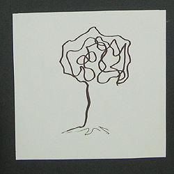
Explore your text's chapters on Line, on Shape and on Texture.
Get familiar with designs that are driven by line, dominated by shape, or rich in texture.
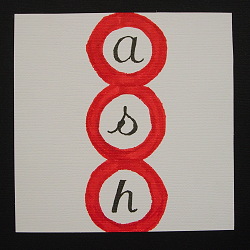
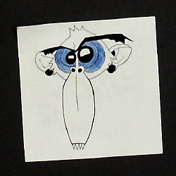
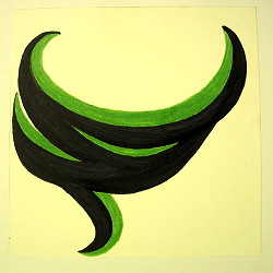
Any and every design needs to have an active player — a sort of lead actor that draws most of the attention, generates much of the energy, and unifies the whole. That dominating visual element is a key part of a graphic concept.
In your mark designs, you'll generate line-dominated ideas, shape-dominated ideas and then some texture-dominated ideas.

Listen to some podcasts on Logo design and development: Logo

Getting Started:
Sketch lots of ideas...quickly.
There is no "right" answer to this problem. But there are good, better and excellent solutions. Search for them!

Give yourself lots of options — require yourself to create 20 possibilities in 10 minutes. (really...you can do it.)
Then step back and see which ones seem more "right" than the others. Then create more variations based on the ideas that your eyes tell you are best (you have to see your ideas on paper to really evaluate what's working. Do not try to select your best ideas until you've sketched them onto paper — that's a common beginning-designer's problem.)
Refine, combine, revise form as needed.
Take your OK ideas, and make good ideas. Revise your good idea until it is really impressive!
Then clean up one concept as best possible, and prepare it for presentation.

Concept, Form and Craft are all required — generally in that order. Remember that your idea is more important than your skill...but push your crafstmanship as far as you can in the short time you have to complete this. In strong solutions, concept trumps craft, but craft conveys concept.

Likely materials: markers, pen, computer (Illustrator, Autocad, etc.), charcoal, acrylic paint.

Typographic Aid:
If your design is based on existing typefaces, try using your computer (or the Art Dept's Mac Lab...its open to you most of the time, except for scheduled classes in the lab). You can select from hundreds of typefaces. Enlarge type to any size you want. Then print out samples and trace over them. (Tracing is not cheating...its a time-saver.)

A Possible Final Drawing Process:
Start on Paper: Work on paper with light pencil. Draw a light 6"x6" square as a visual reference of the outer boundaries.
If you are transfering a design from a thumbnail sketch, it is often best to draw the design afresh—this lets you revise and refine while you enlarge. But you can directly enlarge and trace the thumbnail. ( photocopiers and computer scanners/software will let you scale up your image.)
(tracing paper or a light table (room 202) is a handy way to transfer a design)

Lightly Refine:
Refine your idea in pencil...start with your hardest pencii (2B or HB) making light lines.

Firm up and Darken:
Then build up to slightly darker, more definite contours.

Ink the Contours:
Once you're pretty sure where you want things, get your fine pen out and trace the contour.

Fill Solid Shapes:
Then fill in any solid areas with a broad marker or paint.

Erase Stray Pencil Marks:
After the ink has dried, you can erase the soft pencil lines without disturbing the ink lines. (lightly rub with your kneaded eraser)


Mounting: "neutral board"

Most visual design presentations need to be mounted on some sort of supporting board or backing. This support allows you to display your design without it falling over. (which is very distracting) The presentation board also provides a bit of a visual border or margin — like framing a picture — which is graphically helpful because it isolates your design from the rest of the visual field.

"neutral" — white, black or gray.
Most presentations should be on boards that do not compete with the colors within the design. Neutrals are the safe solutions — until you get more familiar with selecting colors that successfully relate to and enhance colors within your presentation.

"board" — in this class, when I specify a backing as "board", I'm saying you can use almost any reasonably rigid board available — as long as it can be trimmed neatly and it offers the simple, clean, neutral color noted above. Note that "trimmed neatly" matters -- in presentations, craft matters. It matters because sloppy presentations distract from the design, and sloppiness communicates that you don't care about your design. Clients notice. If you don't care to present your design well, they'll assume that they shouldn't care much for your design either.

Where to get backing boards?
For small assignments — like this one — look for scraps of matboard near the mat cutters in the Art building. (Art 223, Art 201, Art 211) Usually there are (un-named, un-labeled) left-overs nearby that can be used.

Your options (from cheapest to most expensive):
poster board ( similar to: bristol board, tag board, railroad board) — really cheap (<$1 per sheet); rather flimsy; comes in both dull colors and gaudy colors. ( Options )

card stock — available at print shops, possibly some at the HUB and Staples. Many colors, but most colors won't be in stock. Usually has a nice glossy coat that takes ink/markers well (but not pencil or charcoal — the surface is too smooth).
Media Center (in the HU Library) will carry letter (8.5" x 11") and tabloid ( 11" x 17") sizes in several colors, available by single sheets. Most are inexpensive.

Foam core/Foam board — HUB, Tillet's. Has styrofoam in the middle, with two sheets of glossy paper on the outside. Usually white...though black and a few colors can be found. Fairly expensive but nicely rigid. Generally too thick for portfolio use (though a well-stocked retailer will have various thicknesses). Surface is not really ideal for presentations, but other papers can be mounted onto it.
( Color etc. | White )

mat board — HUB, Tillet's. Tough and pretty rigid/strong. Many colors available. Color is on one layer of nice paper on top of a thick core of white or off-white stock. (though Black Core is available) Fairly expensive ($7+ for 32" x 40" sheet)
(Dick Blick: Many Options | Cresent Regular )

presentation board (Solid Core black mat board) — HUB, Tillet's. Solid black all the way through. Often preferred by graphic designers and photographers for presentation or portfolio mounting. Actually, black is just one color of many offered with a black core. Fairly expensive ($7+ for 32" x 40" sheet)
(Often, the Art Dept office sells boards cut down to Interior Design portfolio size — 18"x24" )


Label Your Work:
Complete your project by adding a self-identifying label, including your name and email address.
A complete project label might include:

a) course number/title, (e.g. Art 200/2D Design)
b) project name,
c) date and
d) your H-number (req'd for Interior Design students)
e)
Name*

You might also add contact information.
This is not usually needed for class assignments, but its an important professional habit — every design you hand to someone else should have information that
a) identifies you as the owner/creator and
b) enables them to contact you.


Thus:
f) email address*
g) phone number (optional)

*On this first quick design, only Name & Email are required, but feel free to design a label for ongoing use. You can store it on your computer or photocopy it in order to use it later...just leave blanks for b) & c).


Protect Your Work:
Though not required on this most projects, it is often smart to add an overlay — a sheet of paper or plastic that covers and protects your design from spills and smears. You'll need a sheet of paper that is slightly taller than your mounting board. Lay the overlay on the front of your board and fold the excess length over the top. Tape the wrap-around portion to the back of your board. Thus you can protect your work, but easily fold the overlay out of the way to display your design.
Note: any time your image is a delicate medium (i.e. pencil, charcoal or pastel...media that easily rub off) you should...
a) consider a coat of fixative, sealer or varnish and/or
b) add an overlay.

Examples of Artist Marks

Paul Pitt — a.k.a. Coyote Clay (Harding's Ceramics, Drawing and Sculpture professor)

Mr. Pitt's hand carved and decorated flutes each have his distinctive mark burned into them: mark on flute (photo on right); mark as a web icon (top center)

Albrecht Durer (early 16th c. Northern Renaissance graphic artist (printmaker), painter)

Durer's monogram-mark.
Bio and artworks: Wikipedia ABCGallery
If you don't know Durer's name, you know at least one of his works...duplicated and copied thousands of times in art and religious decoratives. Durer was one of the earliest western artists to actually sign and identify his work — works before this time were usually unsigned. See his A-D mark near lower right corner of engraving. See bottom center. Self-Portrait with mark upper left. Upper right. Upper Right. Rhino-upper right.

Other

Monograms are a particular kind of identifying mark — the letters of the artist's name are graphically combined into a distinctive design.
Artist's Monograms.

Bronze casting with monogram (either sculptor's or foundry mark)

Signatures are, in themselves, a kind of graphic mark. Discussion of artsts' signatures. Collection of artist signatures.

Corporate Logos: examples (how many of these would "fit" this project's limitations?

Samples


Glossary | |


Greg Clayton
2D Design
Color Theory

Back

 
Photography Course
 
Course Schedule
Course Schedule
 
Independent Study
 
               © 2017 Greg Clayton/ gclayton@harding.edu