Exam 1 — Sample Quiz Answers

Art 260 / Greg Clayton

If you've not tried the quiz, go back here, download the quiz and give it a try.

Then come here and check your results.


Questions & Answers

1. The hues Red, Yellow and Orange are generally considered to be …
a. Neutral colors                             b. Complementary colors                    c. Cool
d. Warm                                          e. High chroma colors

d. Warm


2. When some colorA is mixed with a little of its complement, the result will be that…
a. …the mixed color is a true neutral.                             b. …the mixture’s chroma is lowered.
c. …the mixed color is a tertiary color.                           d. …the mixture’s value is higher.
e. All of the above.                      

The only certain outcome is that the chroma of colorA will be lowered.
A. ...a true neutral... No. Not if only a little of ColorA's complement is mixed in.
D. ...value is higher... Only in a few special cases (a bit of yellow added to Violet) might this occur. But even then, subtractive color issues will tend to produce a darkening.
C. ...tertiary color... Tertiary is a hue trait that won't be changed by mixing in a bit of a complement. Or course, in those cases where colorA is a tertiary color, (e.g. Yellow-Green), it will stay a tertiary color until so much of its complement is added that it becomes a neutral.


3. Night vision depends primarily upon…
a. rods.                                        b.  cones                        c. the fovia
d. peripheral vision                        e. a full moon

Rods are your friend in low light. Your cones won't help you.
Your fovias are optimized for day-light vision in their centers, and have good night vision just outside that center.
Well, yes, a full moon helps.


4. A stained glass window alters the color of incident (incoming) light primarily by …
a)     …refraction.                         b)   …reflection.                               c)    …absorption.
d)     …transmission.                     e)    …addition.

Absorption is the process that actually turns sunlight into red light. More specifically here, the pigments in stained glass window selectively absorb some colors of incoming light, while allow other colors to pass through (transmit) the glass.

5. Standing inside Notre Dame Cathedral, in Paris, you see the red, blue and gold stained glass.  The colors that you see are…
a)…colors created by refraction.      b)…colors created by reflection.           
c)…light that has been absorbed.    d)…light that has been transmitted.       e) …colors created by “additive color”.

See note above. We see the light that makes it all the way through the glass — light that transmitted.


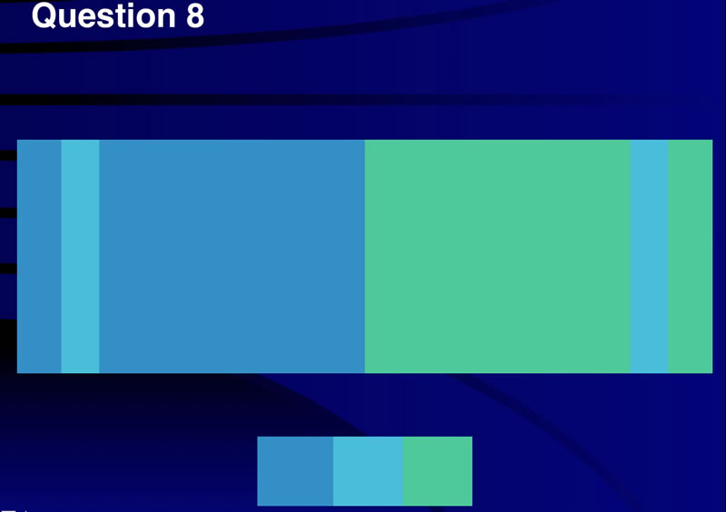
6. Analogous colors…
a. May help create color harmony                       b. Are hues without a common parent
c. Help establish bold contrast and variety            d. Are next to each other on the color wheel
e. A and D

D is clearly true ... by definition analogous colors have hues that lie close to each other on the color wheel.
A is also true in that harmonies are, in fact, easily built using color that have a great deal in common. Analogous hues are very similar visually and have at least one shared "parent hue" among them ... and often two.


7. The phenomena of color afterimage is also known as…
a. Successive contrast               b. Simultaneous contrast   c. Color constancy
d. Idopsin exhaustion                     e. Color blindness


Question 8

      In this slide, two samples of the same blue-green color appear to be quite different colors.  This perception is due to the phenomena of…
      a. Successive contrast                   
      b. Simultaneous contrast  
      c. Color constancy
      d. Rhodopsin exhaustion       
      e. Color blindness

      B. Simultaneous Contrast

      Successive contrast occurs when you stare at one color or pattern for a while, then look away and see the hue-opposite color or pattern. (as in the Jasper Johns flag example.)

      rhodopsin exhaustion is when you burn out your (non-hue-distinguishing) night vision — when your Rods are exhausted. (LIke right now.)

Question 9

All of the outlined colors are Low in Chroma.

The colors vary in value, from high to low.

The colors vary in hue -- orange on the left, and violet on the right.

Question 10

Mix color "A" with color "2" to get the richest, and most easy-to-control color "1".

Why?
Straight-Line Mixing Method.

Why not B? Both colors A and B are on a straight line with #2, so be should work OK.
But ClrB is farther, and ClrA is closer to the color you are trying to mix. Thus you can potentially mix a higher chroma color "1" AND the proportions of Clr2 and ClrA will be less finicky.

What about both ClrC and ClrD?
You can mix them to get a color somewhere between Clr1 and ClrA. That would work, but its also more work to get it just as you want it to be. In practice, look for the simplest mixture that will "hit" the hue, and keep Chroma high.

Question 11

Chroma!

The valus of each of the 7 samples is very close. The hues are all orange, though simultaneous contrast "encourages" the leftmost samples to take on a blueish quality... but they are still orange.

So, the only thing changing dramatically is Chroma.

On the left are very low chroma samples -- almost gray.

On the right is a rich chroma sample.

Question 12: Color Charting

Monet's Impression Sunrise is the painting that originally prompted the term "Impressionism" — which was not intended as a compliment.
How times change.

This painting look remarkably different on various web sites and in various books.
The original is, frankly, more violet and delicate than the image I have here. Whenever images have relatively low chroma, reliable process printing or digital scans can be difficult.

See comments on Monet's choice of the color, and value of the sun.

WikiP | Background on the painting

Hues: Blues (and subtle variations) and Red-Orange (again, with some variations)

Values:As with many watercolor paintings, the white of the paper plays a major role. Here thin washes allow light values to dominate.
(on the other hand, the more I look at this version of the image, the more mid-tone I see. So if you charted more value-5 and less value-8, I'd not argue.)
The two dark boats in the foreground appear virtually black. In fact they are a dark blue. Whichever way you chart them is fine. (unless you're in Paris looking at the original painting...then you'd better see the rich, deep blue.)

Chromas:Most of the painting is fairly subdued in chroma. Monet preserves rich accents of color, particularly for the sun.

Limitations and Dominances: In the limitations, list every color trait that is used. In the Dominant column, look for the largest circles in your chart.

Scheme: This is a pretty straightforward complementary scheme.
The blues actually wander a bit from BBG to Blue to Violet. The oranges also wander from Y to YO to RO.

Question 13: Color Charting

This interior can be tricky to chart because you've got to keep local color separate from atmospheric color. You might be tempted to chart the local color of the carpet, ceiling and woodwork. However, chart what you see in the image — chart it as though you were charting a painting.

Why?
When we design, we design user experiences. The colors and shadows, and their rich or subdued colors, are a part of the planned experience. Lighting and shadows, and their effects, are just as much "the design" as are materials and finishes.

Hues: The main hues are the red of the carpet, and the yellows of the golden altar screen and the woodwork.

Chroma: Many of the colors are surfaces in shadow — darker and lower in chroma than their local colors. Thus, there are a lot of Middle-Low and Low Chroma surfaces.

Value: Because of shadow play, much of this view is fairly dark. (I think the value-8 circle needs to be bigger...the far wall and pew seats, etc. offer more light than is here noted.)

Limitations/Dominances: I've labeled the hues "RRV" (Red-Red-Violet) and "YYO" (Yellow-Yellow-Orange), but you may chart them more simply as R and Y and be pretty close.
Note that the dominances reflect the traits whereever the chart shows the largest circles, or clusters of circles.

The Scheme: Traditionally analgous schemes "prefer" to have more than two hues, but there are several intermediary YO and Orange hues due to reflected light. In any case, Analogous appears the best choice.


Glossary | Color Theory Assignments | Color Theory Course Home | Greg Clayton HU Home