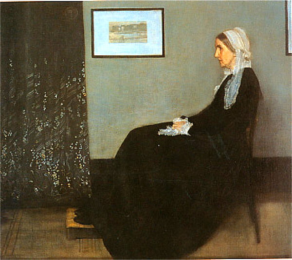
James McNeill Whistler
Arrangement in Grey and Black: The Artist's Mother (a.k.a. "Whistler's Mother")
1871, Oil on canvas
57 in x 64 in
Location: Musée d'Orsay, Paris
The Painting | Commentary Musee d'Orsay |
Dominating Traits:
Flat Shape and Straight Line: the entire image is reduced to simple shapes and edges/lines -- mostly geometric and straight edges. Mostly rectilinear (vertical and horizontal), though a few stiff diagonals occur.
Character of Line: straight, geometric, mostly vertical or horizontal. Edges tend to be fairly clean and sharp -- well-defined (not blurred, vague or faded)
Texture: most of the image is has simple, clean and fairly constant, lightly textured surfaces -- in general textures are subdued so that flat shapes "take over". The drape, to the left, has a prominent texture, but it is the anomaly.
Color: As the title says, its a composition in Black and Grey -- thus, neutrals dominate. Only scarce, warm flesh tones provide contrast (anomaly), otherwise, the color palette is limited to neutrals or very-near neutrals.
Value: Dark tone dominates. Mid-tones cover the wall, and the few light values are subordinate, and thus prominent and focal.
Shapes: The entire, careful composition is built around rectangle -- with few deviations from them. Whistler arranges his point of view staring directly at the wall -- thus the wall is rendered parallel to the picture plane. So the curtains and pictures on the wall project as prefectly squared rectangles -- flattening and stiffening the composition.
Only the sitting woman departs from rectangles -- but her shape is hardly soft and gentle, but is a heavy, sluggish mass, with simple swollen edges. The shapes of, and around her hands and head break of the rectangular geometry and also the hard edges -- these are areas have irregular shapes, delicate textures, and more obscure or textured boundaries -- in contrast to the composition's norm.
3D Space: Depth is orgaized into two distinct but shallow layers or planes -- the foreground woman and chair, and the nearby wall, behind her. This is a very contained and shallow stage -- stiff, and almost oppressive.
2D Space/ Picture Plane/Proportions: The picture plane is neatly divided into three regions -- the left-most rectangle (mostly curtain). Second, the dark floor below -- broken by the woman. And third, the lighter upper right wall. This area is further divided by the woman and the two framed pictures -- rectangles -- on the wall.
The background shape has almost the same proportions as the overall picture field. The woman's head has roughly the same proportions, though vertical. The implied rectangle from the prominent corner (lower left of med-gray wall) to the sitter's head repeat the same proportions. Thus Whistler creates a rhythm of not only rectangles, but also proportions.
Direction: the emphasis is on horizontal motion and edges — forms that seem to cylcle around the woman's form, converging on her and migrating diagonally towards her head.
Contrast: Most contrasts are of mid-gray against darker grays -- thus the dominant contrasts are quite somber and subdued. However, the pictures on the wall, and the hands and face pose much more pronounced contrast.
Quality of Energy/Dynamism/Motion: The composition is decidely still and stiff, with only sluggish movement building towards the sitter's head. The pattern on the curtains is lively -- almost an imaginary realm that the sitter looks to and ponders in her stillness.
The content of the work seems anchored in this sluggish and uninspirring movement — this woman does not seem fun or lively. But her warm flesh tones and the dancing pattern on the curtain -- her focus point -- give us hope of an inner life of some sort.
Order/Allignment/Pattern: This is a carefully structured composition — it is more of an analytic composition than it is a portrait. The arrangement and proportions of rectangles already noted build a slow rhythm. However, other forms are carefully connected and alligned.
The left and the right framed picture align with the woman's head -- the base of her nose aligning with the bottom of both pictures. The proportions of the spacing between may echo the propotions of the composition's dominating rectangles.
The head, hands and wooden platform (beneath her feet) are aligned -- separated by a similar proportional distribution.
Note also how the shape and arrangement of the hands and cuffs loosely echo the shape and pattern of her entire figure and head.
Note the prominent diagonal pattern in the curtain -- it echoes the angle of the axis of the woman's figure.
(look for alignments, structures or groupings that organize parts into larger entities (gestalt))
(look for contrast of any and every kind. Look especially for similar forms that are varied in some way. Look for anomalies — patterns or norms that are broken. Look for disorder, movement and dynamism.)
This predominantly static, still composition is enlivened by its few anomalies —
The less stiff, non-rectangular shape of the woman, and, particulalry her head, scarf and hands.
The notably warm color of her flesh against the neutral grays.
The bold value contrast around her hands & head.
The very bold value contrast, and particularly sharp edges along the frame pictures on the wall.
The varied sizes of the rectangles -- varied forms using the same proportions -- creates a subtle, but present, rhythm.
The diagonal axis of the figure, emphasized by the feet - hands - head alignment.
The lively texture/pattern on the left-side curtain. It feels like a virtual starry night compared to the stiff contrasts and non-pattern elsewhere.
Describe the forms that contribute to their graphic emphasis?
The woman's figure is a general area of interest, though the head area and hands are most prominent.
Their non-rectangular shape, their warmer color, their varied textures, richer value contrasts and their identity as human features in a geometric, man-made context all contribute to our attention to them. They are somewhat central, lying on a diagonal from lower-left to upper-right of the picture plane
Both the feet and the head are aligned with other prominent features.
The feet are aligned with major horizontal and vertical edges -- their directional quality enhancing attention to the feet.
The head is alighned with the sharpest edges and contrasts in the composition -- the edges of the picture frames on the wall.
The prominent (sharp-edged, extended) line of the sitter's body, along the upper-left edge, leads us directly to the sitter's head. Note how crisp and prominent this edge is compared to the edge along the opposite side of the body -- the lower-right edges are blurred and dark.
The curtain to the left is a focal area.
It is has the most dynamic surface pattern -- it has undulating folds expressed through simple modeling of deep folds, and through variations in surface pattern. The pattern itself has striking value contrast, scattering starburst-like flecks across the surface. There is a (anomolous) diagonal pattern nearer the middle of the curtain. The sitter directs her gaze directly at this area -- thus drawing our attention to it and suggesting that her thoughts and inner world may well be more lively than her proper posture would suggest.
The pictures and frames themselves are prominent for their bold contrasts and sharp edges. These break up potentially sparse expanses and reinforce the sitter's head. (proportions/placement of them?)
Most of Whistler's composition offers restrained, carefully controlled relief that thereby supports the few and generally subtle focal areas.
Textures, colors and contrasts are generally subdued, except in the focal areas noted above.
The mass of the woman's dress is a dense, largely constant black.
James Abbott McNeill Whistler: Wikipedia | Artchive | Artcyclopedia | ArtNet |