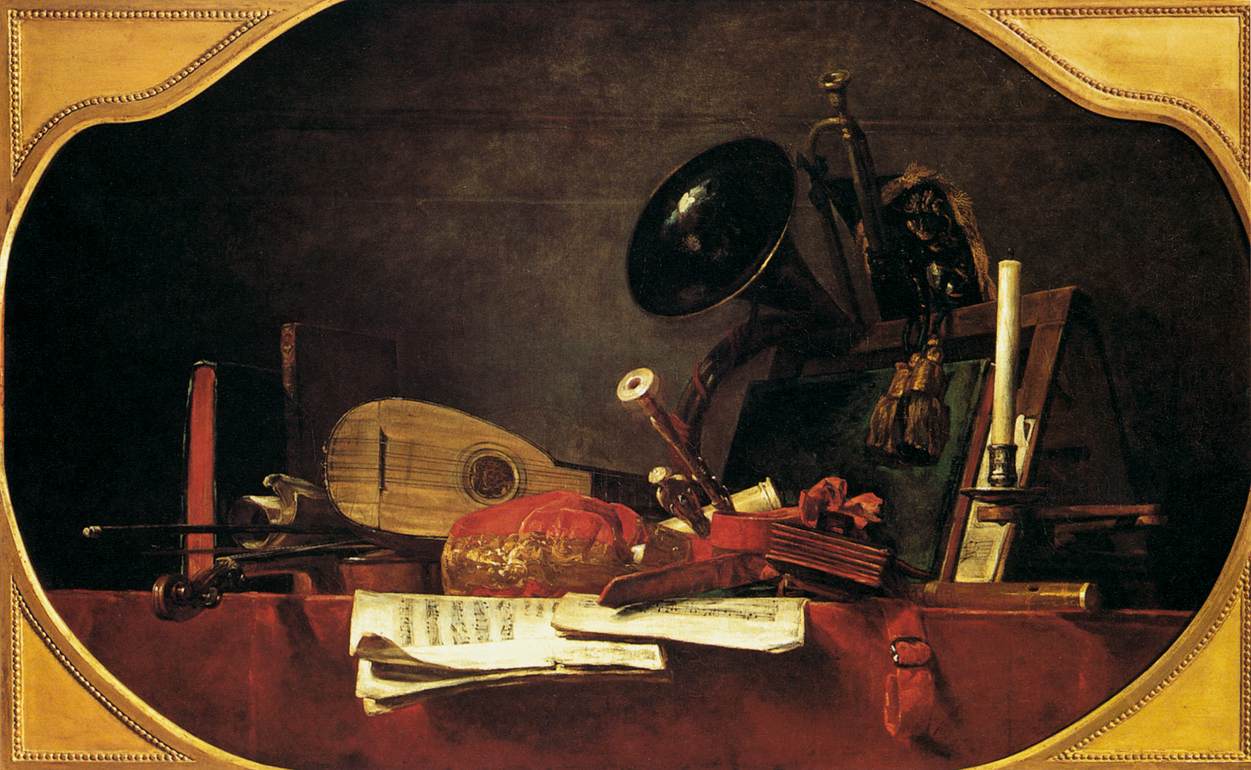
Artist: Jean-Baptist-Simeon Chardin
Painting: The Attributes of Music
Location: Musée Du Louvre, Paris, France
Dimensions: 57.09 inch wide x 35.83 inch high
Jean-Baptist-Simeon Chardin: The Complete Works |
"This overdoor painting - together with the Attributes of Art (Louvre) and Attributes of Sciences (untraced) - was commissioned for the royal château of Choisy. This emblematic canvas has a sense of composition that would impress the cubists." from WGA
In a still life composition, you can be sure that the composition was very carefully arranged -- every ordinary object was chosen carefully, positioned carefully in relation to its neighboring forms, and illuminated carefully for contrast and emphasis. The artist will arrange and rearrange objects until there are connections between forms and rhythms between colors, between textures, between shapes, between directions, etc.
See if you can see how Chardin visually connected the parts into a whole.
(look for elements and traits that repeatedly appear)
Look at the vertical features that "frame" the compostion. On the left is a rich red vertical (edge of a book) against dark black. On the right is well-illuminated white candle against dark forms. These two act almost as a frame or bracket for the compostion. These are needed, in part, because the shape of this painting over a doorway is not the typical rectangle.
Colors are limited to (near)black, reds, yellows and green. The yellows and greens are understated -- generally low chroma while the red can be pretty vibrant against the near-blacks.
(look for alignments, structures or groupings that organize parts into larger entities (gestalt))
Look especially, here, for forms that break out -- break out of confines that have been set up.
What "breaks" out of the "side walls"?
What break forward, almost out of the picture plane?
(look for contrast of any and every kind. Look especially for similar forms that are varied in some way. Look for anomalies — patterns or norms that are broken.)
Brilliant chroma.
Bold value contrast.
Organic versus rectilinear.
Smooth or geometric rounded forms versus irregular, even lumpy rounded forms.
Near-versus-far
Sharp/focus versus blurred/obscured.
Flat vs. 3D:
Describe the forms that contribute to their graphic emphasis?
The large, essentially empty and undisturbed, dark background is the essential relief area.
The foreground's table cloth (or edge of a shelf)
The background is bounds the image space, while the plane of the table cloth is penetrated -- sheet music, the violin's neck and the strap on the right all thrust forward, breaking past the frontal plane, via tromp l'oeil tactics these forms invade the viewer's space.