George Tooker (b. 1920)
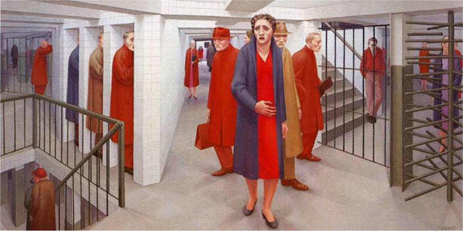
The Subway
George Tooker: Biography | Collection | WikiP | ArtNet | ArtCyclopedia | Tooker, Subway. (img)
(look for elements and traits that repeatedly appear)
the composition is dominated by ...
...
hard, crisp edges, in sharp focus
...by strait lines/edges
...by diagonals (there are verticals as well, but they feel common and expected, while all of the diagonals
...by neutral colors... mostly grays and some beiges
...lots of standing figues (some walk, some lean, but generally, stait, vertical figures in tight masses (i.e. nobody is reaching out)
...surface textures are quite smooth and clean, even flat.
(look for alignments, structures or groupings that organize parts into larger entities (gestalt))
The familiar presented in a very unfamiliar or awkward way.
This is a correctly-rendered perspective view of believable space. At first glance if feels "right" or "correct".
However, the space is made odd or eery by...
...a very low ceiling. It is almost oppressively low.
...there are no windows or obvious exits. Passage lead away, but we really don't know where they go. There is a sense of being trapped or lost.
...the men, sometimes described as "creepers" feel ominous -- they wear long coats. You don't see their hands -- not what's in their hands and not what their hands are doing or preparing to do. The men look very much the same. They do vary, but very little.
...the men seem to dominate. Only on close inspection do we begin to notice the other women. Initially, the central woman appears, and feels, very much alone in a threatening environment.
(look for contrast of any and every kind. Look especially for similar forms that are varied in some way. Look for anomalies — patterns or norms that are broken.)
The diagonals themselves, though unifying, are both graphically dynamic and varied in direction, length and boldness.
Color and value:
The neutrals build up to tans, then to browns, then red-browns and finally bold red.
Describe the forms that contribute to their graphic emphasis?
. The well-centered woman is clearly the main focal area. Her hand and her face are key focal points. The men to either side of her add to the focal group -- a sort of cluster of visual action.
-- her position is very centered and so naturally focal.
-- she is quite large and appears to be the nearest figure to use (2D size: largest and 3D position: nearest)
, no other figures overlap or interrupt her figure.
-- her colors are most intense red, the deepest black (cool gray).
-- he posture is the least rigid and forward. She turns to one side to look behind her.
-- her hand cuts across her waist, breaking the area of her long red dress.
-- the men behind her "frame" her figure in bold, contrasting colors. All of the key colors of the composition are grouped on or near her -- the red, the blue-gray and the yellow-browns.
-- Note how many edges or lines lead to her figure. These directional devices draw owr eye to her and make her more emphatic. The chaos of the space's geometry allows Tooker options for these directional edges.
Subdued neutral colors establish the general relief territory — abruptly broken by rich reds and red-browns.
The dominating geometry of flat walls and straight bars establishes the norm here. The human figures seem almost alien.