Photographer: Jon Warren
Project/Client: Cover story in World Vision magazine on efforts to rehabilitate child soldiers in northern Uganda.
in Communication Arts Aug/06, p193
"World Vision is a Christian relief and development organization dedicated to helping chilren and their communities worlwide reach their full potential by tackling the causes of poverty. We serve the world's poor, regardless of a person's religion, race, ethnicity or gender."
Jon Warren: Child Labor | Video | ChristianityToday |
(look for elements and traits that repeatedly appear)
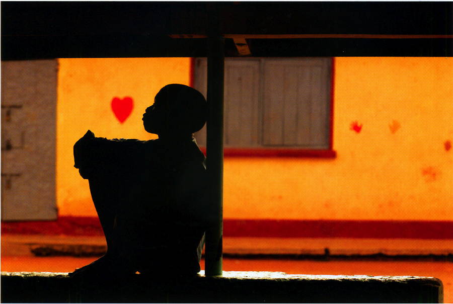
Color: very warm, quite high chroma yellow (YYO) and red.
Contrast: quite bold. The rich fields of solid color contrast with deep, dark, near-black neutral colors.
Edge qualty: Mostly rather clean, but blurred -- only focal areas have sharp focus/clarity.
Line/Shape: dominated by perfectly straight, vertical and horizontal edges -- big rectangles dominate.
(look for alignments, structures or groupings that organize parts into larger entities (gestalt))
Image is nicely organized into regions -- the top, middle and bottom bands. And the prominent/busy left region versus the empty right region.
Juxtapose the very gentle, playful heart, with the somber, pensive little boy.
Juxtapose the dark, organic, forground, human figure, with the brilliant, slightly blurred, rectilinear background.
Play with the surprise if a heart floating in front of a boy...in an unaltered photo. The image infers that the boy might be pondering love, affection and human qualities while in a still, static and man-made context.
(look for contrast of any and every kind. Look especially for similar forms that are varied in some way. Look for anomalies — patterns or norms that are broken.)
Brilliant chroma.
Bold value contrast.
Organic versus rectilinear.
Near-versus-far
Sharp/focus versus blurred/obscured.
"real world" (what the camera captures) versus imaginal world (the allusion ot the boy pondering love/affection.)
Flat vs. 3D: the boy, though in near-silhouette, has a bit of light/modeling to expand his depth a bit, contrasting with the flat wall.
Describe the forms that contribute to their graphic emphasis?
.the main focal area is the boy facing the heart.
The boy is a very large, dark shape on a lightand richly colored field. He is the only really organic shape in a predominantly geometric/rectilinear composition. The boy and heart contrast in terms of space -- he is near, and the heart is far, but they seem to be in the same space -- so there is a curious juxtaposition between the real and the imaginary ...we see the boy, but we also seem to see what he's pondering.
The rectangles and the horizontal edge of the boy's arms frame the heart. The heart is nicely isolated -- floating in space in front of the boy.
The boy/heart are roughly 1/3 from the left...approximating the "rule-of-thirds"
Most of the composition is stark, rectangular, flat-colored.
The pattern of horizontal stripes at the bottom, the dark band at the top, the simple green-grey rectangle on the far left, and the large field on the right (wall and window rectangles) are quite simple and plain compared to the well-isolated body, post and heart area.
Even the boy's body -- almost solid black, acts as a simple relief to the shapes and contrasts of the face-heart area.