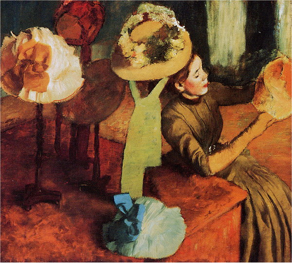
Edgar Degas, The Millinery Shop
1885, The Art Institute of Chicago, Chicago, Illinois
(look for elements and traits that repeatedly appear)
(look for alignments, structures or groupings that organize parts into larger entities (gestalt))
(look for dominances — which traits or elements are prominent throughout the composition?)
Color: Orange, Red-Orange and Yellow-Orange are the dominating analogous hues. Deep Green is the main subordinate color, along with BBG, thus creating a sort of (double-split) complement color harmony.
Texture: Texture is prominent and active throughout — offering visual interest and variety, but also helping to provide a unifying surface action throughout.
Shapes: Circular/Oval shapes and curves are positioned throughout Degas' composition. All other shapes/objects are subdued. The hats — objects that are, here, oval shaped — seem sometimes to suspend in space — their supports being much less prominent than the hats themselves.
(look for contrast of any and every kind. Look especially for similar forms that are varied in some way. Look for anomalies — patterns or norms that are broken.)
Diagonal edges (desk/table, the woman's arm ) contrast with the softn, roundess of the oval hats.
Balance: Degas is a master pictoral composer who enjoys breaking any traditional compositional rules — demonstrating repeatedly that compositional rules are rules of thumb only, and more often, artistic crutches rather than creative tools. Degas prefers, instead, to balance the forces in his images by careful intuition/sensing of graphic weight and visual forces, and then creating unexpected ways of balancing them.
Here the composition is forcibly centered by the bold, vertical yellow-green sash. Despite that, Degas forces the composition into a much less static assymetrical arrangement by pulling attention to the right — the woman on the right, looking to the right, with strong diagonals (arm/desk) pointing/leading right, and, finally, a rich red hat that is cut off by the right edge of the field. All of that "weights" the composition rightward.
So what balances it all? The brilliant white hat on the left, isolated well by dark colors/contours succeeds.
Bottom-to-Top balance is equally unusual. The bright blue bow on the bottom-center hat, reinforced by the huge yellow-green vertical stripe/sash, has to be balanced by a variety of hats and contrasts in the upper 1/3 of the canvas.
Describe the forms that contribute to their graphic emphasis?
(do you see any anomalies to the norm/dominances?)
(are there any directional cues pointing/leading to areas of interest?)
(central position in the composition? rule-of-1/3s positions?)
(heightened contrasts? ...heightened detail/complexity? )
(do forms frame or surround any focal areas? has isolation "enveloped" any relief areas?)
Edgar Degas: ABCGallery | Wikipedia | Artchive | WebMuseum | TheMet | ArtCyclopedia |
The Millinery Shop: img |