Bruce Barnbaum
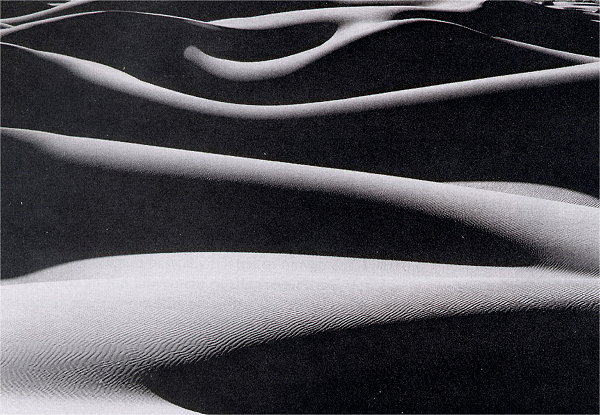
Dune Ridges as Sunrise, Death Valley — 1976. Silver gelatin print, 10.75"x13.25" (Design Basics 7th ed., p. 116)
(look for elements and traits that repeatedly appear)
Color palette is limited to only neutrals, further, the image is almost entirely black and a (nearly) white color. Only a few areas offer soft transitions between these extreme values. These two dominating values reduce the design to rhythms of light and dark, from bottom to top.
Shape and Line are consistently flowing, fluid and graceful (no straight, jagged or organic lines or shapes). Lines and shapes are generally horizontal — while they rise and fall vertically, the general and dominating direction is horizontal, despite there being no actual horizontals in the image at all.
Textures are mostly very smooth — non-textures, per se. However, a pervasive fine pattern is visible in the lighter areas of the sand — the pattern softens that stark smoothness. [ note: Barnbaum's actual print would have far more detail and subtlety than we can see in our digital, web-displayed image. Barnbaum is a master craftsman — he exposes and prints his images for maximum texture and detail. ]
The general organizing structure of the image involves a sort of soft zig-zag from top to bottom. That simple back and forth motion ties all of the individual dark shapes together. The pattern is most obvious in the bottom half of the photo.
Note also the progression from broad horizontal bands at the bottom, to the narrower bands at the top. Basic linear perspective explains that diminuition in size/width — as our eye moves up, we are viewing dunes farther and farther away.
(look for contrast of any and every kind. Look especially for similar forms that are varied in some way. Look for anomalies — patterns or norms that are broken.)
The image consistently juxtaposes extreme light and dark areas, thereby creating repeated, powerful value contrasts.
The shapes are all different — no two of the undulating, horizontal bands are the same as they sway, swell and taper from side to side.
The progression (noted under Unity ) offers variety, as well as a single cohesive structure.
Though not a purely formal kind of variety, its worth noting that this image bridges Landscape and Figure photography. Obviously the imagery is of sand dunes — a beautiful phenomon within a natural landscape. However, the forms are in some ways indestinguishable from a figure study — long torsos and limbs appear to be laying side-by-side. Though no specific anatomy is clear, the quality of form and line is overtly figural. This juxtaposition of landscape and figural form is, in itself, a kind of variety — a surprise or "aha!" discovery of a familiar experience within an unexpected context — we are made more aware of the similarity between distinctly different natural forms.
Describe the forms that contribute to their graphic emphasis?
This image does not have any obvious focal areas in terms of subject matter, but the form does offer contours and details that accent the overall pattern. The lower left has a large, graceful turn, with gradually-progressing values from dark to light, along with interesting textures. The large areas of dark and light surrounding this area serve to isolate, and thus enhance or emphasize it.
Near the top center is an area with hightened complexity — forms sweep and cut back to the left, ending in a dark area, rather than continuing on, as do virtually all of the other bands of white.
The large areas of dark and large light shape — each having little detail to attract our eye or sustain our attention — act as graphically quiet, still areas, allowing the simple undulating curves to be the prominent graphic activity.
Bruce Barnbaum: Barnbaum's Home Site | Luminous-Lint | Benham | Barnbaum Video Lecture/Zones & Values |