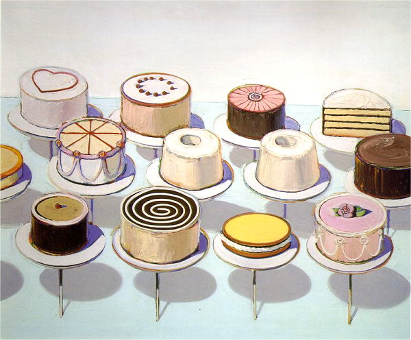
Wayne Thiebaud Cakes
1963; Oil on canvas; 60 x 72 in; National Gallery of Art, Washington
(look for elements and traits that repeatedly appear)
The cakes are all approximately the same size and the same shape (repetition of size; repetition of shape).
The colors used are quite limited -- the same few colors dominate the design. (whites and off-whites dominate the background and cake icing; dull purple used in shadows)
Repetition of the oval shapes (used in the cakes, cake stands and shadows of the cakes -- also in many of the cake decorations.
The cakes are (almost) all unique -- that uniqueness offers both a constant, unchanging quality that unifies the design, as well as variety.
The subject matter, cakes, is repeatedly used — and is, basically, the only subject matter.
The round/oval shape of the cakes and platters is repeated.
The cakes are consistently very textured -- this constant, heavy texture unifies the design while, at the same time, offer a contrast with the dominating flat painted surface.
The chroma, or saturation, of the colors is predominantly subdued -- nearly white.
The uprights and the shadows repeatedly the same size, shape and color.
repetition of shape -- almost all cakes are circular in shape, or cylindrical in mass.
(look for alignments, structures or groupings that organize parts into larger entities (gestalt))
All of the cake are aligned in orderly rows; the cakes are spaced evenly (intervals are repeated).
The cakes are on a shallow plane -- the picture is not deep or expansive. This shallow space helps to unify the composition.
Both the background and most of the cakes are white, thus further compressing the space -- unifying figures and ground.
The pattern, or arrangement of the cakes is regular, lying along simple lines or rows.
Many of the shapes overlap, thus connecting and unifying the many objects into a continuous web. (cakes overlap cakes, and cakes overlap shadows)
The cakes are each on cake-stands of a constant height, creating a regular pattern of shadows, a kind of grid structure that ties all of the separate cakes together.
We can speculate on what the artist intended, though Thiebaud might well disagree. (see interview)
Thiebaud is considered a Pop artist. Pop art relies on familiar, everyday subjects — ordinary things that we see while going about our ordinary activities. The challenge is, in part, to open our eyes to what is all around us. Andy Warhol most often worked to show us the banality — the almost deadening repetition — of the patterns, packages and images around us. Thiebaud seems more genuinely fascinated with common things — ordinary objects, sometimes rural landscapes and sometimes cityscapes. Here, he highlights the shear sensory thrill of beautifully decorated pastries that promise to taste even better than they look. He accentuates the thick icing, the varied designs, and the full, volumetric physicality of each cake — he wants us to want to reach out and grab one, to run our finger though the icing. And then to be playfully disappointed that we can't — these cakes are even more inaccessible than the usual pastry behind glass.
(look for contrast of any and every kind. Look especially for similar forms that are varied in some way. Look for anomalies — patterns or norms that are broken.)
There are two cakes that are identical -- among all of the varied cakes, these two are an anomaly.
One cake is much smaller/shorter; the cakes occasionally vary in height.
One cake is cut in half, with the inside visible.
All of the cake designs/decorations are unique. Each cake has a slight variation in color and pattern and in form -- they are very similar, but (almost) never the same.
There are many splashes of rich color on the cakes -- these fine accents of color contrast with the dominating, uniform near-whites. Small accents of red, pink, yellow, etc. offer colors that contrast dramatically with the predominant neutral near-whites.
Three cakes are dark, against the predominantly light/white cakes.
The bright yellow cake contrasts with the predominantly light/white cakes -- it is an anomaly.
By introducing a few exceptions to the norm, the artist introduces variety.
..a vibrant yellow color...one semi-circular cake, cut in half...each cake has a different decorative design...the two “twin” cakes, identical among the otherwise unique cakes, introduces variety within the variety...there are few accents of dark color.
Describe the forms that contribute to their graphic emphasis?
Large dark shapes (cakes) contrast boldly with the dominating white and near-white imagery.
The painting is sort of "about" competing focal areas -- every cake is supposed to attract our attention and be delicious to look at. So Thiebaud creates distincitve p-atterns
Wayne Thiebaud: Wikipedia | Artchive | Artcyclopedia | ArtNet | Gallery | *Video Interview* |