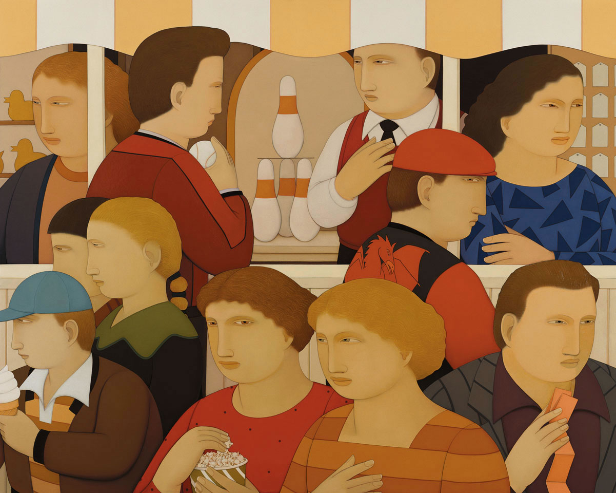
Andrew Stevovich Carnival
1992; Oil on canvas; 4 x 5ft ; Adelson Galleries, New York
Artist's Blog — check out his latest work and exhibitions
Article/Interview on Creative Process | WikiPedia | Adelson Galleries |
(look for dominating traits — look for elements and traits that repeatedly appear)
Shape is the overwhelming, dominating element here. All of the imagery is reduced to almst-flat, carefully-bounded shapes. The shapes have thin but distinct outlines. The shapes have very littel modeling or tonal variety inside them -- for the most part, each shape is a nearly flat color. That flat color emphasizes or exagerates the 2D quality, in contrast to deep modeled 3d forms.
The composition is unified by a very shallow depth -- it is basically a 2D composition with only limited suggestions of a 3rd dimension. There are only barely discernable shadows suggesting a 3d world -- a light source and massive forms -- the entire picture plane is very shallow and flattened. Only overlapping forms create a sense of much depth -- and that is within a very shallow field. The carnival booth is precisely parallel to the picture plane -- very flat as would be a stage backdrop. This also serves to flatten the picture plane.
The shapes tend to be rounded --not quite circular, but always swelling and roundish.
The shapes, and the persons, are roughly the same size throughout. The treatment of subject matter is very consistent -- simplified or smoothed slightly swollen shapes. The women have a wavey-edged hairline.
The eyes are shallow slits, almost "beady eyes" -- though everyone is supposedly having fun at the carnival, no one appears fully awake, alert or excited.
Color is predominantly yellow, yellow-orange and orange - including brown forms of those hues. There is a bit of blue, green, blue purple and red-purple to break up the generally analogous hue scheme.
(look for alignments, structures or groupings that organize parts into larger entities (gestalt))
We can speculate on what the artist intended, though Stevovich might well disagree. Here is a collection of folks busy with little carnival distractions and entertainments. No one is deeply invested or involved, they're just doing. They look about, but we're not shown anything of much interest to see. Note how often a hand is raised... why is that so? How often are people clearly interacting with each other?
(look for contrast of any and every kind. Look especially for similar forms that are varied in some way. Look for anomalies — patterns or norms that are broken.)
There is a bit of blue, green, blue purple and red-purple to break up the generally analogous hue scheme.
No two shapes or people are repeated.
Each person or group is focused on a different activity (or food.)
Describe the forms that contribute to their graphic emphasis?
The composition is very nearly an "allover composition" in which we our attention is drawn here and there with little distinction or hierarchy between subjects.. but that is not quite so.
Most of the people are looking away from the center of the compositon -- the two men at top center being the exception. The subtle focal area may be the top-center bowling pins -- the target for the gentleman with the baseball. Though most people are looking somewhere, this is the only object that is being looked *at* -- or, maybe across. It is one of the few distant areas in an otherwise very shallow field. In a sense, what makes the bowling pins distinct is that they are not near us. They are also rather central. They are one of the few visible subjects that are not people. Note that the sheet on which the upper pin rests is precisely at the viewer's eye level -- the sheet is drawn solely as a line -- no plane or perspective is seen. The bowling pins also echo, or even state, the general shape of all these rounded people.
Andrew Stevovich: Wikipedia | Artchive | Artcyclopedia | ArtNet | Gallery | *Video Interview* |