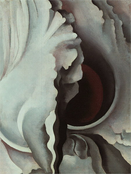
Georgia O'Keefe, Black Iris III
1926, oil on canvas, The Metropolitan Museum of Art, NY
(look for elements and traits that repeatedly appear)
(nearly) neutral color dominates.
Shapes and curves are quite prominent. They are almost all undularing, rhythmic curves, with a few arc-like, clean curves. Edges are almost all crisp and sharp -- well-defined. Shapes are all filled with rather smooth textures and gently gradating color.
(look for alignments, structures or groupings that organize parts into larger entities (gestalt))
The shapes and curves tend to spiral or radiate from the center.
(look for the dominant elements and traits)
Curved edges dominate — broad sweeping simple curves ("C" shapes)...
....along with many undulating curves — curves that go back and forth and back and forth.
Neutral color dominates, particularly whites and near-whites. The bold black and the subtle deep, dark red contrast with the white.
Most contrasts are quite soft and subtle. The few bold contrasting edges then become quite dramatic by comparison.
Clarity: most edges are fairly sharp and crisp. While shapes/surfaces have gentle, soft gradations of value, the contours are predominantly sharp.
Gradients/Blends: most shapes invovle softly changing color -- usually value changes most. There are few "flat" and constant areas of color.
Divide the design along a vertical, irregular edge — keep the left side predominantly light, and the right predominantly dark in value.
Dominate with undulating, curving shapes and contours as a means to abstract the iris blossom.
Build up value contrasts along those swirling and loosely spiraling edges as the design moves to the center.
Also, build depth from the outside, inward — from relatively flat at the outer edges, to deep overlapping forms at the focal area.
Look for contrast of any and every kind.
Look especially for similar forms that are varied in some way.
Look for anomalies — patterns or norms that are broken.
While much of the image involoves soft, gradating values, several instances of bold value contrast makes the image quite dynamic, particuarly since color transition at the edges is quite abrupt.
The undulating lines/contours add energy and motion.
Note
the buildup in contrasts from outside-to-center of the design — the outer part of the composition tends to have softly contrasting edges/values, but moving inward, the contrasts get bolder.
The design is generally circular — not quite a bullseye, but very circular, or spiraling, and centered. However, there is a strong vertical axis running up and down the center of the composition, contrasting with that soft circular/spiral quality.
The gradients of colors create a sense of movement and dynamism.
The prominent overlapping near the center creates an area of heightened depth, compared to the fairly flattened outer areas.
Describe the forms that contribute to their graphic emphasis?
Near the center is an area of very high value contrast.
The bold vertical dividing line contrasts with the curving, roughly circular movement elsewhere. This prominent vertical, contrasting with the dominating circular/spiral composition stands out.
The boldest circular shape (strong light-dark contrast), that is, the very dark red-black shape, is in the same central area, drawing further attention.
The deep dark color next to the prominent white also adds to this area. The Large dark and red half-circles on the right surround and define this focal area well.
Position/Location: the vertical division is in the (left-to-right) center of the composition -- a prominent location visually. The graphic importance of the center is compounded by the overall symmetrical composition.
Directional Elements: Several directional elements lead to, or point to this area, thereby enhancing its graphic weight.
Particularly, at the bottom, a prominent vertical path starts narrow and then swells at it reaches the center — it acts as a sort of road heading to the center.
At the top, an undulating curve arcs inward, from the edge of the composition toward the central curls.
The one red area gradates from a somewhat rich red towards black. This gradient along the cresent-like curve moves attention inward, building emphasis.
Also, left and right of the lower center area is consistently curves, thus enabling the contrasting straight/vertical lower-center forms to be more emphatic.
Georgia O'Keefe: Met | Artcyclopedia | Bio | Museum | WikiPedia | VideoIntro | Video2 | *Video Interview* | Video Portfolio1 |