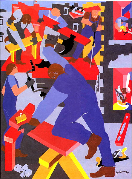
Jacob Lawrence, (1917 - 2000) American
The Builders — 1980; gouache on paper; 34 x 25 1/2 in.; Collection of Safeco Corporation, Seattle
(from a series of paintings and prints Lawrence created honoring labor and laborers.)
(look for elements and traits that repeatedly appear)
The limited range of color — each are primaries — provides a similar quality of color, despite the varied hues.
Shapes are dominant — all imagery is presented as simple, sharp-edged, flat-colored shapes — almost as though each shape were cut out of paper.
Edges/Lines are consistently clean and sharp.
The space is flattened and rather upturned — the image is certainly not a "window onto a world", but rather the ground plane, the back walls (?) and the picture plane are each roughly the same. This makes the scenes feel very shallow — compressed into a narrow, compacted, and thus bound, simplified and unified space.
(look for contrast of any and every kind. Look especially for similar forms that are varied in some way. Look for anomalies — patterns or norms that are broken.)
Value is quite boldly varied. There are only a few values in use — thus the values are simplified.
Color offers boldly contrasting hues — Red, Blue and Yellow, as well as the neutrals Black and White. These colors, primaries and the extreme neutrals, contribute to the dynamic contrast of the image.
Direction: the shapes and illustrated figures are in action and are, thus, almost always "at an angle" — diagonal dominating, verticals and horizontals being rare subordinate directions.
(look for formal features that repeatedly appear. Dominances contribute to the unity of a composition, and often involve overt repetition.)
Dominant Element: Shape
Lawrence builds all of his imagery with bold, well-defined, flat, constant-colored shapes. As such he ignores variations in texture, or varied values within shapes (modeling). Dominating shapes tend to simplify the imagery, creating a more casual, even playful approach -- disarming the viewer.
Dominant Contrast: Bold or Varied
Lawrence keeps the entire image quite active — there are no broad, sustained relief areas.
Dominant Colors: Red and Blue compete here. The Blue is more pervasive, and this acts as a foundation for the intesnt red passages. The tension between similar proportions of red and blue add to the dominating bold contrast.
Describe the forms that contribute to their graphic emphasis?
The large, central figure, swinging his hammer, dominates the image.
The figure is graphically emphasized due to:
a) Position: the figure is centered
b) Size: the large size, itself, commands attention, but also, the scale is markedly larger than the other figures, thus contrasting with them.
c) the constant blue is enhanced with large patches of contrasting red in the background. Also, there is a lot of the lighter blue background isolating the dark blues of the figure. While most of the painting has busy, multi-colored backgrounds surrounding the other figures, Lawerence has isolated or buffered this central figure more than any other.
d) Lines of Force and Direction Cues: the figure has bold, dynamic, diagonal shapes/edges. Also, the yellow sawhorse (bottom center), the red board and then the leg, torso and arm of the figure create a bold zig-zag movement through the composition — a more defined motion than elsewhere.
Lawrence gives us very little relief — the image is, after all, about the constant busyness of the worker's day. Visual relief is scarce just as physical relief — breaks — are scarce for the workers.
There are differences, however in graphic activity — some areas are more cluttered with action and shapes than other areas — thus there is variety in the degree of emphasis/action and relief/calm. In general, the image begins somewhat simple at the bottom, and then gets busier and busier as you go up.
NOTE on the lead-in to the composition:
Typically, an image "begins" somewhere on the left, or the top edges — frequently a lead-in will be created near the top left, where English-reading viewers habitually begin.
Jacob Lawrence: WebMuseum | Met | National Gallery (US) | ArtChive | Olga's | Wikipedia | ArtNet | PBS | Phillips Collection |
Jacob Lawrence and Gwen Knight Resource Center | JLGK Image Archive |