Paul Manes, Eiso
(look for elements and traits that repeatedly appear)
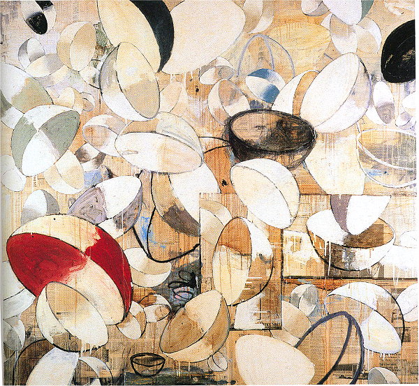
The bowls, or half-sphere forms are repeated everywhere — oval and circle shapes dominate the image.
All of the bowls are created with outlines — though some are shaded/modeled, all of them have very distinct boundaries and most have prominent contour lines (thus, line is a prominent visual element in this composition).
The dominating colors are nearly neutral (most are white, off-whites, black and tan colors).
The values are mostly fairly light. (high values dominate the composition)
The size of the bowls are similar — none are huge, though there are a few tiny ones.
The orientation is consistently irregular — there are no "level" bowls, all of them are rotated at odd angles.
The point of view is also utterly consistent. Even though the bowls seem to be tossed and turning randomly in space, every single bowl is viewed from the same angle — in all cases, about 2/3 of the bowl is its opening and 1/3 is the side/bottom of the bowl. There are however, no bowls viewed exactly from the side, none viewed acactly from the top and none viewed from the bottom. So the sense of randomness is really quite falise.
The bowls are spaced rather consistently — the spatial intervals are similar. That is, there are no areas packed full of bowls, and no areas with wide open spaces -- with huge intervals.
Almost all of the bowls overlap other bowls — very few are isolated with space all around them.
The pattern of shading is identical in each bowl — each shaded bowl is divided into four colored areas, almost checkerboard-like. This pattern is consistent even though it defies realistic lighting — and a single light source is usually used to help unify a realistic image, but here lighting is utterly arbitrary and false.
(look for alignments, structures or groupings that organize parts into larger entities (gestalt))
(look for contrast of any and every kind. Look especially for similar forms that are varied in some way. Look for anomalies — patterns or norms that are broken.)
Some areas are painted solid and opaque — in contrast, other areas are bare canvas or lightly stained canvas.
Some bowls are painted with shading and so modeled as three-dimensional masses, other bowls are no more than outlines — and there are many variations in between.
There are a couple of rectangles. These rectangles contrast with the dominating curves and bowl-shapes.
However, the rectangles also interrupt the spatial realism of the image. These boxes contain sort of mini-pictures within the picture. Yet these small images are spatially "in between" the free-floating bowls — basically disturbing the apparent realism. The boxes are overlapped by other bowls, as well as overlapping more distant bowls. As such, it is as though these little images are free-floating objects just as are the other bowls.
Though the dominant colors are nearly neutral — whites, blacks and tan colors — there are anomalous reds and blue accents.
Though the dominating value is rather light, there are contrasting anomalous areas of dark, black, solid shapes.
There is no single light source in this composition — the constant pattern of shading of the bowls defies any constant light source. So there is a subtle sort of variety -- a non-realistic, always changing direction of light.
Describe the forms that contribute to their graphic emphasis?
The areas with distinct, rich and anomalous color tend to command attention most — the red area is large and rich, the blue area less so, but still prominent.
Other areas of emphasis are also due to distinctive color — very dark areas that stand out against the dominating light and light-mid values. Several black bowls command attention.
However, this design understates any prominent focal areas — it is close to an "allover design", in which there is an unbroken continuous pattern, rather than elevating any forms to prominences. Consequently, there is little distinction between areas — there are no powerful areas of emphasis and no fully subdued relief areas.
This absence of strong focal areas serve to enhance the sense of clutter and chaos of the work — surely a response the artist intended.