WPF Controls and Layout

  1. WPF controls
    1. Many common UI components like Button, Label, TextBox, Menu, and ListBox
    2. Add to XAML
      <Label x:Name="label1">Hello, WPF!</Label>
      
    3. Can also add programmatically by adding to layout's Children property
      Label myLabel = new Label();
      myLabel.Content = "Hello, WPF";
      grid1.Children.Add(myLabel);
      
    4. Control properties
      1. Width, Height
        1. Device-independent unit (1/96th inch) measurement
        2. Can use other measurement units: px, in, cm, pt
        3. Auto to use minimum size around content
      2. MinWidth, MinHeight, MaxWidth, MaxHeight - define a range of acceptable values
      3. HorizontalAlignment (Left, Center, Right, or Stretch) and VerticalAlignment (Top, Center, Bottom, or Stretch)
        Various alignments
        From Christian Mosers' WPF Tutorial


      4. Padding (extra space inside the control) and Margin (extra space around the control) - L, T, R, B
        Padding and Margin
  2. Control layout
    1. Windows Forms: Set absolute (x,y) position
    2. WPF: Set relative position in its layout container
    3. Controls grow/shrink as window grows/shrinks
    4. Common layouts
      1. Grid - controls layed out in rows and columns

        Grid layout

        <Grid>
            <Grid.RowDefinitions>
                <RowDefinition Height="Auto" />  <!-- Minimum space needed by controls -->
                <RowDefinition Height="Auto" />
                <RowDefinition Height="*" />     <!-- All remaining space -->
                <RowDefinition Height="30" />
            </Grid.RowDefinitions>
            <Grid.ColumnDefinitions>
                <ColumnDefinition Width="Auto" />
                <ColumnDefinition Width="280" />
            </Grid.ColumnDefinitions>
            <Label Grid.Row="0" Grid.Column="0" HorizontalAlignment="Right" Content="Name" />
            <Label Grid.Row="1" Grid.Column="0" HorizontalAlignment="Right" Content="Email" />
            <Label Grid.Row="2" Grid.Column="0" HorizontalAlignment="Right" Content="Comment" />
            <TextBox Grid.Column="1" Grid.Row="0" Margin="3" />
            <TextBox Grid.Column="1" Grid.Row="1" Margin="3" />
            <TextBox Grid.Column="1" Grid.Row="2" Margin="3" />
            <Button Grid.Column="1" Grid.Row="3" HorizontalAlignment="Right" 
                MinWidth="80" Margin="3" Content="Send" />
        </Grid>
        
      2. Canvas - controls positioned at explicit coordinates
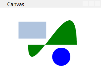
        Canvas layout

        <Canvas>
            <Rectangle Canvas.Left="40" Canvas.Top="31" Width="61" Height="37" Fill="LightSteelBlue"  />
            <Ellipse Canvas.Left="114" Canvas.Top="88" Width="40" Height="40" Fill="Blue"  />
            <Path Canvas.Left="61" Canvas.Top="28" Width="107" Height="80" Fill="Green" 
                Stretch="Fill" Data="M 10,100 C 10,300 300,-200 300,100"/>
        </Canvas>
        
      3. StackPanel - controls stacked left to right (Horizontal orientation) or top to bottom (Vertical orientation)

        StackPanel

        <StackPanel Orientation="Vertical">
            <TextBlock Margin="10" FontSize="20">Select a direction:</TextBlock>
            <Button Margin="10">Up</Button>
            <Button Margin="10">Down</Button>
            <Button Margin="10">Left</Button>
            <Button Margin="10">Right</Button>
        </StackPanel>
        
      4. DockPanel - controls docked to left, right, top, bottom, or center

        DockPanel

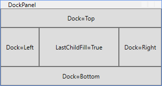
        <DockPanel LastChildFill="True">
            <Button Padding="10" Content="Dock=Top" DockPanel.Dock="Top"/>
            <Button Padding="10" Content="Dock=Bottom" DockPanel.Dock="Bottom"/>
            <Button Padding="10" Content="Dock=Left"/>
            <Button Padding="10" Content="Dock=Right" DockPanel.Dock="Right"/>
            <Button Padding="10" Content="LastChildFill=True"/>
        </DockPanel>
        
      5. WrapPanel - controls stacked in one row (Horizontal orientation) or column (Vertical orientation)

        WrapPanel

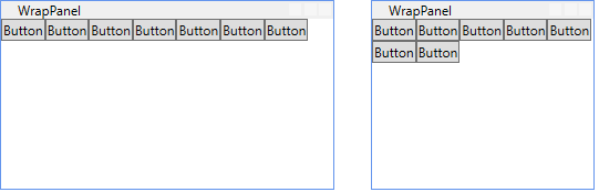
        <WrapPanel Orientation="Horizontal">
            <Button Content="Button" />
            <Button Content="Button" />
            <Button Content="Button" />
            <Button Content="Button" />
            <Button Content="Button" />
            <Button Content="Button" />
            <Button Content="Button" />
        </WrapPanel>
        
    5. Best practices (source)
      1. Avoid fixed positions - use the Alignment properties in combination with Margin to position elements in a panel
      2. Avoid fixed sizes - set the Width and Height of elements to Auto whenever possible
      3. The Canvas panel is ideally just for vector graphics
      4. Use a StackPanel to layout dialog buttons
      5. Use a GridPanel to layout a static data entry form. Create an Auto sized column for the labels and a Star sized column for the TextBoxes