- Controls have properties that can be modified to alter a control's appearance
- Use WPF Styles to apply the same property values to a group of controls
- Use WPF Control Templates to change underlying visual presentation of a control
- Style is a collection of reusable property-value & event-handler definitions
- Concept is similar to style sheets for HTML
- Styles are XAML resources - reusable objects defined for entire application
- Example applying styles to several sliders
<Window.Resources>
    <Style x:Key="SliderStyle" TargetType="Slider">
         <Setter Property="Slider.Minimum" Value="0" />
         <Setter Property="Slider.Maximum" Value="255" />
         <Setter Property="Slider.IsSnapToTickEnabled" Value="True" />
         <EventSetter Event="Slider.ValueChanged"  Handler="slider_ValueChanged" />
    </Style>
</Window.Resources>

<Slider Name="redSlider" Style="{StaticResource SliderStyle}" />
<Slider Name="greenSlider" Style="{StaticResource SliderStyle}" />
<Slider Name="blueSlider" Style="{StaticResource SliderStyle}" />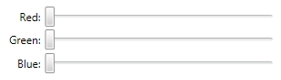
- Example applying same style to different controls
<Window.Resources>
    <Style x:Key="WashedOut" TargetType="{x:Type FrameworkElement}" >
         <Setter Property="Opacity" Value="0.5" />
    </Style>
</Window.Resources>

<!-- Same style applied to different controls -->
<Button Content="Button" Style="{StaticResource WashedOut}" />
<Label Content="Label" Style="{StaticResource WashedOut}" />
<CheckBox Content="CheckBox" Style="{StaticResource WashedOut}" />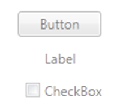
- Appearance of WPF controls determined by a control template
- A control template is a hierarchy of visual elements
Button | Border | ContentPresenter | String - All visual controls use a default control template
- Changes to the control template can redefine the appearance of the control without changing its functionality
- Example control template for a Button with modified border and ContentPresenter
<Window.Resources>
	<ControlTemplate x:Key="MyButtonTemplate" TargetType="Button">
		<Border Name="Border" BorderThickness="2" CornerRadius="10"
				BorderBrush="BlueViolet">
			<ContentPresenter HorizontalAlignment="Center"
							  VerticalAlignment="Center"
							  TextBlock.FontWeight="Bold"
							  TextBlock.Foreground="Firebrick"
							  Content="{TemplateBinding Content}" />
		</Border>
	</ControlTemplate>
</Window.Resources>

<Button Name="button1" Width="100" Height="30">Button 1</Button>
<Button Name="button2" Width="100" Height="30"
    Template="{StaticResource MyButtonTemplate}">Button 2</Button>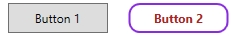
- A trigger is used to change a control's appearance when it enters a certain state
- Can be used with styles or control templates
- Must be defined in
Style.TriggersorControlTemplate.Triggers - Style with trigger example
<Window.Resources>
    <Style x:Key="MyButtonStyle" >
        <Setter Property="Button.Opacity" Value="0.5" />
        <Style.Triggers>
            <Trigger Property="Button.IsMouseOver" Value="True">
                <Setter Property="Button.Opacity" Value="1" />
            </Trigger>
        </Style.Triggers>
   </Style>
</Window.Resources>

<Button Width="100" Height="30"
	Style="{StaticResource MyButtonStyle}">Push Me</Button>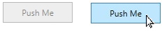
- Control template with trigger example
<Window.Resources>
	<ControlTemplate x:Key="MyButtonTemplate" TargetType="Button">
		<Border Name="Border" BorderThickness="2" CornerRadius="10"
				BorderBrush="BlueViolet">
			<ContentPresenter HorizontalAlignment="Center"
				VerticalAlignment="Center" TextBlock.FontWeight="Bold"
				TextBlock.Foreground="Firebrick" Content="{TemplateBinding Content}" />
		</Border>
		<ControlTemplate.Triggers>
			<Trigger Property="IsMouseOver" Value="True">
				<Setter TargetName="Border" Property="Background"
						Value="LightBlue" />
			</Trigger>
		</ControlTemplate.Triggers>
	</ControlTemplate>
</Window.Resources>

<Button Width="100" Height="30"
    Template="{StaticResource MyButtonTemplate}">Button 2</Button>