HTML5 Web Form Elements

  1. HTML5 introduces a number of form elements which allow web apps to use the same GUI widgets/controls that native application use
    1. Behavior of these widgets varies between browsers
    2. Developers sometimes use a polyfill for browsers that don't support the widget's behavior
    3. Many of the form elements perform data validation when the form is submitted, replacing complicated JavaScript
      1. Any <input> control can turn off data validation using the formnovalidate attribute
        <input type="submit" value="Submit without validation" formnovalidate>
        
      2. A form can turn off validation for all elements using the novalidate attribute:
        <form action="purchase.php" novalidate>
        
      3. required attribute means a value for the control must be supplied or the browser will not allow the form to be submitted
        <!-- User MUST enter something here -->
        <input type="text" required>
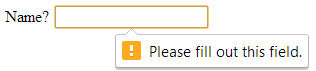
        
        Required text
      4. pattern attribute for supplying a regular expression which the input must match
        <!-- Text box only accepts 4 digits -->
        <input type="text" pattern="^\d\d\d\d$">
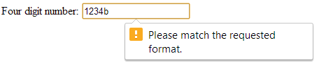
        
        Error when 4 digits not entered
    4. Other important attributes
      1. autofocus attribute gives the control the focus when the page is loading, and only one control per page can use it
        <!-- Text box has focus when page is first loaded -->
        <input type="text" autofocus>
        
      2. placeholder attribute gives "hints" to the user as to what is expected to be typed into a text box
        <!-- "Name" appears in text box -->
        <input type="text" placeholder="Name">
        
  2. Color input
    1. For selecting a color - Chrome and Firefox launch a color dialog box
      <input type="color">
      
      (#RRGGBB value)
  3. Date and time inputs
    1. Date - Chrome launches a date-picker dialog box
      <input type="date" required>
      
      (yyyy-mm-dd)
    2. Date and time set to UTC (Coordinated Universal Time)
      <input type="datetime" placeholder="yyyy-mm-ddThh:mm" /> 
      
      (Example: 2012-08-15T14:20)
    3. Date and time in the local time zone
      <input type="datetime-local" placeholder="yyyy-mm-ddThh:mm" /> 
      
      (Example: 2012-08-15T14:20)
    4. Month within a year
      <input type="month" placeholder="yyyy-mm"> 
      
      (Example: 2012-05)
    5. Week within a year (nn is number between 01 and 53)
      <input type="week" placeholder="yyyy-Wmm" /> 
      
      (Example: 2012-W01)
  4. Generic input types
    1. Number between min and max
      <input type="number" min="1" max="10" step="1"> 
      
    2. Range between min and max (slider control)
      <input type="range" min="0" max="50" value="25"> 
      
  5. Other input types
    1. Email
      <input type="email" placeholder="name@domain.com"> 
      
      (Example: joe@yahoo.com)
    2. Telephone number using a regular expression to ensure proper format
      <input type="tel" placeholder="(###) ###-####" pattern="\(\d{3}\) +\d{3}-\d{4}">
      
      (Example: (303) 761-9719)
    3. URL
      <input type="url" placeholder="http://domain.com/">
      
      (Example: http://www.yahoo.com/)
    4. Search query
      <input type="search" placeholder="Search"> 
      
  6. Autocompletion
    1. Use <input autocomplete="on"> to turn on ability of browser to fill-in fields that you have previously supplied
      1. Must supply name or id attribute for it to work
      2. Best to set autocomplete="off" for private information like passwords
    2. Use <datalist> tag to supply an input element with pre-defined values that appear as user is typing
      <input list="browsers">
      <datalist id="browsers">
      	<option value="Internet Explorer">
      	<option value="Firefox">
      	<option value="Chrome">
      	<option value="Opera">
      	<option value="Safari">
      </datalist>